Pages

Showing posts with label Websters Pages. Show all posts

Sunday, March 26, 2017

Black and White

If you visit here much at all, you know that I love mixing colors, patterns and textures.  It is my favorite thing about scrapbooking. But sometimesa challenge helps nudge (shove) me out of my box.  This week I came across two challenges that would take color (mostly) out of the mix. 

One of the March "Layout A Week" challenges at Studio Calico asked that you make black and white the focus of your project.  And one of the challenges at the Paper Issues Spring Crop called for a monochromatic layout.  So I went for it.....

I limited myself to black and white (and a little gold) for a layout.  And to be honest, I kind of love it.

I focused on mixing patterns and textures while trying to maintain a "light" feel.  The black plastic grid was from an ancient Studio Calico kit and had been hanging on my peg board forever.  When choosing papers I used two vellums (because they add lots of texture without adding much visual weight) and patterns that were predominantly white.  A chalkboard shipping tag added a different texture and a pop of black.  And the black and white photo really pulled it all together.

I'm not giving up all those pretty patterned papers but this was a fun exercise with a great end result.  And that nudge out of my box is the reason I love creative challenges.  It pushes me to try something different I never would have tried.

I hope you're finding your own scrappy time.  Try something new the next time you sit down to play.  You might just love what you make.


Sunday, May 22, 2016

Using a Transparency

Transparent elements are big in scrapbooking right now.  And I am a huge fan - I love that they provide opportunities to add color and texture but generally maintain a light feel.  But 12x12 transparencies are coming with lots more color and pattern than ever before - and I think they can be a bit challenging to use.  In fact, my stash is growing quickly - they are so pretty but I end up not using them. 

So when the Spoonful add-on at Studio Calico came with this Dear Lizzy transparency I was determined to use it.


I found the perfect inspiration is a sketch at Citrus Twist Kits. The diagonal design seemed to provide a great opportunity to incorporate the transparency to add color and pattern as a background element.


It turns out - that wasn't as easy as I thought it would be.  I ended up piecing together several patterned papers, including the transparency to create a custom background.


Once the background was done I worked on a photo block.  And I'll admit that I had a hard time with placement - the vertical orientation in the sketch just didn't work well.  I think I moved the block around for 15 minutes and it just didn't look right.  I added the pink and white striped paper from my scraps on a whim - and was really surprised that it seemed to work to anchor the whole thing. 

Because the design was busy and I had used a number of bold patterns, I kept embellishments to a minimum (a challenge for me).  But I thought it was really fun to add a second transparent element with the acetate word from Pinkfresh Studio.  And I was really surprised at how well the hot pink thickers worked on top of the transparency. Finally, I couldn't call it done without a few ink spatters.

So what's accumulating in your stash because you love it but can't quite figure out how to use it.  Challenge yourself to put it on a project this week.  You might just be surprised with the end result.

Have a great Sunday.

Saturday, May 21, 2016

Capturing the Everyday

I started as an "event" scrapbooker - you know - capturing all the stuff we do.  But as I've scrapped more and gotten older, I am increasingly focused on capturing the minutia of everyday life.  I want the albums I put together for my children to include bits of everyday life that will bring back memories of everyday (and things there kids won't understand at all). 

Nothing is bigger in my daughter's everyday life right now than snapchat.  But I suspect it will be long gone by the time her children are teens.  So I decided I wanted to do a layout that at least would make her think back to the time when she couldn't go an hour without snapchat.

I started with the current sketch at Stuck?! Sketches and the May kits from Studio Calico


It has lots of opportunities to layer and add bits and pieces so it was perfect for me.  I ended up with this.


I really stuck closely to the sketch.  But I moved the banners to the bottom of the photo block instead of the side of the photo block.  To balance that change I shifted an embellishment cluster to the top corner of the photo block.  The title stayed at the bottom of the page but shifted to the opposite side (another result of the shift in the banners.)

Most of the supplies are from the Jolly Holiday kits.  But I did pull that fun veneer grid from my stash.  And this was a great time to dig into my die cut stash to help build embellishment clusters. 

And I can't wait til my daughters children are going through her album and ask her what "snapchat" is.

Hope you're finding time to scrap this weekend.  I'm on a roll so I better get back to work.  Have a great weekend.

Sunday, April 3, 2016

Getting (A Little) Messy

I've been really lazy about writing here lately and definitely want to get back on track.  A lot has been going on with my family lately, and this seems to be one of the first things that doesn't get done.  But I've been busy creating and doing some reorganization, so I have lots to share. Hopefully this will be the week I get back on track.

One of my creative goals this year is to experiment more with mixed media.  I have the supplies, but almost never use them.  I've spent some time thinking about why I don't use those supplies more and can come up with a long list of reasons.
  • I am too impatient to wait for things to dry
  • I don't think of myself as artistic and don't have the confidence to experiment
  • I love playing with papers and embellishments, and I am not sure how to incorporate mixed media into my style....
.... I could go on, but you get the idea.  So I am going to try and push out of my comfort zone by playing with a mixed media technique at least one or two times a month.  This month I tried a silkscreen (which I know is super easy) and ink splatters which I already use on almost all of  my projects.  The idea is to try something, not to get overwhelmed with the process.

I started with the current sketch from My Creative Sketches.


For my layout I stayed close to the sketch but dropped the large rectangle down into the bottom corner of the layout.  I also moved the strips of paper in front of that rectangle.

Papers and embellishments are from March Studio Calico kits - Homespun and addons

I also added a larger square of the bright green paper and covered most of it with white vellum to create additional dimension.  I wanted the pop of color but too much of that green was going to overwhelm the other papers.  I used a label and a project life card to extend the feeling of strips on the far side of the photo.  And that little woodgrain flag is a vintage studio calico color theory flag from my stash.

Because I don't plan well, I built my layout design and then went back to add the silkscreen leaf motif in the top corner.  The silkscreen was in the March scrapbook kit at Studio Calico and is just lovely.  After I stuck it to the top corner of the paper, I randomly added small bits of Color Theory acrylic paint in 4 colors - mint hint, limelight, blush crush and coral bay - until the design was well covered.   I pulled up the silkscreen and washed it right way. (This is an important safety tip if you want to use your silkscreen more than once.)  I was thrilled when I came back and looked at the way it turned out.  It picked up all the colors in the paper strips but was still soft and simple.  And it dried really quickly ........  I added a few gold spatters around the leaf and down at the bottom of the page and I was done.

At the end of the day, I called this experiment with mixed media a success - I pushed myself a little bit out of my box and ended up with a layout that still looked like I made it.  It's taken me a long time to develop my style and I don't want it to get lost in a rush to try all the new things.

I'd love to hear any suggestions you might have for other mixed media techniques I should try.  I have gelatos, watercolors, acrylic paints, gesso, lots of spray inks and who knows what else tucked away here.  It's time to use them more .....and of course I've never been afraid to buy a new supply.

In the meantime, thanks for stopping by.

Thursday, July 30, 2015

Do Over

There aren't too many times when we really get do overs but scrapbooking is one of those places where it is totally possible.  I try not to do it too often but sometimes I just really don't like my end product.  This was one of those days.

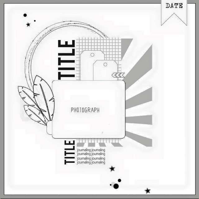
Sunbursts are all the rage but I have a really hard time with them.  But when the sketch this week at Citrus Twist Kits featured a sunburst I thought I would give it a try. 


I thought about what I didn't like on past projects when I tried to use a sunburst and realized that they seemed to look heavy on my layouts.  So I decided to cut my sunburst from vellum


But I didn't like it and I'm not sure why.  My daughter thought it was because I needed more rays...

I set it aside but kept thinking about it and really didn't like it.  Then I remembered some vellum leaves in my stash (The advantage of a big purge is that you remember what you have.)So I lifted the photo block off the original layout and started over.


And I like it so much better!  And it took me about  minutes since I left the photo block intact.

Now I don't recommend frequent do-overs - after all there are so many photos waiting for love.  But once in a while it is definitely worth it!

So am I the only one who starts over?

Thanks for stopping by.....

Tuesday, July 28, 2015

Quick and Easy

I spent last Thursday - all day - cleaning up my craft room.  My daughter (who is only 15) could be a professional organizer. She helped me empty it out, sort through baskets, purge, and put it back together.  Late that night I had a clean space and was ready to play.  But after 1 quick layout, we went out of town. 

And when we came back I had to do something about the purge piles in the living room.  So it wasn't til last night that I had a chance to play again in my clean space.  I pulled together a quick layout using the newest sketch at Stuck!


I started with my July goodies from Citrus Twist (which currently hold the place of honor in the top of my Raskog).  I added a few scraps from my stash and couldn't resist the sevenpaper puffy hearts. 

Some gold ink splatters and I was done.  I'm hoping to play some more this week, but have a feeling my scrap time is limited until the weekend. 

Hope you are finding time to play.  Thanks for stopping by.

Friday, July 24, 2015

Mixing Textures

I think a lot about mixing colors and patterns on my layouts.  But I don't think about texture very often at all.  But the truth is that texture is just as important.  And my July box from Citrus Twist Kits provided the inspiration to use texture as a focus in choosing elements for my newest layout.

I started with a great piece of woodgrain paper.  The main kit included a fun piece of fabric that I would never have thought to use on a layout.  But it served as the perfect base for my photo block.  It added depth and interest that paper just wouldn't have brought to the table.

Design inspired by sketch at Citrus Twist kits
The embellishment kit included denim stickers which sounded a little strange but I love.  And they added another textural element.  Shiny gold chipboard contrasted with the fabrics and woodgrain for added interest.  And it just so happens that I had added some cork stickers to my box that worked perfectly with my project. Enamel dots, wood buttons, flair and acrylic shapes all added more texture and interest.  And of course I don't seem to be able to finish a layout without ink splatters.  But this time I used navy colorshine instead of gold, white or black.

Hope you have a great weekend.  We are headed to my hometown.

Thanks for stopping by.

Sunday, June 21, 2015

Sun-kissed

I love the colors in the summer themed lines this year - aqua, orange, citrusy yellow, blue and pink.  The are so bright and fresh!  So when I looked at the current sketch at Stuck!,  I knew I wanted to play with those shades. 


I was really inspired by all the vertical layers in this sketch.  I really focused on pulling those elements into my layout.  I was working with a single 4x6 picture (another old one from when my kids were small), so that element worked really well for me.  Here's what I ended up with.


I love those mason jars you fill from Crate Paper - and the way it added another vertical element to my layout.  And since I don't have a sewing machine, I used a little glossy accents to glue it closed.  It dries clear so you don't notice the glue at all.

Note:  I made this layout with a kit and add-ons from Citrus Twist Kits.  Tomorrow I am starting a weekly series of kit reviews with the Citrus Twist Kits June scrapbook kit. 

Thanks for stopping by!

Saturday, April 25, 2015

Vellum!

I have lots of scrap related obsessions, but lately vellum has been on the top of the list.  I love that it has been included in collections in lots of colors, prints and textures lately.  And I have quite a stash.

Most often I use it for layering in a photo block.  But when I saw the current sketch on the My Scraps and More Sketch Blog, I decided to try using vellum as the inspiration for my layout.  The sketch uses lots of strips of paper and I thought it would be fun to layer strips of vellum.


The layered vellum strips created a light girly look that i really like.  I mostly used strips from my scraps. And I added in a few strips of white and gray patterned paper to make the strips feel more substantial.   More vellum and a glassine bag to create a photo block finished off the layers across the page.


I dug out some old Basic Grey chipboard alphas for the title and added some embellishments.  And I just couldn't resist that floral stamp from the Studio Calico Lisse Street kit.  I lvoe that it looks like a doodle.

Thanks for stopping by.

Saturday, April 4, 2015

Starting With A Sketch

One of my favorite starting points is a sketch.  So when I heard My Scraps and More was having a sketchathon in April, I was thrilled.  I've been scrapping a lot, and its the perfect way to keep my momentum going.  I mean, 30 sketches in 30 days?
 
The first sketch was published on April 1; the challenge also required fussy cutting.


I hate fussy cutting so I almost skipped the challenge.  But I really liked the sketch.  And I had photos from hy husband's birthday last summer that were begging to be scrapped.  So I poked around in my scrap room for paper that would lend itself to simple fussy cutting.  I found a sheet printed with black frames that seemed perfect.


The title and chipboard phrase stickers are from the Maggie Holmes Confetti collection.  I used the colors in the numbers to drive my color selections.  And I went to work on the background with my current favorite technique - layering rub ons and ink splatters. I added some small puffy stars from Crate Paper's Journey line to add a bit of dimension.

I'd love to know your favorite starting points for layouts when your stuck.

Thanks for stopping by.


Tuesday, November 25, 2014

December Daily-ish - Embellishments.

Yesterday I talked a lot about the paper choices I made for my album.  Today I'm talking about embellishments .  As I thought about embellishments, I came up with the following principles to help choose embellishments:
  • I wanted a mix of holiday and non-holiday themed embellishments
  • I wanted a mix of textures and colors
  • I didn't want to end up with a lot of things to put away when the project was done.
Again I looked at the different kits out there to see what appealed to me.  For instance I love seeing holiday words in script form so I was excited to find some heidi swapp holiday word stickers in my stash.  And I may well buy some cut files so I can play with this look more.

I also realized that I am going to work on my album here at home most if not all the time.  And my scrap room organization is about having things where I can see them since I use what I see.  But my holiday embellishments are stored in two Iris boxes and are hard to dig through.  So I decided to focus on pulling holiday embellishments and adding reminders of non-holiday themed embellishments to my kit rather than pulling everything I might want to use.  (Remember - I don't want a lot to put away at the end of the project.)

So here is a photo that gives you a feel for the embellishment mix I've chosen.


 Here are the items I've chosen:
  • die cuts - a mix of traditional, vellum, and acetate pieces so I can add a variety of textures
  • rub-ons - I love using rub-ons lately, especially directly on a photo since I don't have access to photoshop.  Those gold star rub-ons were from Chic Tags last Christmas
  • bags, pockets, folders and envelopes - perfect for creating inserts to hold journaling and memorabilia
  • trim - I pulled a mix of ribbons and twine
  • tags - love those gold glitter tags from Pebbles
  • flair - a mix of traditional flair, cameos from Webster's Pages that were in my stash and those Glitz giant gems.
  • washi tape - a variety of colors, widths, and textures
  • wood veneer - both painted (from Basic Grey's 25th and Pine collection) and unfinished
  • frames - I love frames in pockets, on inserts and on top of page protectors.  They are a great way to add dimension.  I have a mix including Crate paper, Studio Calico and My Minds Eye
  • That fabric tag from an old Basic Grey collection was in my stash.  I added it specifically for the texture.
  • Stickers
  • Enamel dots (I found those gold and silver ones from Teresa Collins at JoAnns but have easy access to lots of colors and sizes)
  • sequins - the stars from Studio Calico's Magical collection are in my kit, but again, lots of colors and sizes are in easy reach
  • stickers - these are from the 25 days class kit but I have other holiday themed stickers in my kit also
  • buttons - the holiday themed ones are from Fancy Pants, but my button bowl is right by my desk.
And of course, every album needs some alphas.  I pulled a few I was pretty sure I would use, but will likely go to my stash also.  And I did by the Gossamer Blue plaid alphas just for this project.  Swoon.


And while I am not much of a stamper, I am really working to use my stamps more.  So I pulled my holiday themed stamps out to store with my kit.  Some of these are from the November Studio Calico kits also.


And finally I went through my stash of project life style cards and pulled some that fit with my colors that I thought I might use.  (Since I store my cards by color this was pretty quick to do.)


So by now you should be sick of hearing about my kit.  But just in case you are still interested, I will share a bit about kit organization tomorrow.

Don't forget to leave a comment for an entry into my holiday giveaway.

Thanks for stopping by.

Monday, November 24, 2014

December Daily-ish - Choosing Paper (and a winner)

I've got it together now - I took my December Daily kit pictures over the weekend (when I had daylight), so we are good to go!  As I mentioned before, I am starting my album with Thanksgiving, since that kicks off our holiday season, and I am not worried about documenting every day. (Somedays it is about work, school and sleep at my house - even in December.)  Instead I am focused on capturing our holidays whenever they happen. 

Today I am  talking about paper.  I choose my color palette at the start of this project - if you've forgotten it is a light blue, soft red, black, lime green and pink.  To me it's a modern take on
traditional holiday colors.


So I knew those were the colors that I wanted in my paper choices.  And I've noticed that I am using paper that is not holiday themed for my traditional Christmas layouts more often than not.  But I love Christmas supplies, so I have quite a stash.  So I decided to mix holiday and non holiday papers for this project.  And I looked at the paper choices in the different December Daily kits to get a sense of what the experts chose and what appealed to me the most.  Here are my primary paper choices.


I tried to get a balanced assortment of the different colors in my palette, plus some prints.  I cut them all down to 6x8 sheets (the largest I will use in my snap album).  Many of the choices came from my scrap files.  But in most cases I also ended up with a 4x6 piece that I am also keeping with my kit.

 I know I am going to use gold as an accent through my album.  So I also wanted to choose some papers that added gold.  I love these papers because they bring a mix of textures to the project.  These are also cut down to 6x8.  My favorite might just be the gold glitter stripes from Pebbles.


And then there are some sheets of paper designed to be cut apart into project life style cards.  I left these whole for now since I wasn't sure how I would use them at this part.  But they are a huge value when working on a mini album.  Most of these are from this year's Websters Pages holiday collections (one of my only holiday themed purchases this year), but I've been hoarding that sheet from Studio Calico.


And finally some vellum (I love vellum!!!) - These sheets are from Webster's Pages also.  I've left them whole and will cut them apart when I know where and how I am using them.  That glitter vellum is amazing and that pieces that says "New Year" might just end my album. And while I haven't pulled any for my kit, I have some of the Brighton Pier gold star vellum in my stash and it might just find its way into this album. 


Sorry this got so long, but paper is near and dear to my heart.  Don't forget to leave a comment today for an entry into my holiday themed giveaway. 


Finally a winner

I almost forgot to pick a winner for the blog rebirth giveaway.  Sorry about that!  But this morning I put names in a hat and let my husband pick.  And he picked:

I follow your blog through an app called feedly. So it may not show up on your list of followers, but I am following!!!

Rebecca - please send me your mailing info so I can get this out to you! If I don't hear from you, I will pick a new winner on December 1st.

Thanks for stopping by. 

Sunday, May 19, 2013

Layering with Pop Off The Page

This month's class at Studio Calico is Pop Off The Page 2 - I missed the first class, so was thrilled to have a chance to take this one.  I am always trying to add dimension and texture to my pages and am excited to try new things.

This week's challenge was about layering with patterned papers. I love to add layers, but struggle with keeping a clean feel to the layout.  I tried layering in a horizontal pattern across the page for this layout.  It ends up adding lots of dimensions without getting too busy.

I started with this picture of my daughter - I love the vintage feel of the photo (even though it is only a few years old).


 I thought I'd share some lessons learned (even thought they may be obvious to you.)

1.  When you don't like an effect you create, don't give up.  I started this page by using gold lame color shine with a mask to create a background texture on white cardstock.  I hated the effect.  But when I wiped the mist of with a paper towel, I love the soft, beigey-gold color I ended up with.

2.  If your picture is dark, add some darker papers to balance the feel.

3.  Repeat patterns and colors.  I used some of the patterned papers more than once and repeated the gold color shine on the doily.

4.  Not everything has to glued down  - loose edges and pieces of trim add lots of interest and texture.  For instance, this gold ribbon is much prettier loose than fastened flat to the page.


5.  Add embellishments after you finish your layering.  Cluster small embellishments for bigger impact.  And mix up your embellishments - variety is way more interesting to the eye that a single style of embellishment.


6.  Repeat elements to tie the layout together.  I added a new piece of trim to the top of this layout, but layered with the resin flowers and the gold ribbon to tie it together.

I'd love to hear your tips and tricks for layering and making your layouts pop.  Hope you have a great Sunday.


Monday, January 21, 2013

One Little Word Title Page

A few weeks back I talked about trying to do One Little Word for the first time.  I chose "focus" as my word - focus on the positive and things you can impact and let go of things you cannot change.  But ultimately the class wasn't in my budget.  As a result, I've had a hard time getting started. 

But this weekend My Scraps and More had a One Little Word crop on their forum boards (the challenges are still open this week) and it gave me a little kick in the butt.  I put together my title page for my album/journal for one of the challenges.


My album is an old 8x8 ditto album my daughter has discarded and the size presents a challenge all its own.  I've never done anything that size before.  But I have to admit, I was pleased with how this came out.  It isn't quite like anything I've done before, but it still feels true to my style.

Here's a bit about the elements of my page:
  • The background is from the Bo Bunny double dot line - I love all the great colors the ledger paper comes in.  It is one of my go to products and I try to keep a range of colors in my stash at all times.
  • I broke out the Mister Huey's (in silver again) to create the large "My Life" element and the spatter effect.  I also used it to color a white paper doily.
  • I used a Fancy Pants stencil card with the Mr. Hueys and love the impact of those large words.  I then layered a vellum scrap over the top to soften the look.
  • The sequins and vellum arrow are from Studio Calico kits and have been hanging out in my stash as things I love but wasn't sure where to use.  Their sequins are the yummiest colors!
  • The small alphas and the flair are from Basic Grey.  The sparkly jewel is from a Websters Pages warehouse box.
  • The polaroid frame is from KI Memories (yuoget a whole 12x12 sheet of them to break apart - all with different words and patterns.
  • The last piece is a Dear Lizzy die cut.
Are you working on your OLW effort?  Any pointers/ideas to start really working on the issue would be much appreciated.  Enjoy your Monday.

Thursday, January 17, 2013

Mixing Patterns

I probably said it before, but I love layout challenges.  They provide great prompts and inspiration and push me to try new things.  Even when I don't officially complete the challenge, the ideas are in the back of my head.

In the past week I've seen challenges about mixing patterns at My Scraps and More, 2Peas and Studio Calico.  Many of the sketches have also been designs that encourage mixing patterns.  So I decided to see how many patterned papers I could use on a single layout.  It was 9.


Here are some tips:

1.  Pick a subtly patterned background paper (Echo Park, For the Record 2) that supports the design.  Those little doily patterns provided the perfect frame for the circles of patterned paper.

2.  Dig out those 6x6 papers. (I tend to accumulate them and don't remember to use them.)  The smaller scale of the prints seemed to work bigger than 12x12 papers.

3.  Stick to a 2-3 collection s and manufacturers - these are from Basic Grey's Lucille and a Websters Pages pack I got in a warehouse box.

4. Pick one more subtle pattern to frame your photo.

5.  Go for a splashy title and limit the embellishments.  (I actually used sparkly thickers and no embellishments on this layout.)

So use up those patterned papers, make room for new goodies from CHA and create a fun layout.  Have a great Thursday.

4. 

Saturday, January 12, 2013

Wish I Was There

The Winter Craft and Hobby Association show (CHA) starts today an i wish I was there.  I've been watching all the sneaks and can't believe the great lines coming out.  (I hope my lottery ticket wins!)

Since I can't be there, I thought I'd share some of my favorite sneaks with you - these are line I know will find their way into my stash.

DIY by Crate Paper - I think this is my absolute favorite - look at the transparencies and other great embellishments!
DIY_Embellisments 2

Snippets by Studio Calico - love the colors, patterns and wood veneer


331367_SC_Snippets_CollectionPack_PKG_F-01

 331341-WOOD VENEER-01

Daily Flash  by October Afternoon - they are just starting to show sneaks but I love this one - especially the die cuts and alphas.

_DF Sneak Peek v2-01

Composition and Color by Websters Pages - This is an Allison Kreft design and gorgeous.  I love the colors and patterns, those little bags and nini folders - and think I need it all.

 Allisonpresentation (2)


Hipster by Basic Grey - I love the colors, the acetate alpha and the wood veneer is amazing!


Day To Day by Elles Studio - the collection has great patterned paper, colors and design elements.


by Theresa Collins - inspired by memories of her mom - I love the colors and those enamel dots


Screen shot 2013-01-10 at 8.57.29 AM
Screen shot 2013-01-10 at 9.05.22 AM
 Screen shot 2013-01-10 at 9.07.15 AM

Collectable by My Minds Eye - I love the way MME brings out different themes within a collection; it provides so many opportunities to mix and match product and create your own look.  And they have lots of new enamel dots colors (which are one of my big weaknesses.)
 IMG_1461

 IMG_1431


 IMG_1409

 MME Collectable-Unforgettable

Since I'm not there, I'm just going to keep checking things out online and building my giant wish list.  And I think I'll play along with the CHA events at 2Peas and Studio Calico.  Are you paying attention to all the great new releases?  What are your favorites?