Pages

Showing posts with label colorshine. Show all posts

Thursday, July 30, 2015

Do Over

There aren't too many times when we really get do overs but scrapbooking is one of those places where it is totally possible.  I try not to do it too often but sometimes I just really don't like my end product.  This was one of those days.

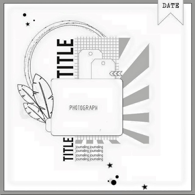
Sunbursts are all the rage but I have a really hard time with them.  But when the sketch this week at Citrus Twist Kits featured a sunburst I thought I would give it a try. 


I thought about what I didn't like on past projects when I tried to use a sunburst and realized that they seemed to look heavy on my layouts.  So I decided to cut my sunburst from vellum


But I didn't like it and I'm not sure why.  My daughter thought it was because I needed more rays...

I set it aside but kept thinking about it and really didn't like it.  Then I remembered some vellum leaves in my stash (The advantage of a big purge is that you remember what you have.)So I lifted the photo block off the original layout and started over.


And I like it so much better!  And it took me about  minutes since I left the photo block intact.

Now I don't recommend frequent do-overs - after all there are so many photos waiting for love.  But once in a while it is definitely worth it!

So am I the only one who starts over?

Thanks for stopping by.....

Monday, December 1, 2014

Tag!

For the first time in more than 20 years, I wasn't hosting Thanksgiving.  So I had some extra time.  So I decided to make some special holiday tags.  (It was the perfect project because I could work easily in small bits of time and finish each tag pretty quickly.)  Plus I made a dent in my never-ending holiday stash. 

I started with 10 plain white shipping tags.  I laid them out on an old piece of cardboard like this.


 I pulled out my favorite multi-media product ever - the gold martha stewart liquid gilding and a foam brush.  (I've learned that foam brushes work really well with this product and, because they are so inexpensive, you can just throw them away when you are done.)


 I painted the tags with the liquid gilding and had 10 shiny gold tags that would serve as the base for my project.  The liquid gilding dries super fast, so I was ready for the fun part in no time.  I pulled out a box of miscellaneous christmas embellishments and started to put together different combinations of paper scraps and embellishments. 

The best part of this project was the ability to create a really different feel for each tag.  Here are some of my favorites.


 I love the vintage feel of this one.  And the soft texture from the scrap of handmade paper that is behind the Santa.  Initially the red twine was not a bold enough finish but when I doubled up, it was perfect.


 These colors are way less traditional, and the effect is much cleaner than the first tag.  I doubled up the twine again here for a stronger impact from the trim.


Tags are also a great way to experiment with different techniques.  I experimented with silkscreen and acrylic paint over the liquic gilding on this tag.  The result wasn't as clean as I wanted, but it still created a fun look.  Tags are a great place to experiment with techniques!


This is my favorite - I had been looking for a chance to use that plaid washi from Freckled Fawn.  And the deer from the Gossamer Blue Get Happy wood veneer is awesome (I used a couple coats of black color shine to color it).  I finished it off with wide red satin ribbon which helped to balance the visual weight from the deer.

And here is a picture of all 10 tags. 


Some of them will end up on gifts and others will end up as part of holiday projects (like my December Daily-ish album).  They were so much fun to make, that I will probably make more - and maybe with the silver liquid gilding.  I've never tried it.

If you have a chance experiment with some tags - they are fun, quick and inexpensive - and a great way to use up bits and pieces in your stash.

Thanks for stopping by.


Saturday, November 29, 2014

Obsessing Over Die Cuts

I love adding layers and little details to my layouts.  So I am thrilled with all of the die cut and ephemera packs that have been coming out with the new collections.  They provide quick and easy layers, can provide places to journal and add details that pull your eye through a layout.  I think thee are die cuts on almost every layout I do these days.

I sort my die cuts by color and store them in Elle Avery envelopes that way.  So most often I mix and match die cuts from different manufacturer's and collections.  But this layout was a layout I made using the November Studio Calico kits.   One of the add-ons included the ephemera pack from the newest Maggie Holmes collection - Open Book.

 
When working with a kit, I usually start with the patterned papers.  I pick 3-5 that I really like together and lay them on the desk.  For this layout I had 3 papers picked - the navy text, the pink dot, and the mossy green chevron.  I had a scrap of the purple Basic Grey paper sitting there from a prior project.

My initial idea was to layer the three papers I'd chosen on the picture.  But I couldn't get it to "work."  Eventually I pulled the layers apart to create a horizontal block across the layout .  I really liked that, but the picture didn't look right (I'd already cropped it with my original concept in mind and I had way to much space on one side of my layout)  

I started by building up the photo block, adding a piece of the purple Basic Grey scrap and another paper from the kit - the white with cork polka dots.  I folded a glassine bag that was used to pack kit embellishments in half under the photo  - this is a great way to add texture and dimension and to reuse packing material.  This gave the photo more weight but I still needed to balance it on the other side of my layout.  

Those die cuts really came to the rescue - I took a smaller piece of the purple scrap on my desk and placed it opposite the picture.  I layered three die cuts to create an element on my layout that balanced the photo.  I added a gold polka dot tag from Pebbles to the cluster and placed a kraft thicker heart from Amy Tangerine on top of the tag.  I used enamel dots to hold the tag string so it looks like the tag is hanging on the layout.


To finish I added another diecut cluster at the top of the page, mixing in antoher one of those kraft thickers and a label from my kit. I love that floral banner


 A shipping tag die cut went under the photo, a phrase label from the kit went on top of the photo and I added one more die cut to create a third element in the large horizontal piece across my layout.  I pulled some old thickers from my stash for the title and created some hand-written journaling strips to finish off the the design.  (I may be the last person in the world to figure this out, but those journaling strips don't have to be white - I used pale blue cardstock and love the softer look.) And of course, every layout needs some ink splatters (I just need to learn to let them dry before I touch them.I used navy color shine from Heidi Swapp here.


Thanks for stopping by today.


Sunday, November 23, 2014

12 Days of Christmas at Papercut Labs

Papercut Labs is hosting a fun holiday event - it is the 12 Days of Christmas Crop and Blog Hop.  They have 12 fun challenges that can be combined for entries for some great prizes.  And I can't resist the chance to win some goodies for my stash, so of course I'm playing along.

My first entry is a layout inspired by the amazing Natalie Elphinstone.  My Studio Calico kit in November included this amazing tree paper.  But I was totally stumped by it.  I couldn't figure out what to do with it.  Then she posted a gorgeous layout at Studio Calico and on instagram using it as her base and I was off.  She mixed patterns and strong colors with the paper for a gorgeous effect.

I had a picture of my 22 year old son standing by a buckeye tree that he picked at a free tree event when he was only 5 or 6.  It was only a twig then, and I love this picture because it captures both that old memory and my life today.  It seemed like the perfect picture of this tree paper.  I mixed it with shades of green, blue, purple and peach (a really different color palette for me).    I added some die cuts (including some amazing vellum leaves from my Studio Calico kit) and a doily.  The doily was too bright when a first tried it, so I turned it over and used the back side which was the perfect pale blue.  Here's what I ended up with.


I used Studio Calico color theory lavender soda ink to stamp on the peach paper and amethyst color shine for the ink splatters.  I also added a few enamel dots and a piece of wood veneer for the finished layout.  And I used some pale blue cardstock from the card kit for my journaling strips.

Don't forget to leave a comment for an entry into the holiday giveaway. 

Thanks for stopping by.