Pages

Sunday, November 30, 2014

Repetitive Stamping

I want to use my stamps and my ink pads.  I have all the Studio Calico Color Theory stamp pads and the colors are gorgeous.  And I get stamps in my kits each month, so my stamp collection is a little out of control.  But I have to admit that using my stamps is not my first instinct.  So I almost never buy a stamp set outside the kits.  I just don't use them enough.

But a few months back, I couldn't resist this stamp set offered at Studio Calico as an add-on to the card kit.  It is called the Circles set by Splendid Finn,

Picture 1 of 4x3" Circles Stamp Set by Splendid Fiins
I couldn't tell you exactly why, but I fell in love.  And it turns out that so far the solid circle is my favorite stamp in the set.  I am a little addicted to using it for repetitive stamping, mixing colors to create custom backgrounds.  Earlier this week I needed a quick retirement card for a friend at work.  I pulled out inks in color theory, blush crush, flamingo, lavender soda and purple rain - and that circle stamp.  I randomly stamped circles in different colors to fill in a piece of white cardstock.


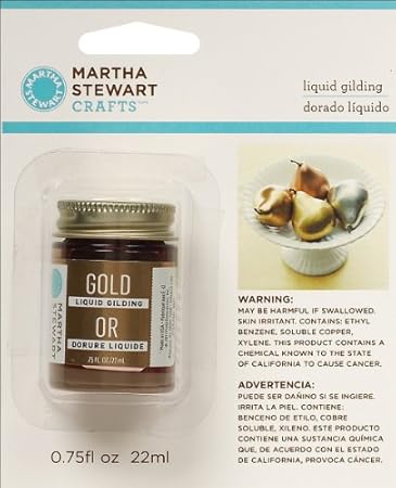
After that it was easy.  I used a Pebbles tag that said celebrate and edged it with gold brilliance ink.  I added gold glitter embossing powder to a wood veneer "m" to create a monogram to make the card more personal and finished with a strip of gold glitter washi from My Minds Eye.  And then just for a little sparkle, I added lots of tiny pink star sequins.  Mitali deserved a lot of sparkle.

I used the same technique to create a quick and easy Christmas card.  This time I used inks in the green and aqua color range - emerald city, lime light, yes peas, mint hint, and glass slipper.


I added a red holiday banner sticker and a gold star from my stash (both from old Studio Calico collections) and I was done.  If I had more of  those banner stickers, I might just mash produce this card.

If you try this, don't forget to stamp multiple times with your stamp before you re-ink.  This creates lots of variety in the colors you het for your circles (or whatever image you stamp.)

Thanks for stopping by.

Saturday, November 29, 2014

Obsessing Over Die Cuts

I love adding layers and little details to my layouts.  So I am thrilled with all of the die cut and ephemera packs that have been coming out with the new collections.  They provide quick and easy layers, can provide places to journal and add details that pull your eye through a layout.  I think thee are die cuts on almost every layout I do these days.

I sort my die cuts by color and store them in Elle Avery envelopes that way.  So most often I mix and match die cuts from different manufacturer's and collections.  But this layout was a layout I made using the November Studio Calico kits.   One of the add-ons included the ephemera pack from the newest Maggie Holmes collection - Open Book.

 
When working with a kit, I usually start with the patterned papers.  I pick 3-5 that I really like together and lay them on the desk.  For this layout I had 3 papers picked - the navy text, the pink dot, and the mossy green chevron.  I had a scrap of the purple Basic Grey paper sitting there from a prior project.

My initial idea was to layer the three papers I'd chosen on the picture.  But I couldn't get it to "work."  Eventually I pulled the layers apart to create a horizontal block across the layout .  I really liked that, but the picture didn't look right (I'd already cropped it with my original concept in mind and I had way to much space on one side of my layout)  

I started by building up the photo block, adding a piece of the purple Basic Grey scrap and another paper from the kit - the white with cork polka dots.  I folded a glassine bag that was used to pack kit embellishments in half under the photo  - this is a great way to add texture and dimension and to reuse packing material.  This gave the photo more weight but I still needed to balance it on the other side of my layout.  

Those die cuts really came to the rescue - I took a smaller piece of the purple scrap on my desk and placed it opposite the picture.  I layered three die cuts to create an element on my layout that balanced the photo.  I added a gold polka dot tag from Pebbles to the cluster and placed a kraft thicker heart from Amy Tangerine on top of the tag.  I used enamel dots to hold the tag string so it looks like the tag is hanging on the layout.


To finish I added another diecut cluster at the top of the page, mixing in antoher one of those kraft thickers and a label from my kit. I love that floral banner


 A shipping tag die cut went under the photo, a phrase label from the kit went on top of the photo and I added one more die cut to create a third element in the large horizontal piece across my layout.  I pulled some old thickers from my stash for the title and created some hand-written journaling strips to finish off the the design.  (I may be the last person in the world to figure this out, but those journaling strips don't have to be white - I used pale blue cardstock and love the softer look.) And of course, every layout needs some ink splatters (I just need to learn to let them dry before I touch them.I used navy color shine from Heidi Swapp here.


Thanks for stopping by today.


Friday, November 28, 2014

Leather Feathers and Old Photos

I am more than a little addicted to my Studio Calico kits - I get super excited for sneaks, presale and getting that box each month.  One of the biggest reasons is that those kits often push me in new directions.  For example, I am pretty sure I never would have tried doilies or sequins without those kits - and now those are crafting staples.  Same goes for shipping tags.

But this month was really out there.

When sneaks came out, the Concord add-on was super expensive.  And I already had most of the papers.  I did love the Amy Tangerine kraft thickers and I really liked the stamp set, but I still wasn't sold.  But at reveal there were two items that sold me.  The first was the wood veneer world mask.  And I will admit that I'm hoarding that, waiting for the perfect photo and layout.  The second was the leather feathers.  I was fascinated by the idea.  I was pretty sure I wouldn't be able to figure out how to use them, but still couldn't resist.  That kit went right in my cart.

Picture 1 of Concord

And when it came it was beautiful - and I loved the leather feathers -- and I had no idea what  I was going to do with them.  Until Tuesday night.

My son was driving through the night with friends to come home from college in South Carolina for Thanksgiving.  I knew I wouldn't sleep (that mom worry gene)  and was hanging out in my scrap room.  And old picture of Nicholas (he's about 1 in the photo) caught my eye and I decided to pull together a layout to help pass the time.

I started with this week's sketch at Studio Calico.  I loved all the horizontal lines (and am now thinking about trying a vertical version).


I pulled out some papers from my kit and got to work.  As the layout came together I kept thinking about those 3 leather feathers.  They seemed like the perfect finishing touches for this layout.  So before I knew it, the first one was highlighting the journaling.


The second one found its way onto the layout too - it accents the photo block.  And the third and largest feather created the final horizontal element on the layout.


But I was out of feathers and felt like I needed something at the top of the page.  I pulled a wood veneer heart that said love from my stash, colored it with navy colorshine  and added it with a paper strip.


And then the layout was finished


 - and Nicholas pulled in the driveway about 30 minutes later.

Think about scrapping some of those old photos.  Its so much fun to play with those memories.  And it helps remind us of why we love scrapbooking so much!

Thanks for stopping by!

Thursday, November 27, 2014

December Daily-ish - Finally Starting

 Happy Thanksgiving!!!!

Now that I've bored you silly all week with talking about how I picked supplies and how I am storing my supplies, I am finally going to share a page.  I chose a page protector with 12 2x2 pockets for my title page.  I wanted to be able to do something fun and use a variety of supplies to set the tone for the project. 


I started by cutting 5 2x2 pieces of paper and used the oversize gold alphas from Pebbles to add the letters in the word "merry."  Then I started to pull embellishments to the different pockets.  Here are some highlights:

  • The gold glitter tag is also from Pebbles.  I added the year with some small alphas for a custom look.  It is stapled into the pocket.  I left the string sticking out the top for now.  I am thinking I might have some other ribbons sticking out by the time the album is done, but if I don't I will trim the twine later.  And I glued a snowflake wood veneer on the back of the tag so it's pretty on the back side of the page too.
  • Those puffy gold stars are scraps from trim that came in an old Studio Calico kit.  They are stapled into place also.
  • That black plastic strip that says "celebrate" came in the November Studio Calico card kit.  I used adhesive to attach it to the top of the page protector.  And I put a corresponding piece that says grateful on the other side of the page protector in the same place.  Since Thanksgiving will be on the other side of  this, it should work perfectly.
  • The sequins are from my stash.  I started with some of the red stars from Studio Calico - one of the embellishments I chose for my kit -- and added others from my stash.  I mixed sizes and colors.  And since I don't have a sewing machine, I used glossy accents to glue the pocket closed.
  • The chipboard frame is from Crate Paper and the little wood heart is from the Atlantic collection by Studio Calico.  They are both attached to a small transparency square that slides in the pocket.  And another frame and another heart are attached to the back side.
  • The wood veneer star is just floating in the pocket for now.  If it doesn't want to stay in I will staple it, but for now it works.
  • The last square is a piece of white card stock that I covered with different washi tapes placed randomly.  The tape with words is holiday masking tape that came in one of the November scrapbook add ons from Studio Calico.
The back side of the page serves as a foundation page for Thanksgiving.  I will use patterned paper and small photos in the pockets that don't hold embellishments.


 I think I will use a full 6x8 page protector on the page opposite. 

Don't forget to leave a comment for an entry into my holiday themed giveaway.  This is the last day to enter.

Thanks for stopping by.


Wednesday, November 26, 2014

December Daily-ish - Getting Organized

So now that I've pulled all that pretty paper and all the fun embellishments out, I need a way to store them.  I know lots of people use pretty trays with little bowls and I love that idea.  But the only place I would have to leave the tray is on my desk and this isn't the only project I will work on over the next month or two.  And I love the idea of using muffin tins - vintage or new - to sort embellishments.  But again - where am I keeping the muffin ins?

So I needed a solution that would allow me to put the project away when I wasn't working on it.  I looked at an empty iris box in the basement, but it wasn't big enough and I wasn't sure how I would keep the supplies organized.  And, to be honest, I am always looking for an excuse to by organizing stuff.  So off to Michaels I went. 

I found an Iris box that is twice as deep as the standard boxes I already have.  I liked that because I could close it up and put the box away.  And with the extra depth, I was pretty sure I could fit all my supplies.  But I still wanted to be able to sort embellishments.  So I was super excited to find a tray with adjustable dividers that fit in the iris box.  And storage was on sale and I had a coupon for 25% off my total purchase.  Those suckers were coming home with me. 

The bottom of the box holds my papers and large embellishments.  I also put in the container of leftover paint from my cover.  I can dig through those supplies easily and everything goes right back in.


I even used a box from a Studio Calico project life kit in the bottom of the box.  It holds the project life cards I pulled out and is easy to dig through.  And I don't have to worry about the cards scattering all over the box.


The tray fits on top of the supplies in the bottom of the box.  I used the adjustable dividers to create the compartments that fit my supplies.  I even divided up the die cuts so that vellum, acetate, and traditional die cuts so I can find what I want quickly. 


When I'm not working on the album, I close up the box and put it away.  And if I do want to go somewhere else to work on my album with friends, I can grab the box and go.  It's not as pretty as those trays with bowls, but it fits my needs perfectly.

Oh you may have noticed that the album itself doesn't fit in the box.  I put all the page protectors in the album and keep it on my desk.  I like to stand it up so that the cover is a little bit like having a decoration on my scrap desk.

Don't forget to leave a comment for an entry into the holiday themed giveaway.  And thanks for stopping by.

Tuesday, November 25, 2014

December Daily-ish - Embellishments.

Yesterday I talked a lot about the paper choices I made for my album.  Today I'm talking about embellishments .  As I thought about embellishments, I came up with the following principles to help choose embellishments:
  • I wanted a mix of holiday and non-holiday themed embellishments
  • I wanted a mix of textures and colors
  • I didn't want to end up with a lot of things to put away when the project was done.
Again I looked at the different kits out there to see what appealed to me.  For instance I love seeing holiday words in script form so I was excited to find some heidi swapp holiday word stickers in my stash.  And I may well buy some cut files so I can play with this look more.

I also realized that I am going to work on my album here at home most if not all the time.  And my scrap room organization is about having things where I can see them since I use what I see.  But my holiday embellishments are stored in two Iris boxes and are hard to dig through.  So I decided to focus on pulling holiday embellishments and adding reminders of non-holiday themed embellishments to my kit rather than pulling everything I might want to use.  (Remember - I don't want a lot to put away at the end of the project.)

So here is a photo that gives you a feel for the embellishment mix I've chosen.


 Here are the items I've chosen:
  • die cuts - a mix of traditional, vellum, and acetate pieces so I can add a variety of textures
  • rub-ons - I love using rub-ons lately, especially directly on a photo since I don't have access to photoshop.  Those gold star rub-ons were from Chic Tags last Christmas
  • bags, pockets, folders and envelopes - perfect for creating inserts to hold journaling and memorabilia
  • trim - I pulled a mix of ribbons and twine
  • tags - love those gold glitter tags from Pebbles
  • flair - a mix of traditional flair, cameos from Webster's Pages that were in my stash and those Glitz giant gems.
  • washi tape - a variety of colors, widths, and textures
  • wood veneer - both painted (from Basic Grey's 25th and Pine collection) and unfinished
  • frames - I love frames in pockets, on inserts and on top of page protectors.  They are a great way to add dimension.  I have a mix including Crate paper, Studio Calico and My Minds Eye
  • That fabric tag from an old Basic Grey collection was in my stash.  I added it specifically for the texture.
  • Stickers
  • Enamel dots (I found those gold and silver ones from Teresa Collins at JoAnns but have easy access to lots of colors and sizes)
  • sequins - the stars from Studio Calico's Magical collection are in my kit, but again, lots of colors and sizes are in easy reach
  • stickers - these are from the 25 days class kit but I have other holiday themed stickers in my kit also
  • buttons - the holiday themed ones are from Fancy Pants, but my button bowl is right by my desk.
And of course, every album needs some alphas.  I pulled a few I was pretty sure I would use, but will likely go to my stash also.  And I did by the Gossamer Blue plaid alphas just for this project.  Swoon.


And while I am not much of a stamper, I am really working to use my stamps more.  So I pulled my holiday themed stamps out to store with my kit.  Some of these are from the November Studio Calico kits also.


And finally I went through my stash of project life style cards and pulled some that fit with my colors that I thought I might use.  (Since I store my cards by color this was pretty quick to do.)


So by now you should be sick of hearing about my kit.  But just in case you are still interested, I will share a bit about kit organization tomorrow.

Don't forget to leave a comment for an entry into my holiday giveaway.

Thanks for stopping by.

Monday, November 24, 2014

December Daily-ish - Choosing Paper (and a winner)

I've got it together now - I took my December Daily kit pictures over the weekend (when I had daylight), so we are good to go!  As I mentioned before, I am starting my album with Thanksgiving, since that kicks off our holiday season, and I am not worried about documenting every day. (Somedays it is about work, school and sleep at my house - even in December.)  Instead I am focused on capturing our holidays whenever they happen. 

Today I am  talking about paper.  I choose my color palette at the start of this project - if you've forgotten it is a light blue, soft red, black, lime green and pink.  To me it's a modern take on
traditional holiday colors.


So I knew those were the colors that I wanted in my paper choices.  And I've noticed that I am using paper that is not holiday themed for my traditional Christmas layouts more often than not.  But I love Christmas supplies, so I have quite a stash.  So I decided to mix holiday and non holiday papers for this project.  And I looked at the paper choices in the different December Daily kits to get a sense of what the experts chose and what appealed to me the most.  Here are my primary paper choices.


I tried to get a balanced assortment of the different colors in my palette, plus some prints.  I cut them all down to 6x8 sheets (the largest I will use in my snap album).  Many of the choices came from my scrap files.  But in most cases I also ended up with a 4x6 piece that I am also keeping with my kit.

 I know I am going to use gold as an accent through my album.  So I also wanted to choose some papers that added gold.  I love these papers because they bring a mix of textures to the project.  These are also cut down to 6x8.  My favorite might just be the gold glitter stripes from Pebbles.


And then there are some sheets of paper designed to be cut apart into project life style cards.  I left these whole for now since I wasn't sure how I would use them at this part.  But they are a huge value when working on a mini album.  Most of these are from this year's Websters Pages holiday collections (one of my only holiday themed purchases this year), but I've been hoarding that sheet from Studio Calico.


And finally some vellum (I love vellum!!!) - These sheets are from Webster's Pages also.  I've left them whole and will cut them apart when I know where and how I am using them.  That glitter vellum is amazing and that pieces that says "New Year" might just end my album. And while I haven't pulled any for my kit, I have some of the Brighton Pier gold star vellum in my stash and it might just find its way into this album. 


Sorry this got so long, but paper is near and dear to my heart.  Don't forget to leave a comment today for an entry into my holiday themed giveaway


Finally a winner

I almost forgot to pick a winner for the blog rebirth giveaway.  Sorry about that!  But this morning I put names in a hat and let my husband pick.  And he picked:

I follow your blog through an app called feedly. So it may not show up on your list of followers, but I am following!!!

Rebecca - please send me your mailing info so I can get this out to you! If I don't hear from you, I will pick a new winner on December 1st.

Thanks for stopping by. 

Sunday, November 23, 2014

12 Days of Christmas at Papercut Labs

Papercut Labs is hosting a fun holiday event - it is the 12 Days of Christmas Crop and Blog Hop.  They have 12 fun challenges that can be combined for entries for some great prizes.  And I can't resist the chance to win some goodies for my stash, so of course I'm playing along.

My first entry is a layout inspired by the amazing Natalie Elphinstone.  My Studio Calico kit in November included this amazing tree paper.  But I was totally stumped by it.  I couldn't figure out what to do with it.  Then she posted a gorgeous layout at Studio Calico and on instagram using it as her base and I was off.  She mixed patterns and strong colors with the paper for a gorgeous effect.

I had a picture of my 22 year old son standing by a buckeye tree that he picked at a free tree event when he was only 5 or 6.  It was only a twig then, and I love this picture because it captures both that old memory and my life today.  It seemed like the perfect picture of this tree paper.  I mixed it with shades of green, blue, purple and peach (a really different color palette for me).    I added some die cuts (including some amazing vellum leaves from my Studio Calico kit) and a doily.  The doily was too bright when a first tried it, so I turned it over and used the back side which was the perfect pale blue.  Here's what I ended up with.


I used Studio Calico color theory lavender soda ink to stamp on the peach paper and amethyst color shine for the ink splatters.  I also added a few enamel dots and a piece of wood veneer for the finished layout.  And I used some pale blue cardstock from the card kit for my journaling strips.

Don't forget to leave a comment for an entry into the holiday giveaway. 

Thanks for stopping by.

Saturday, November 22, 2014

Frustrated .... But Regrouping (and some quick card ideas)

I was - and still am - super excited about blogging again.  But this week was really frustrating.  I had a plan for a series of posts about my December Daily(ish) album this year, and was ready to go.  But winter came early to Ohio and I remembered the challenges it brought.  It is impossible to get good photos of projects and supplies on dreary winter days if before and after work.  So those blog posts ground to a halt.  I apologize. 

But now I've learned and I'm getting back on track.  I will just need to make sure photos happen on the weekend when I have daylight.  Those blog posts are coming this week.  And I am going to extend my December Daily(ish) giveaway til midnight on Thanksgiving.  All  comments on blog posts through Thanksgiving will go into the hat. 

In the meantime, I thought I share a tip for quick and easy cards.  I love to use project life style cards when I need a quick card.  Someone has already thought hard about design -- I might as well take advantage of that expertise.  Here are some examples.


The striped card here established the color scheme and made the rest of the design quick to pull together.


The "Hello Sunshine" Card added the sentiment and set the tone for the card.  A few simple layers and I was done!
 

The kraft card here created a fun, casual feel.  All it needed was some patterned paper and some sparkly star sequins to create a festive Christmas card.  (And  the star sequins behind and on top of the vellum added lots of dimension without lots of work or supplies.)

So use up those project life cards - or look at the cut apart patterned papers as a quick way to make custom holiday cards this year. 

Thanks for stopping by.  Remember that the December Daily giveaway has been extended til Thanksgiving so don't forget to comment.  All comments on that post and all the posts til Thanksgiving are entries into the drawing.

Thanks for stopping by!

Tuesday, November 18, 2014

A Handbook Diary

 Note:  Today's post was supposed to be about paper choices for my December Daily, but the photos I took over the dreary November weekend don't really show the colors accurately, so I am putting that off til I can get some better pictures.  But don't forget the December Daily GiveawayComments all week enter you into the giveaway.

I failed project life - in fact I didn't even make it a month.  But I am more than a little fascinated with the idea of pocket scrapbooking as a way to keep a record of everyday life.  And I love the Studio Calico handbooks.  So I decided to start a handbook as my personal album. I feel like I am at a turning point in my personal growth, and I wanted a place to document me and my life.


The things I put in my handbook might be about me - like my favorite flower


And they might be about things happening in my life or things I'm feeling


And they might be about things happening with people I love that are important to how I feel about my life.


There are no rules for my handbook.  I do what I want when I want to do it.  I experiment with different techniques sometimes and at other times I do something super quick and easy.  Sometimes the photos in my handbook also show up in layouts for my family albums or my kid's albums.  But when you look through the album you get a picture of the things in my life that were important to me at the time.   It is really turning out to be the perfect way for me to keep a diary. 

My first handbook is almost full.  And I can't wait to start another one.  But I am sure there are other fun ways to use those albums and I'd love it if you would share your ideas.


Monday, November 17, 2014

December Daily - To Do or Not To Do ....and a Giveaway

 Holiday giveaway is extended til midnight on Thanksgiving!  Keep commenting on my daily blog posts for extra entries.

I love the idea of a December Daily album.  But I tried it once, made all my pages and never printed any pictures.  Plus I chose a 6x6 size and used so many layers and embellishments that it didn't come close to closing - even without those photos.  But it was beautiful and it was fun to do.

So at the beginning of the month, I waffled back and forth about the project.  I signed up for the 25 Days class at Studio Calico, but still wasn't sure.  We just don't do fun holiday things that I would put in an album everyday.  But then I realized - it doesn't have to be a December daily to be a special holiday album.  So I am approaching the project as an album to document our 2014 holidays.  I am starting with Thanksgiving and ending with the new year.  And there won't be pictures and/or journaling everyday. 

I looked at all the kits out there - Ali Edwards, Gossamer Blue, and Freckled Fawn to name a few.  Then My Scraps and More put out both an album kit and an embellishment kit.  All of these kits seemed to be a good value, but some of them required a pretty big investment.  And I didn't love every single thing about any of them.  And I have a lot of supplies.  So if I am going to do this, it is going to be with a homegrown kit.

In my first attempt I learned that choosing an album was critical to the project's success.  I knew I wanted a 6x8 album, but which one.  I ultimately chose a kraft Snap album with a black spine.  The size and price were good, it was neutral and easily customizable, there is a large variety of page protectors and it was readily accessible. I got mine at JoAnns.


 Black Snap Binder, 6"x8" - Simple Stories


But what about the kit.  I started with choosing a color palette by pulling out my cardstock and pulling sheets til I had colors I like.  I had done some Christmas layouts lately and think those color choices influenced the colors I chose for my album.. I ended up with pale blue, soft red, lime green, black and pink.


Once I had my color palette, I couldn't wait to get started with the cover.  I knew I wanted to paint it, a pale blue but couldn't find a color that was just what I wanted.  So I mixed a blue, a mint, and white paint til I got just the color I wanted.  I also pulled out my gesso and the Martha Stewart liquid gilding in gold for my cover.


I started by taping off the black fabric spine with washi tape - I'm a messy crafter.  Then I primed the album inside and out with gesso.  I painted the inside with the gold liquid gilding and a foam brush.  aIt looks amazing.  It is shiny and smooth and will provide a perfect backdrop to all my pages. (This picture doesn't really do it justice.)


Then I took on the outside of the cover.  I painted it with the pale blue paint color I had mixed and a foam brush.  I used just one coat because I really like the look (hint - I used an extra piece of chipboard and treated it just like the album cover - that way I could see how it would look with a second coat of blue paint.


The wood veneer tree was from Elle's Studio last year.  The red sequin star is from the Studio Calico Magical sequin pack.  And then a wide line green grosgrain ribbon tied in a bow finished off my cover.

I loved the end result.  It reflects the colors and feel of the products I chose for my kit.  (I'm still thinking about adding the year to the bottom branch of the tree>

Giveway:  While I was making my December Daily kit, I pulled some things that might fit right in with your holiday crafting plans.  Leave a comment on any post this week and be entered to win.  Giveaway closes at midnight on November 23rd.

Here are some of the goodies I pulled.  (This isn't a kit - its an assortment of holiday themed supplies that might fit in with your Christmas supplies,)

I'd love to know what ideas you have for adding the year to my cover - or if you think I should stop where it is.  (I know I will put the year on the spine.)

I'm going to share more about my December Daily kit building and organization later this week.  Hope you stop back. 

Sunday, November 16, 2014

Illustrated Faith


My intention is to focus this blog on creating.  But sometimes other parts of my life will creep in to provide context for some of the creative attempts I share.  This is one of those days.  I hope you don''t mind.  (Some of you might have read this in the facebook bible journaling group.)

I've never had a very strong or specific faith.  I was raised in the Catholic church and have always believed generally.  But my husband, second son and daughter have always had much stronger, more committed spiritual lives.  So when I was first exposed to the concept of bible journaling on Shanna Noel's blog (she is amazing!), I was surprised that I was so drawn to the concept.  I told my husband and daughter I wanted to try it.  But they were appalled - to both of them it seemed disrespectful and like an excuse to spend more time in my scraproom.  So I let it drop.

But the idea stayed in the back of my mind.  And one Sunday evening when we attended mass at an older church I was captivated by the colors coming in the stained glass windows.  I felt like God was telling me that using my creative side to explore my faith was the path that would work for me.  So I told my husband and daughter that I hoped they would understand, but I was going to explore bible journaling.  I was stunned when they pulled out a bible they had bought me for just that purpose.

My 14 year old daughter told me that she had come to the conclusion that anything that led me to reading the bible was ok.  Out of the mouths of babes . . . . .


So I've begun exploring the bible.  Sometimes I read the church reading for the day, sometimes I am inspired by a prompt from Shanna Noel and sometimes I open the bible at random and read.  Then, if I am inspired, I travel into my craft room and go at it with stickers, stamps, ink, shipping tags, you name it.  Over time I hope my bible is full of color and joy. 


Thanks for stopping by and letting me share.

Saturday, November 15, 2014

Scraps!

No doubt about it - pretty patterned paper is one of my weaknesses.  I probably have more patterned paper, carefully sorted by color and pattern, than I can use in my lifetime.  And there is no question - I continue to fall in love with no collections and add more paper to my stash.

But I hoard my paper.  I hate throwing even small scraps away.  And those scraps go into hanging files, sorted by color and pattern.  I use them as layering pieces sometimes.  And if they are big enough pieces, I use them for cards.  Or I go there when I think a project needs just a splash of a certain color.

But last week one of the challenges during the pinspiration crop at My Scraps and More was to create a layout inspired by a picture of a rubik's cube.  And I challenged my self to use only scraps (other than the layout base).  And of course embellishments were fair game.

So I pulled scraps of 9 different papers - I chose different colors and patterns.  And then I cut 3 inch squares and arranged them in a simple grid pattern.  Once I liked the arrangement, the adhesive came out and I created the base for this layout.


I layered on 3 3x3 photos with a white border from Persnickety Prints and went to town with the embellishments.  The Heidi Swapp color magic die cuts worked really well because I could use my inks to get just the color I wanted.  I also added stickers, paper scraps, enamel dots and buttons.  And of course, a layout is almost never done til there are ink splatters.

 So use those scraps and link me up to your projects.  I could use some new ideas.

Giveaway alert:  Don't forget the blog rebirth giveaway.  There are only a couple more days to enter.

Have a great Saturday.  Thanks for stopping by.

Friday, November 14, 2014

An Unlikely Favorite

I am really a pretty simple scrapper.  I love the look of all the mixed media techniques, and even have acquired some of the supplies.  But I really don't play with them very often - I either worry about ruining a project or am unhappy with the results.  Let's face it - ink splatters were a big achievement for me.

So boy was I surprised when one my mixed media purchases turned into one of my scrap room favorites.  Its the Martha Stewart Gold Liquid Gilding.

Martha Stewart 32214 0.75-Ounce Liquid Gilding, Gold 

It is super shiny and dries super fast.  And it makes a huge impact whether you use it in a subtle way... 

Use it with a paint brush to emphasize embossing (see the wood tape in this layout) 

make really unique ink splatters like these where the gold separated from the solvent 
 .....or in a big way

painting a large piece of wood veneer for quick and easy title


stamp with a cork on a transparency for a one of a kind background
I do have a couple of cautions - you need to use it in a well ventilated space and I have ruined more than one paint brush.  So now I have a couple I keep for just this product.  (At my husband's suggestion, I use windex to clean them and it works pretty well, but I think I need to buy some brush cleaner at the craft store).  Or, depending on the project, I use a foam brush and throw it away after I'm done.

And wait til you see my December Daily cover next week - I am so excited to share it.  

Now I have to go shopping - I just found out this product comes in a copper finish - I think I might just need that.

Giveaway Alert:  There are still a couple days left in my blog rebirth giveaway.

Thanks for stopping by!