Pages

Showing posts with label pretty little studio. Show all posts

Tuesday, September 29, 2015

Brimfield Is My Favorite

It's no secret - I haven't loved the Studio Calico kits lately.  Far Far Away (back in January I think) was really pretty though there were pieces I struggled with and I really enjoyed Lisse Street (maybe March or April), but the rest of the kits have been challenging for me to use or just totally not my thing.  But Brimfield is a home run!  (Yes I still think the kit should have some more stuff for the price, but it was beautiful and fun to use.) The papers are gorgeous - beautiful color and patterns that are classic and versatile.  It felt like the kits that inspired me to become a subscriber three years ago.
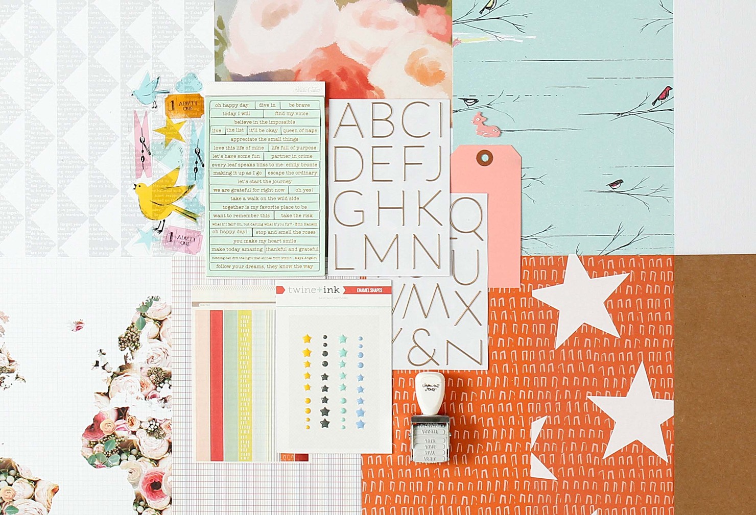

Which made me think - what really makes me love a kit - it's not the stamp (in fact I sold the stamp in this kit.)  I think it is versatility - I made five layouts with the goodies in my September box before I broke it up into my stash.  And I when I look at them they all look unique.

Four of the layouts were in prior blog posts - one is soft and romantic, one features a train and has a little bit of a vintage feel, one is super bright and fun, and the fourth one features soft colors and feels classic.  And the fifth one (at least to me) captures a sense of contentment, mixing bright colors with pastels.

inspired by sketch at Citrus Twist kits
So I'm putting away Brimfield after five layouts - but it was a good one!  (That star transparency is going to end up in a December Daily) In fact if it goes on sale down the road, I will be trying to nab another one.

Thanks for stopping by.

Saturday, August 29, 2015

3 To Inspire

Every Saturday Citrus Twist Twist Kits posts a "3 To Inspire" challenge.  The DT member leading the challenge gives you three prompts that you use together to create a single layout. Last Saturday the prompts were:

1. Create with at least 5 squares. 

2. Use medium (mist, ink, gesso).

3. Layered stickers.
 
So here is what I came up with
 
 
Use 5 squares - I used 4 squares of patterned paper, a square photo and a large square of plain vellum.
 
Use a medium - This was a bit out of my comfort zone.  I used gesso with a mask on that square of plain vellum to create texture behind my photo.  I absolutely loved how this turned out and will repeat the process on other projects.  I also used the gesso and mask to add interest on both sides of the page with the gold crosses.  I also added blue, green and gold ink spatters.
 
Layered stickers - I layered stickers from the Crate Paper Journey collection to create the bottom element in my grid design.  
 
This is one of my favorite layouts in a long time.  I can't wait to see today's challenge.
 
Thanks for stopping by.

Tuesday, June 9, 2015

Mixing Metallics

Metallics are a huge trend in scrapbooking right now.  And I'm all in - I love the shine and/or glitter they add to my projects.  But I've always used one metallic on a project - silver, rose gold, gold, bronze or copper.  I don't mix metallic when I am picking jewelry so why would I mix them on a scrapbook project?

But the challenge this week at Studio Calico was to pull together a simple project with new (to you) colors.  So I challenged myself to mix metallics.  (And as a bonus, my simple layout design was based on the Sunday sketch.)

Saturday my daughter printed some pictures from her freshman year of high school from her phone and gave them to me to scrapbook for her album.  Those photos are a gift since candids with friends are hard to come by when they are in high school.  And one of those photos were of a friend - Christian - she talked about all year long.  I am super excited to be able to incude that relationship in her album.

I had a tag from the Pink Paislee Atlas collection (LOVE!) sitting on my desk that started my design.  Then I pulled some scraps of my favorite papers from the Carolina Moon kit that happened to coordinate perfectly with the tag.  In the spirit of keeping it simple, I didn't trim a single piece of paper or mat my picture.  I just laayered the paper strips and tags one either side of hte picture.


The tag had silver accents and I attached a Heidi Swapp charm to the twine running through the tag to add  different element.  And I added some other little emebellishments, including copper hearts  (from the Galileo project life kit) and arrows (from Pretty Little Studio).  Silver stars and dots from the Bottle Toss project life add on last night added more shine.  And that big white acrylic word created a great title without weighing down the whole layout.  I really like the white on white.

I have to admit to linking the mix of copper and silver here.  Maybe I should try mixing metallics when I wear jewelry too?

Thanks for stopping by.