Pages

Thursday, July 30, 2015

Do Over

There aren't too many times when we really get do overs but scrapbooking is one of those places where it is totally possible.  I try not to do it too often but sometimes I just really don't like my end product.  This was one of those days.

Sunbursts are all the rage but I have a really hard time with them.  But when the sketch this week at Citrus Twist Kits featured a sunburst I thought I would give it a try. 


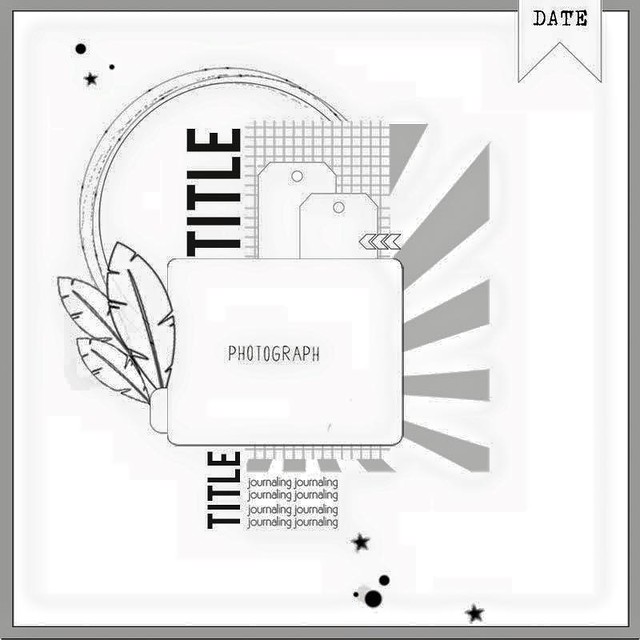
I thought about what I didn't like on past projects when I tried to use a sunburst and realized that they seemed to look heavy on my layouts.  So I decided to cut my sunburst from vellum


But I didn't like it and I'm not sure why.  My daughter thought it was because I needed more rays...

I set it aside but kept thinking about it and really didn't like it.  Then I remembered some vellum leaves in my stash (The advantage of a big purge is that you remember what you have.)So I lifted the photo block off the original layout and started over.


And I like it so much better!  And it took me about  minutes since I left the photo block intact.

Now I don't recommend frequent do-overs - after all there are so many photos waiting for love.  But once in a while it is definitely worth it!

So am I the only one who starts over?

Thanks for stopping by.....

Tuesday, July 28, 2015

Quick and Easy

I spent last Thursday - all day - cleaning up my craft room.  My daughter (who is only 15) could be a professional organizer. She helped me empty it out, sort through baskets, purge, and put it back together.  Late that night I had a clean space and was ready to play.  But after 1 quick layout, we went out of town. 

And when we came back I had to do something about the purge piles in the living room.  So it wasn't til last night that I had a chance to play again in my clean space.  I pulled together a quick layout using the newest sketch at Stuck!


I started with my July goodies from Citrus Twist (which currently hold the place of honor in the top of my Raskog).  I added a few scraps from my stash and couldn't resist the sevenpaper puffy hearts. 

Some gold ink splatters and I was done.  I'm hoping to play some more this week, but have a feeling my scrap time is limited until the weekend. 

Hope you are finding time to play.  Thanks for stopping by.

Friday, July 24, 2015

Mixing Textures

I think a lot about mixing colors and patterns on my layouts.  But I don't think about texture very often at all.  But the truth is that texture is just as important.  And my July box from Citrus Twist Kits provided the inspiration to use texture as a focus in choosing elements for my newest layout.

I started with a great piece of woodgrain paper.  The main kit included a fun piece of fabric that I would never have thought to use on a layout.  But it served as the perfect base for my photo block.  It added depth and interest that paper just wouldn't have brought to the table.

Design inspired by sketch at Citrus Twist kits
The embellishment kit included denim stickers which sounded a little strange but I love.  And they added another textural element.  Shiny gold chipboard contrasted with the fabrics and woodgrain for added interest.  And it just so happens that I had added some cork stickers to my box that worked perfectly with my project. Enamel dots, wood buttons, flair and acrylic shapes all added more texture and interest.  And of course I don't seem to be able to finish a layout without ink splatters.  But this time I used navy colorshine instead of gold, white or black.

Hope you have a great weekend.  We are headed to my hometown.

Thanks for stopping by.

Monday, July 20, 2015

Kit Review: Paper Camellia

Prior Reviews
 
Happy Monday!  We had a crazy weekend with some unexpected tasks, so I'm a little bit late today.  But  I wanted to share the next installment in my kit review series.  This week I played with the April kit from Paper Camellia.


I wasn't familiar with this kit club at all so I didn't know what to expect when I ordered a kit.  But it was packed with a mix of Maggie Holmes, Crate Paper and My Minds Eye.  The soft color palette was perfect for a photo of the bowl of Lake Erie beach glass and pebbles I keep on my desk at work.  

The kit included a 3 sheets of cardstock, 5sheets of patterned paper and a ton of embellishments.  I  tend to love any kit that comes with a full package of die cuts and that Maggie Holmes confetti pack was on my wish list.  The kit did not include a stamp.  

My only complaint about the kit would be the lack of a larger scale alpha.  It had several small My Mind's Eye alphas (the mixed color alpha you see in the photo and several tile style alphas), but I love thickers and alphas of a similar scale. And the Maggie Homes thicker pack provided lots of choices for putting together a title to a layout.

I was really inspired by a layout by the wonderful Danielle de Kronik which just happed to be the Sunday Scraplift challenge at Paper Issues this week.  So here is my finished product.


I especially loved all the gold accents in this kit.  They provided lots of textures that helped keep the soft color palette interesting.  (The enamel dots and hearts were from my stash.)

Paper Camellia kits are $29.95 for subscribers.  Shipping in the United States is $8. The website says you can cancel at any time.  But if you cancel after the 20th, you will receive the next month's kit.  It seems like a super manageable commitment and the kit was a great value.  I've been checking out their website and the past kits all look really lovely.  They offer a variety of add-ons each month too and have a project life style kit as well.  This is definitely on my list of kit clubs to keep an eye on.  

I still have kits from Studio Calico and Scraptastic sitting in my scrap room and a Cocoa Daisy kit is on its way.  I am still thinking about trying to snag kits from Clique Kits and Gossamer Blue to add also.  Let me know if there is another kit that you think I should check out.

Enjoy your evening.  Thanks for stopping by.


Saturday, July 18, 2015

#Look - and a challenge (and a prize)

I haven't been scrapping as much lately and I certainly haven't been spending my 30 minutes a day in my scrap room.  But for the last couple of days I have been thinking about scrapbooking and what it means to me.

While I scrapbooked (is that a word?) on and off starting in high school, I got serious when my children were little.  I've been playing with paper pretty seriously for more than fifteen years now.  Somewhere along the line, almost all the pictures from my childhood got lost or thrown away.  It was important to me that I preserved those memories for my children so that the same thing didn't happen to them.

When I started scrapbooking it was all about the event and big moments in their lives - birthdays, holidays, the big game, the first day of school.....But over time, and especially in the last few years, my focus has shifted to more of the moments and things that make up everyday.  And the act of creating became way more important to me.  In fact, I know - and my family knows - I am a much happier person if I find at least 30 minutes to create every day.

That focus on the everyday little things is the biggest gift I have received from scrapbooking.  It makes me much more aware of the world I live in and helps me look at things differently.  So last night I decided to try and capture that in a layout.

I found a black and white photo of a tree trunk in box of random photos.  I took it during the Snapshot class at Studio Calico last September.  I think the prompt was "Texture."


I used a grid design that allowed me to use a lot of small details that seem unrelated but really went with my theme.  Plus it was a great way to use up lots of bits sitting on my desk. I really like all the bright papers and embellishments with the black and white photo too!

So I am going to focus on the things I love about scrapbooking and hope my urge to create comes roaring back.  In the meantime, I am going to try to remember to look at the everyday things. I thought maybe you all could help me too.  So here's the challenge:

Pay attention to the things you see everyday (you probably already do this if you are a scrapbooker).  Take a photo, make a layout and link me up.  I will pick one person at random to receive a $10 gift certificate at their choice of Paper Issues, Studio Calico, Citrus Twist or My Scraps and More.  All entries have to be posted by August 1 at midnight. Your layout should be a new project.

I can't wait to see what you come up with.  And I can't wait to be inspired by you.

Thanks for stopping by. 


Wednesday, July 15, 2015

Splash!

I love to use a sketch as a starting point.  But recently I realized that the way I use sketches has really changed.  I used to print the sketch and try to duplicate the design.  Now I tend to look at the sketch and then go to my desk and get to work.  This way I find that I pull some key elements that stand out to me and create (sort of) my own design. 

The sketch Citrus Twist kits published on Sunday is a great example. 


When I look at this sketch I focus on the square and rectangular elements layered down the page, the tag ('cause I love tags) and the cluster at the top corner.  So I used the June Citrus Twist kits and came up with this.


My design cascaded on a more horizontal or diagonal path when I was done.  And I used one photo instead of three. It turned into my own design inspired by that sketch. And one of my favorite parts is the mix of sparkly stars, sequins, and puffy dots with gold and white ink splatters. 

I attached the sequins using a fun technique I learned on someone else's blog a couple of years ago.  Instead of attaching the sequins with adhesive under them, I placed a drop of glossy accents on top of each sequin.  When the glue dries, the sequin is firmly adhered and it looks a bit like a water droplet.  It is a great technique for beach and water pictures!


You just have to make sure that cupped sequins are flat side down or the sequin won't be stuck to your page.  (I learned that the hard way on this project.

Thanks for stopping by - hope you have a wonderful Wednesday!


Monday, July 13, 2015

Kit Review: Scrapbook Circle

Prior Reviews

It's another Monday and time for another kit review.  I have been lucky enough to win both the May and July kits from Scrapbook Circle.  My plan was to work with the May kit this week, but when the July kit showed up on my doorstep, plans changed.  So I played with the July kit from Scrapbook Circle.


The kit had a great color palette that would lend itself to both bright and soft layouts.  Papers came from Crate Paper, Shimelle, Dear Lizzy and Pink Paislee.  The mix of embellishments was great too - The puffy stickers from SevenPaper are one of my recent favorites.  And I loved the Elle's Studio wood veneer pack.  (It made me wonder why I don't have more Elle's Studio in my stash.)  And the exclusive cork pieces were really fun.  The kit also came with an exclusive stencil which might help push me into experimenting with some of those mixed media supplies I've accumulated.

However, the only alphabet was the small tile style alpha from Shimelle.  I missed having a large scale alpha in the kit (although I have the world's largest collection of thickers and really don't need any more so that is really silly).  The kit does not include a stamp (important if you are a stamper)and does not include any cardstock - which doesn't bother me because I rarely use it.

These kits are not offered on a subscription basis - an interesting twist in a time when so many companies are focusing on securing commitments.  That's definitely an advantage in my book.  And they offer add-ons (including more pp and cardstock), cut files  and printables that coordinate with the kits.

My intention was to put together a layout that used some of the bright colors in this kit.  But I ended up with this layout emphasizing soft, pretty colors about my daughter helping me fix Thanksgiving dinner (2 and a half years ago - I might be a bit behind).

Design inspired by July 4th scraplift challenge at My Scraps and More
I added the doily, sequins and small pink alpha to the kit products for my layout. The label with the gold border made me really happy and I think I used almost an entire pack of the Elle's Studio wood veneers.  

The kit was lots of fun (the May kit is really pretty too) and I love that you don't have to make a commitment - I will be checking their website every month to see the kits and I am sure that some of them will be showing up on my doorstep in the future.  

Thanks for stopping by. 

Saturday, July 11, 2015

Sunshine

My mojo is gone and I'm not sure why.  Maybe it's all the rain in Ohio this summer.  But I need to get it back.  I get cranky when I am not finding time to scrap every day.  So I went to my favorite jumpstart - a sketch - and picked a summery palette and an old beach picture to counteract all the fray rainy days.

Citrus Twist Kits publishes a sketch on their blog every Sunday.  They are usually fun and adaptable.  Here is the one from last Sunday.


What really struck me was the large vertical element, the tag (one of my favorite elements)  and the text at the bottom of the layout.  And I pulled out the June Citrus Twist kits - they have a great summery mix of products. 

But I didn't have a large vertical photo I wanted to scrap - I had this 4x4 photo of my daughter at the beach a million years ago.  I created the vertical element with some patterned papers and used embellishments to create text elements under the photo.  I loved the tag transparency from Pink Paisley that was in the kit and didn't want to waist any of it.  So I cut it in two and created a sense that the tag ran under the entire photo block. 


Then I played with bits and pieces and ended up with a simple grid (big surprise right)to finish off the layout.  I love the mix of Poolside diecuts, evalicious, seven paper vellum hearts and citrus twist puffy stickers.  The end result was a bright, sunny layout that chased those rainy day blues away.

When I'm stuck, that first layout is the hardest - now I'm ready to play.  And it's Saturday, so I should have some time.  Hope you have a great day!

Thanks for stopping by.

Monday, July 6, 2015

Kit Review: Felicity Jane

Happy Monday!  It's time for the third installment in the kit review series I am doing.  This week I played with the June Felicity Jane kit titled "I Am...."


Felicity Jane is a fairly new kit club.  The kits feature exclusive papers each month.  I would describe them as modern takes on classic patterns.  The color combinations and patterns in the kit each month are swoon worthy.  But I am a bit of a paper snob - I generally only use good quality paper that has a nice weight to it.  So before I committed to a kit, I ordered the paper pack a couple of times to try it out.  And it turned out that the papers were even more beautiful in person. 

Another great feature of the kits is the packaging.  First it shows up on your step in a bold black and white striped box - somehow that makes the mail just a little bit more fun.  Your kit is wrapped in black polka dot tissue and tied with a big black ribbon. There is a pile of white shredded paper on top. It just made it feel a little bit like I was opening a present.  And (at least in June) all the tiny bits and pieces came in a round black and white striped box.  I have visions of having a row of them filled with little bits in my craft room some day.

In addition to the six unique two sided papers, the kit included 2 sheets of cardstock (one piece was kraft with large gold dots this month) and lots of bits and pieces.  Each month the kits also include  a 6x12 sheet of exclusive cut aparts that coordinate with the papers and an exclusive stamp.

I used the kit to create a title page for my daughter's 7th grade album.  I was using a school picture and I thought the kit offered lots of bits to use to dress up that boring school picture.  Here's what I came up with.


 One of my favorite things about this kit was that it inspired me to use techniques that I don't often take time for.  I pulled out my watercolors to personalize the white foam die cut leaves and word "love."  And I used my silhouette to cut that big number 7.  I love the look I got (accidentally on purpose) by using the center of the bull's eye paper.  And I took that adorable red and white clothespin apart - both so it was less bulky and so I would be able to use it again.  The only thing I used here that wasn't is the paper tape on the bottom of the layout (my desk was so messy that I thought it was part of the kit - ha!)

So I loved the Felicity Jane kit.  It was such a unique combination of colors, patterns and embellishments (gold polka dot "sequins"?!).  I already have my eye on the July kit.  But they've been selling out so I better make up my mind quickly.

So I am still working on this series - still to come are Studio Calico, Scrapbook Circle, Scraptastic and Paper Camellia.  I also have my eye on Gossamer Blue, Cocoa Daisy and Clique Kits.  Are there any others I am missing?

And if you missed them and are interested, here are links to the first two installments:
Thanks for stopping by!