Pages

Showing posts with label color theory. Show all posts

Sunday, April 3, 2016

Getting (A Little) Messy

I've been really lazy about writing here lately and definitely want to get back on track.  A lot has been going on with my family lately, and this seems to be one of the first things that doesn't get done.  But I've been busy creating and doing some reorganization, so I have lots to share. Hopefully this will be the week I get back on track.

One of my creative goals this year is to experiment more with mixed media.  I have the supplies, but almost never use them.  I've spent some time thinking about why I don't use those supplies more and can come up with a long list of reasons.
  • I am too impatient to wait for things to dry
  • I don't think of myself as artistic and don't have the confidence to experiment
  • I love playing with papers and embellishments, and I am not sure how to incorporate mixed media into my style....
.... I could go on, but you get the idea.  So I am going to try and push out of my comfort zone by playing with a mixed media technique at least one or two times a month.  This month I tried a silkscreen (which I know is super easy) and ink splatters which I already use on almost all of  my projects.  The idea is to try something, not to get overwhelmed with the process.

I started with the current sketch from My Creative Sketches.


For my layout I stayed close to the sketch but dropped the large rectangle down into the bottom corner of the layout.  I also moved the strips of paper in front of that rectangle.

Papers and embellishments are from March Studio Calico kits - Homespun and addons

I also added a larger square of the bright green paper and covered most of it with white vellum to create additional dimension.  I wanted the pop of color but too much of that green was going to overwhelm the other papers.  I used a label and a project life card to extend the feeling of strips on the far side of the photo.  And that little woodgrain flag is a vintage studio calico color theory flag from my stash.

Because I don't plan well, I built my layout design and then went back to add the silkscreen leaf motif in the top corner.  The silkscreen was in the March scrapbook kit at Studio Calico and is just lovely.  After I stuck it to the top corner of the paper, I randomly added small bits of Color Theory acrylic paint in 4 colors - mint hint, limelight, blush crush and coral bay - until the design was well covered.   I pulled up the silkscreen and washed it right way. (This is an important safety tip if you want to use your silkscreen more than once.)  I was thrilled when I came back and looked at the way it turned out.  It picked up all the colors in the paper strips but was still soft and simple.  And it dried really quickly ........  I added a few gold spatters around the leaf and down at the bottom of the page and I was done.

At the end of the day, I called this experiment with mixed media a success - I pushed myself a little bit out of my box and ended up with a layout that still looked like I made it.  It's taken me a long time to develop my style and I don't want it to get lost in a rush to try all the new things.

I'd love to hear any suggestions you might have for other mixed media techniques I should try.  I have gelatos, watercolors, acrylic paints, gesso, lots of spray inks and who knows what else tucked away here.  It's time to use them more .....and of course I've never been afraid to buy a new supply.

In the meantime, thanks for stopping by.

Thursday, February 18, 2016

Playing With Color

Every month a member at Studio Calico hosts the Layout a Week Challenges.  The challenges are generally applicable to traditional layouts, project life and card-making.  Its always fun to see what people come up with, but this month the first challenge might be one of my favorites ever.

Carson Riutta (also a member of the SC Creative Team) is hosting the February LOAW challenges and her first challenge was so much fun.

The challenge was to mix at least 10 inks and then blindly choose three.  Use just those three colors (plus neutrals) to make a project - layout, project life spread or card.  I love mixing colors and patterns but this challenge made me really nervous.  And I'll admit it - I was prepared to cheat and pick over if I really hated the colors that I ended up with.

I took all of my color theory ink pads (except the black, greys and creme brulee) and laid them o0ut randomly at my desk.  Then I had my husband mix them up.  I held a sheet of  stickers in front of my face and picked three at random.  Here's what I ended up with.....


That's right - purple rain, lime light, and glass slipper.  I happen to really like all of those colors, but I never would have thought about using them together in one project.  My daughter took one look and told me I really lucked out.

I decided to make a spring card for my project.  So I left the ink pads on my desk and when through my small scraps looking for papers in that fit my color story.  And I found a great card sketch at Paper Issues.

Here's what I ended up with.


I used a metal die to cut the word happy out of a piece of scrap paper and used some puffy stickers from Evalicious for the sentiment.  The tag pulls out and provides a great opportunity to add a "secret message" when I am ready to give the card away.  And those purple jewels were left from the Lemon Lush collection Studio Calico issued about a million years ago.  (Yes I am still hoarding papers and embellishments from that collection.)

This was a great way to experiment with different color collections.  Play along - and if you are a member at Studio Calico, don't forget to link to the challenge thread - a gift certificate goes to a random winner every month.  And link me up too - I will come give you some love.

Monday, January 11, 2016

3 Generations

For me scrapbooking is generally about finding a way to excercise the creative side of my brain.  But the chance to capture special moments is a big part of that too.  And when there was a rare picture of me with my mother and my daughter, I knew I wanted to scrap it (probably for both my daughter's album and our family album) even though the photo quality was poor.

The January Studio Calico kits arrive on my doorstep Friday and I fell in love with all the papers and embellishments immediately.  It is just beautiful and packed full of bits and pieces.I started by pulling some of my favorite papers to work with.


I haven't been scrrapping much so I knew I would have a hard time getting started.  So I went looking for a sketch. The current sketch challenge at Paper Issues was just what I was looking for.


I really liked all the layers (of course) and the angled paper under the photo block really caught my eye.

The angled paper under the photo block in the sketch inspired me to angle all my layers.  And I am seriously in love with the large alphas that are so trendy right now.  These color theory alphas are amazing.  And the alternating colors reminds me a little bit of candy canes - perfect for the theme of my layout. 

Hope you all are getting your scrappy mojo back after the holidays.  I am trying hard - I still have my December Daily to finish and have started working on my One Little Word album (this is a first time project for me and I am super excited), but am determined to find time to make some traditional layouts too.  Have a great week.

Thanks for stopping by.

Wednesday, June 10, 2015

Color Theory Labels

Happy Workspace Wednesday!  My real workspace (where they pay me)  is crazy busy right now, but I have dreams of spending more time in my fun workspace.  It's full of pretty things that make me happy - like this bowl full of color theory labels.


Thanks for stopping by.

Monday, May 4, 2015

Trying New Things - Silkscreen

Did you have a chance to play this week in celebration of National Scrapbook Day?  I love all the challenges that get posted around the world - they tend to push me out of my comfort zone so that I try new things (or at least experiment with products and techniques I rarely use.  Silkscreens are a great example.

I have a few silkscreens - mostly from Studio Calico kits - but I rarely use them.  I love the thought of them and I love the look you get, but I'm not very confident with them.  And I rarely want to take time to let a project dry.

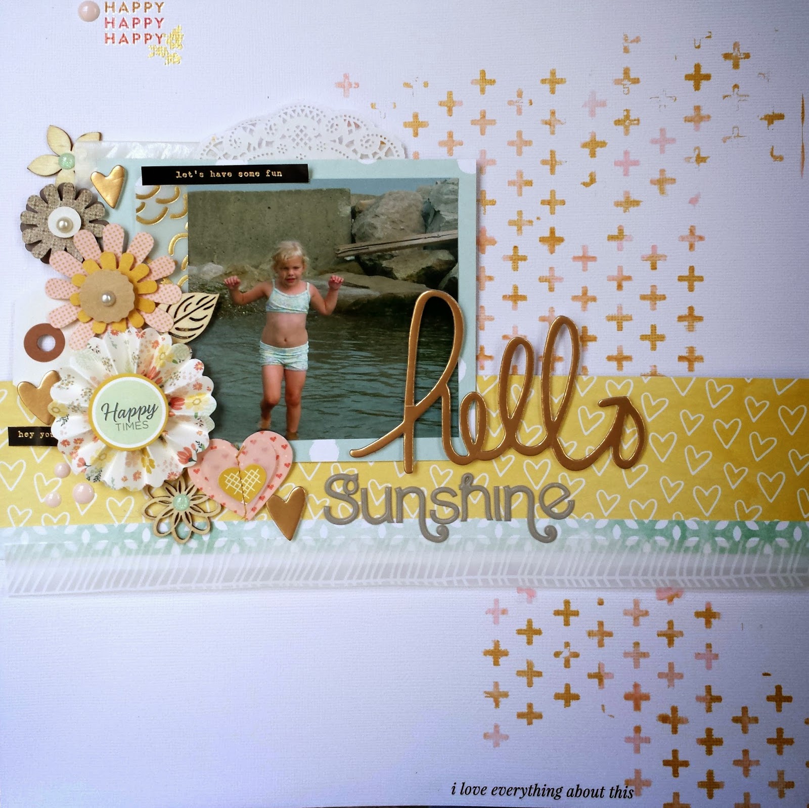
But this weekend, I got those babies out - twice.  I use done with acrylic paints here and it was super easy.  I figured out approximately where I was going to put my photo and then laid the silkscreen down next to it.  I put little dabs of color theory blush crush and 24K paint on the silkscreen and then smeared it around so the colors blended and I had a random mix of pink and gold.  The only problem I had was that my silkscreen was small and I had to reapply it several times to cover enough of the background for the look I wanted.


The second time I got out my silkscreens, I used them with watercolors. I used a small piece of watercolor paper and adhered my silk screen.  I then applied different yellow, orange and pink colors across the silkscreen to create a title block for a simple grid layout.


Oh - and those clouds - a stencil with gesso.  And I painted that veneer butterfly.  I was using those supplies.  Now the trick is to keep the momentum going.

So did you try anything new this weekend?  Link me up.  I'd love to see.

Thanks for stopping by.

Monday, December 8, 2014

A Quick and Easy Christmas Card

This time of year is super crazy at my house.  No matter how often I say that we are going to have a relaxed and enjoyable holiday, it seems like everything goes nuts starting the day after Thanksgiving.  And this year is no exception.  So last week passed in a blur of holiday craziness with work and school squeezed in. 

But over the last couple years, I've learned that a few quiet minutes in my scrap room each day go a long way to maintaining my sanity.  So this weekend I was determined to get back on track.  My craft room is a disaster right now which makes me crazy, but I squeezed in some crafty time - the organizing is going to have to wait.

I woke up Sunday with an idea for a card inspired by paper from Studio Calico's card kit last month.  I knew it would come together quickly, so it was perfect project for this time of year. 


I started with a plain white card base - I know they are easy to make, but I buy them just because it makes things so quick and easy.  I trimmed the great tree paper from the Walden card kit so that it was slightly smaller than the card.  Then I added a piece of vellum over the patterned paper. 

I knew I wanted to create a simple cluster in the bottom corner of the card.  I pulled out the stamp from this month's embellishment kit - Waldorf.  It had a small pine branch that was just what I had in mind.  I stamped the image a couple of times with Studio Calico Color Theory Yes Peas Ink and made sure the images overlapped slightly.


For the sentiment I used the stamp from the Garland Road project life add-on (November 2014) from Studio Calico and Gold Galax Brilliance Ink.  I placed the image just to the side and below the branches.  I pulled out one of those "vintage" wood veneer "tweets" from Studio Calico to link my sentiment and pine branches.  I colored it a soft red with a pale tomato Hero Arts ink dauber.    It just took a few tiny gold star sequins to finish it off.

I love when a project is inspired by a paper or embellishment.  They always seem to come together so quickly.  Link me up with your last project inspired by a supply in the comments.  I will pick one link at random for a $5 Studio Calico gift card.  I will choose a winner on December 21 - that way you will have the gift card in plenty of time for the January kit reveal.

I still have to pick the winner of my holiday giveaway - hopefully in the next few days. It totally got away from me last week.

Thanks for stopping by!


Monday, December 1, 2014

Tag!

For the first time in more than 20 years, I wasn't hosting Thanksgiving.  So I had some extra time.  So I decided to make some special holiday tags.  (It was the perfect project because I could work easily in small bits of time and finish each tag pretty quickly.)  Plus I made a dent in my never-ending holiday stash. 

I started with 10 plain white shipping tags.  I laid them out on an old piece of cardboard like this.


 I pulled out my favorite multi-media product ever - the gold martha stewart liquid gilding and a foam brush.  (I've learned that foam brushes work really well with this product and, because they are so inexpensive, you can just throw them away when you are done.)


 I painted the tags with the liquid gilding and had 10 shiny gold tags that would serve as the base for my project.  The liquid gilding dries super fast, so I was ready for the fun part in no time.  I pulled out a box of miscellaneous christmas embellishments and started to put together different combinations of paper scraps and embellishments. 

The best part of this project was the ability to create a really different feel for each tag.  Here are some of my favorites.


 I love the vintage feel of this one.  And the soft texture from the scrap of handmade paper that is behind the Santa.  Initially the red twine was not a bold enough finish but when I doubled up, it was perfect.


 These colors are way less traditional, and the effect is much cleaner than the first tag.  I doubled up the twine again here for a stronger impact from the trim.


Tags are also a great way to experiment with different techniques.  I experimented with silkscreen and acrylic paint over the liquic gilding on this tag.  The result wasn't as clean as I wanted, but it still created a fun look.  Tags are a great place to experiment with techniques!


This is my favorite - I had been looking for a chance to use that plaid washi from Freckled Fawn.  And the deer from the Gossamer Blue Get Happy wood veneer is awesome (I used a couple coats of black color shine to color it).  I finished it off with wide red satin ribbon which helped to balance the visual weight from the deer.

And here is a picture of all 10 tags. 


Some of them will end up on gifts and others will end up as part of holiday projects (like my December Daily-ish album).  They were so much fun to make, that I will probably make more - and maybe with the silver liquid gilding.  I've never tried it.

If you have a chance experiment with some tags - they are fun, quick and inexpensive - and a great way to use up bits and pieces in your stash.

Thanks for stopping by.


Sunday, November 30, 2014

Repetitive Stamping

I want to use my stamps and my ink pads.  I have all the Studio Calico Color Theory stamp pads and the colors are gorgeous.  And I get stamps in my kits each month, so my stamp collection is a little out of control.  But I have to admit that using my stamps is not my first instinct.  So I almost never buy a stamp set outside the kits.  I just don't use them enough.

But a few months back, I couldn't resist this stamp set offered at Studio Calico as an add-on to the card kit.  It is called the Circles set by Splendid Finn,

Picture 1 of 4x3" Circles Stamp Set by Splendid Fiins
I couldn't tell you exactly why, but I fell in love.  And it turns out that so far the solid circle is my favorite stamp in the set.  I am a little addicted to using it for repetitive stamping, mixing colors to create custom backgrounds.  Earlier this week I needed a quick retirement card for a friend at work.  I pulled out inks in color theory, blush crush, flamingo, lavender soda and purple rain - and that circle stamp.  I randomly stamped circles in different colors to fill in a piece of white cardstock.


After that it was easy.  I used a Pebbles tag that said celebrate and edged it with gold brilliance ink.  I added gold glitter embossing powder to a wood veneer "m" to create a monogram to make the card more personal and finished with a strip of gold glitter washi from My Minds Eye.  And then just for a little sparkle, I added lots of tiny pink star sequins.  Mitali deserved a lot of sparkle.

I used the same technique to create a quick and easy Christmas card.  This time I used inks in the green and aqua color range - emerald city, lime light, yes peas, mint hint, and glass slipper.


I added a red holiday banner sticker and a gold star from my stash (both from old Studio Calico collections) and I was done.  If I had more of  those banner stickers, I might just mash produce this card.

If you try this, don't forget to stamp multiple times with your stamp before you re-ink.  This creates lots of variety in the colors you het for your circles (or whatever image you stamp.)

Thanks for stopping by.