Pages

Sunday, April 26, 2015

Top and Bottom

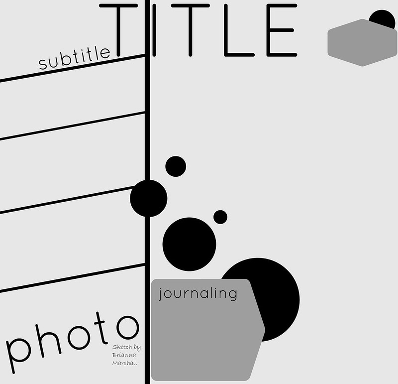
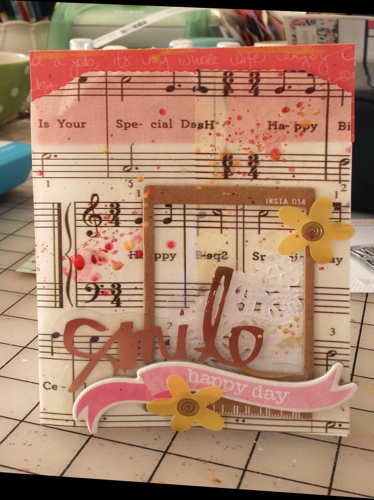
Sometimes I feel like my layouts all look alike - either grids or a slightly off-center photo block - or some combination of the 2.  So the current sketch at Stuck! was a great jumping off point for something different.


The sketch placed the design elements at the top and bottom of the page.  I had several false starts before I actually managed to put a layout together.  But it was really perfect for me - different but I still got to play with lots of layers and little bits..


I moved the layers on the top so that they were diagonal from the photo block in the bottom of the page.  It felt more balanced to me.  And the title in my layout ended up (more or less) centered. 

I found that using a sheet of patterned paper with pattern and texture helped make the sketch work for me.  I am definitely white space challenged.

So am I the only one who feels like they are in a design rut?  How do you keep your layouts fresh?

Thanks for stopping by.


Saturday, April 25, 2015

Vellum!

I have lots of scrap related obsessions, but lately vellum has been on the top of the list.  I love that it has been included in collections in lots of colors, prints and textures lately.  And I have quite a stash.

Most often I use it for layering in a photo block.  But when I saw the current sketch on the My Scraps and More Sketch Blog, I decided to try using vellum as the inspiration for my layout.  The sketch uses lots of strips of paper and I thought it would be fun to layer strips of vellum.


The layered vellum strips created a light girly look that i really like.  I mostly used strips from my scraps. And I added in a few strips of white and gray patterned paper to make the strips feel more substantial.   More vellum and a glassine bag to create a photo block finished off the layers across the page.


I dug out some old Basic Grey chipboard alphas for the title and added some embellishments.  And I just couldn't resist that floral stamp from the Studio Calico Lisse Street kit.  I lvoe that it looks like a doodle.

Thanks for stopping by.

Friday, April 24, 2015

Christmas - but not Christmas product

When I first started scrapping back in the dark ages, I was obsessed with Christmas themed supplies.  And I still have a huge holiday themed stash.  But lately, my holiday layouts seem to be built with little or now themed products.  Instead I seem to gravitate toward classic patterns and colors when I am working with holiday photos.

This layout was inspired by last week's project life sketch at Studio Calico. 


And this layout goes back to one of my go to designs - a basic grid.  But I trimmed a piece of pale blue ledger paper and turned it on the side for the base.  Then I let the columns and rows on the ledger paper shape the grid.  It was a fun technique that came together really quickly - I will definitely try it again.


And that jillibean soup flash card was perfect for my photo!

I'm curous - are you still using lots of themed supplies or have you moved in a different direction too? 

Thanks for stopping by.

Thursday, April 23, 2015

A Big Photo

I used to scrap 4x6 photos period.  Now my favorite photo size is either 4x4 or 3x3.  But I still like to mix it up.  So those 4x6 and 3x5 photos creep into my layouts.  And sometimes I order polaroid style prints from Persnickety Prints.  And I have a stack of larger photos on my desk.  So Sunday I pulled out a 6x12 photo.

The photo of my 14 year old daughter swinging and laughing is one of my favorites from last summer.  She is 15 now and I am afraid there won't be too many more pictures of swinging and playing and being a kid.  And because the photo caught the sense of motion - check out her hair - I ordered a large print because I didn't want to lose any of the details or the sense of joy. 


The layout is super simple.  I just layered patterned paper and vellum to one side ofthe photo to add interest.  On the other side I added a column of vellum hearts from Sevenpaper, going from large to small.  I need about a zillion packs of those hearts!

The title went right on the photo.  Those giant chipboard letters from Studio Calico's Lisse Street scrapbook kit were perfect for this.  (I could use a few zillion packs of those too).  I added the date and a phrase sticker to my paper layers near the bottom of the page.  A few glittery hears and a die cut mounted with foam squares and I was done. 

I am a ridiculously slow scrapper and I don't think this took me more than 45 minutes.  Of course, I was helped with inspiration from mem186 at Studio Calico.  She picked an awesome layout for me to lift that was the real starting point here. 

Thanks for stopping by.

Wednesday, April 22, 2015

Three New Things

My husband frequently says that I like organizing my supplies more than I like using them.  That's an overstatement, but I do love trying to figure out the best way to organize my stash.  Like most scrappers I am most likely to use what I see.  My goal is to make it usable, to make clean up easy and to avoid hoarding.

So over the past couple of weeks I have added three new storage things to my scrap room to try and speed up my scrapping.  The first is for all those pretty tear strips on patterned paper.  I never want to throw them away, but if I put them in my scrap folders they seem to get bent or I forget about them.  So now I have them out near my trinner where I see them - they are visible so I remember to use them, they stay straight this way, and the container is right where I cut them off paper, so they go right in. 


Other long narrow strips of patterned paper are going in here too.  I am really liking how this is working, so now I am on the hunt for a pretty tall container to take up permanent residence here.

The second is for small scraps that I want to save for layering.  I had been sticking them in with my larger scraps.  But then I forgot about them or didn't want to bother digging them out, so I just kept cutting new sheets of paper.  And eventually I threw them away.  So I found this pretty porcelain berry basket at Marshall's to sit on my desk.  It is full of small pieces of paper that are perfect for layering.  


I intentionally got something that wasn't too big.  This will force me to clean it out periodically so that the little pieces I'm saving don't get totally out of control. 

And my favorite new thing - a basket for embellishments that sits on my desk.  It holds a mix of brand new and older things that I am currently loving.  It is a mix of products that I can go to first when I am looking for those perfect bits that make a layout special.  (If I don't find something there I can still go to my stash.)

 
 I am hoping this will help me use things up, keep my desk more organized and speed up my projects.  And my plan is to clean it out every month or so to move things in and out so that the mix is always fresh.  So far, I love how this is working.

Share your favorite storage tips below - I am always looking for new ideas.

Thanks for stopping by.


Tuesday, April 21, 2015

Not Where I Was Headed

I'm having a lot of fun with the sketches from the My Scraps and More Sketch-a-thon this month.  And most of the time my layouts end up looking something like the sketch I started with - even if I turned it or changed the angle.  But once in a while, the sketch and my finished layout part company by the time I'm done. 

Saturday I started with this sketch.  It called for 3 photos.  I only had one, but I had a plan.  I was going to use one of those Maggie Holmes acetate letters and a piece of patterned paper for the the other two photos.   I think that's when I started to go my own way.


Then I looked at all the layers drawn under the two photos on the sketch.  Those became two strips of paper under my "substitute items."


The same kind of layers were drawn down by the other photo - suddenly those became four strips of patterned paper.  And that fun diagonal frame in the sketch - it became another square of patterned paper that connected the two components.  And now  that pretty sketch had turned into a grid style layout - still pretty, but very different from the sketch.

It just took a couple of things to finish off the layout.  I added small alphas right on top of the acetate alpha to create my title, added some ink splats (of course) using tinsel, seafoam and blush colorshine, a couple of bits from the new Pink Paislee collections, and some veneer butterflies from my stash. 

This is what I love about sketches.  They provide a great starting point and leave a lot of room to bring your own style to your finished project.

What would you make with this sketch.  If you give it a try, link me up.  I'd love to see.

Thanks for stopping by.

Monday, April 20, 2015

Spring

Each week Studio Calico posts a challenge from a member on their blog.  (I dream about being asked to do this).  The challenges are always fun, but last week's is one of my all time favorites.  It inspired a layout I would never have thought to make.

The challenge was to use a quote and leftover pictures and/or scraps of pictures.  And I have lots of pieces of pictures left from cropping.  I never want to throw them away but I have no idea why I am saving them. 

When I saw the challenge I immediately thought of photo scraps of a handbook spread I did last year with photos of spring flowers.  And of of my favorite project life card in the Lisse Street project life add-ons.  It had a quote about spring from Henry Wadsworth Longfellow

Came the spring with all its splendor,
all its birds and all its blossoms,
all its flowers and leaves and grasses

Maybe its because the winter was so rough, but the quote touched me as soon as I saw the card.

I arranged the photo scraps and the card in a simple grid.  Then I pulled out the Lisse Street 4x6 paper pad and cut small pieces to fill in the gaps.  I don't have a sewing machine but I love the look people get when they stitch and then bend up the papers, so I tried to replicate it.  I put a strip of adhesive down the middle and bent the edges up.

The project life card is attached to a vellum scrap and mounted with foam tape.  Then I added a few simple embellishments and some ink splatters to finish off the page.  

Use up those photo scraps and link me up with your projects.  I'd love to see.

Thanks for stopping by.

Saturday, April 18, 2015

Getting Started

I've really been going strong in my scrap room lately, but this past week I slowed way down.  I had a stack of sketches on my desk and lots of pictures, but I just couldn't seem to get started on anything.  Then last night I came across the latest Creative Jumpstart.

Creative Jumpstarts are challenges published (I think bi-weekly) by Marcy Penner and Stephanie Bryan - two of my favorite scrappers.  The challenges vary but this one was a recipe challenge - striped paper, chipboard and washi.

This was just the push I needed.  I had a picture of my cube-mate at work where she is looking between the glass panels that separate our workspaces that I had wanted to scrap and a fun striped paper from the Studio Calico Lisse Street kits that reminded me of her (I don't know why - it just .did).  And I had a sketch from My Scraps and More I really liked but had been struggling with


I thought it was perfect for my photo because the stripes reminded me of the way the cubes are lined up and the way we look for the glass panels.  But I finally figured out that the angle of the stripes was throwing me off.  I am a pretty lazy scrapper and its a lot of measuring and work to get those angles straight for a whole page.

So I turned the sketch 90 degrees, straightened out the stripes (sort of) and ended up with this.


Most of the papers I used were from the 4x6 paper pad - the smaller scale worked well for the size of the strips. 

I layered some of my paper strips for added interest.  And I used foam tape to adhere some of the strips and the photo - this created some dimension which I really liked. 

Next the washi - one of my favorites right now is a whide tape with navy hearts.  It was perfect, but I wanted a less perfect strip.  So I adhered one side of the tape to the paper and then tore down the middle for an uneven strip at the bottom of my page.  I finished it off with some chipboard thickers. 

If you try the creative jumpstart, the sketch or both, I'd love to see.  Link me up!

Thanks for stopping by.

Thursday, April 16, 2015

Colored Cardstock

I can remember when colored cardstock was a craftroom staple.  That must be why I have a really big basket of it - even though I almost never use it.  But once in a while, I dig out a piece for a project.

Saturday I was working with the May Studio Calico kits and really wanted to use the fun vellum in the main scrapbook kit.  It is printed with fun words in a great font - in white.  And when I put it over patterned paper, I felt like the detail was lost.  So I tried it over white paper - totally a waste of the pattern.  So finally I dug around in that basket of colored cardstock and pulled out a piece of soft aqua cardstock.

The vellum looked perfect"

Layout design inspired by sketch at My Scraps and More

I wanted a simple design so that the vellum would really shine. So I created a simple layered photo block.  The gold foil card is from the Studio Calico letterpress calendar offered at the beginning of the year (I snagged it at Last Call a while back) from a past month.  I cut it down so it worked in my design.

Of course I added ink splats, but some of them separated creating ugly blots on my cardstock.  I dug out some wood veneer flowers and used them to cover up the ink splats that didn't turn out so well.  And they turned out to be the perfect finishing touch.

Maybe this will motivate you to dig out that colored cardstock I know you have buried in your craft room.  Thanks for stopping by.

Note:  I just realized the date is wrong on my label - it was July 5, 2014.  I've fixed it now.

Tuesday, April 14, 2015

Those Maggie Holmes Alphas

I am a confessed hoarder (though I am working on it) and I love my stash.  And alphas are one of my most favorite thing.  So When the new Maggie Holmes acetate alpha came with my Lisse kits, I feel in love.  And I couldn't wait to use it......
I only got the blue ones so I am going to have to order a set.......
I loved the scale - they are about 2 inches wide - and the distressed finish.  They are just so fun.  (Please note that I am a recovering hoarder - I loved them and wanted to use them :)  )

So I decided to use them as the starting point for a layout with a photo from Thanksgiving - our family has a Tripoley tradition and we often play for pennies when we get together.


I used my tiny attacher to create a title up the side of my page.  I loved that it totally filled the space.  I even had to trim the "P".  Then I pulled papers and other bits from my Lisse Street kits to create the simple grid.  That light blue card is a project life card I trimmed down and the sentiment on it is from another PL card.  And of course it took a few ink splatters to finish of the layout.

Thanks for stopping by. 

Monday, April 13, 2015

Stuck!

Lately my favorite starting point has been a good sketch.  And when I came across this sketch at Stuck! Sketches, I loved it.  So I printed it and put it in a pile of sketches I love that is accumulating on my desk.  (That way I don't have to spend time finding a sketch when I'm ready to scrap - they are just ready for me.)


I pulled some papers and embellishments from the Studio Calico Lisse Street kits as my starting point and went to work.  I even used my cuttlebug and a tag die to cut a project life card into a tag shape. 


I just kept adding layers til I was happy with it. I kept adding strips of paper and even ripped a piece of the sevenpaper gold triangle vellum when I was too impatient to hunt down my scissiors - But I like the look of the torn paper her.  Then I went to my stash - there are some "vintage" Dear Lizzy stickers on here that worked perfectly with the colors and feel of my layout.  I also added some wood buttons from freckled fawn that were sitting on my desk and some Crate Paper Crapft Market dimensional stickers with burlap to finish it off.  And of course I need some ink splatters - these are with Mister Huey's opaque white.

Thanks for looking.

Sunday, April 12, 2015

30 Minute Layouts

I am great at collecting classes - but it seems like I never take the time to actually work through the lessons.  But last Saturday I had lots of time (my husband was sick and my daughter was doing the teenager thing and staying in her room), so I opened the class from Lilith Eckels at Big Picture Classes.  It was titled "30 Minute Layouts" and I am the slowest scrapper known to man most days so it seemed like a perfect fit.  Plus Lilith rocks - I always love her projects.  So I figured it was good for some eye candy if nothing else.

Have I mentioned that I am painfully slow when I scrapbook.  I obsess over the placement of every enamel dot, die cut and piece of veneer.  I can move one label around for hours trying to find the perfect place.  So imagine my surprise when I had worked through 2 lessons and had two completed layouts in about 3 hours.  This was record setting pace for me.

The first lesson was really about choosing supplies and organizing.  I watched the video and read through the narrative - and then whipped together a layout about work.

The second lesson is about pulling layouts together with leftovers from other projects.  I started with a stack of scraps by my trimmer and embellishments scattered across my desk.


I added the base paper, the veneer hearts, and the label.  Everthing else was sitting on my desk .  If I didn't use it, I would have to put it away.  I call this a win-win.  I played, ended up with a layout and have less to put away.    (Note:  Design inspired by sketchy saturday at PI)

Then I made a second layout with the scraps from the scraps - all I added was the base paper and the alphas.


So maybe I should take more of those classes I collect?  And for sure I am going to consider possibilities before I clean up. 

Thanks for stopping by.

Saturday, April 11, 2015

Making Patterned Paper

So I think I mentioned the 30 minute layout class at Big Picture Classes before.  I finished the class today (it took me exactly a week - and I did all the assignments).  The last lesson was about using a single color of ink and a stamp to make your own patterned paper.

Now I have a lot of stamps from kits, but almost never use them.  So I considered marking the lesson complete and moving on.  But stamps are a big investment and I did "have to have" all the Color Theory ink pads (because that would motivate me to use my stamps - talk about rationalization).  So I rummaged through my stamps to see if one would catch my eye. 

The floral stamp from the Yeats, a September Project Life Add on At Studio Calico caught my eye.  This was strange since I almost never use floral paper, but I went with the impulse.


I started with a sheet of smooth white cardstock and selected the Gray Area Color theory ink.  I like the soft gray and thought it would keep the floral from being too overwhelming.  I stamped the darker images first.  Then I went back through and added the lighter images by stamping off some of the ink on a piece of scrap paper.  I ended up with this - which I loved.


In the class the hand stamped paper served as the base of the layout.  But I had a hard time making that work for me.  So I cut a piece to serve as the base for the large photo block and a strip for the bottom of my page.  I kept the color scheme super simple - working with aqua, gray, black and white - and touches of gold of course.  I added lots of paper layers trying to get a mix of textures and patterns.  I mean we don't have to talk about how long the white corrugated paper might have been living in my scrap room.  And the gold foil heart layer is a project life card from Pinkfresh Studios.


I loved this photo of my daughter (who bought the same shirt for my mother and herself so they could twin - I mean how many teenagers want to "twin" with their grandmother?  The title is from a Valentine my mother sent Elisabeth (several years in a row).  I tried to add embellishments that captured the love and fun I saw in the picture they are mix of studio calico, kit exclusives, sevenpaper, crate paper, freckled fawn and elle's studio.  And lately I don't seem to think a layout is done unless I've added rub on and splatters.

Maybe this will inspire you to dig out those stamps.  Thanks for stopping by.

Thursday, April 9, 2015

Problem Solving Through A Layout

We all scrapbook for different reasons - and if you are like me, maybe for a lot of reasons.  I scrapbook because I think those albums are important to pass on to my children down the road .  But even more importantly I have learned that I am happier if I find time to do something creative every day.  And sometimes, I scrapbook about a problem or concern that is on my mind.  I find it is a great way to organize my thoughts.

Lately I have been thinking a lot about work, retirement, and finding a balance in my life.  I haven't reached any momentous conclusions, but I know that I have work to do in this area.  So when Studio Calico's member challenge this week was to use a photo to indirectly document something, I chose to do a layout about work and how I feel about work. 


The journaling is very personal to me and not something I want to share with anyone.  So it is on that white tag sticking out behind the photo.  I stuck a library pocket to the back of the photo block so that the tag can go in and out easily.  I don't want to share the journaling right now - but I don't want my thoughts to be buried forever either.

Putting the layout together didn't resolve anything for me, but it did help me to organize my thoughts about the issues I want to address.  That's a step forward.  So next time you're worrying, try focusing on something creative as a way to think through your issues.  If nothing else, you will have some time to relax and play.

Thanks for stopping by.

Note:  The layout design was inspired by the April 4th sketch at My Scraps and More.

Tuesday, April 7, 2015

Adding Texture and Dimension

I love pretty paper, but lets face it - it is flat.  So I am always trying to add dimension and texture to my layouts.  Those heavy textured papers are always favorites for just that reason.  But they seem to be harder and harder to find.  And since my LSS closed, I am having to guess at the texture of a sheet of paper based on online descriptions and knowledge about specific manufacturers.

As a result, I am looking more at my stash to find ways to use layers and embellishments to add dimension and texture to layouts.  When I worked with this sketch from MSAM, I really tried to focus on texture and dimension as a way to make the design my own.


I started with a patterned paper background.  The large polka dots were fairly bold for a background, but seemd to go with the feel of my page and added a lot of dimension before I did anything else. 

Textures - Crate Paper - Craft Market
Then I started building the layers.  I pulled the peach and the floral papers from the March Studio Calico kits.  Then I dug through my scraps and found a piece of navy corrugated paper (maybe Fancy Pants?) and added that.  I also used a glassine bag that was leftover kit packaging under my photo - those pabs are a great way to add dimension and texture without spending an extra dime!


I added die cuts from Pinkfresh Studios (Up In the Clouds) and Elle's Studio (Cierra) and a glittery piece of wood veneer that was in my stash.  I dug out those gold foil alphas from the Studio Calico Lemon Lush line for the title.   Some ink splatters (using teal, peach and primrose colorshine) finished it off.

The finished layout had lots of dimension without burying the picture. 

Thanks for stopping by.

Monday, April 6, 2015

It's All About the Title

I title just about every layout I make.  But most of the time that means pulling out a pack of thickers and sticking them on. It works but its just not always a lot of fun (even if I have lots of thickers to choose from.)  So I started thinking about how else I could make a title.

I remembered those stories I read in Highlights magazine when I was little - the ones where pictures substituted for some of the words.    And I decided to use that as the inspiration for the title on my next layout.


This layout is made with goodies from my March Studio Calico box.  Everything came in the kits except the dog die cut - it was in a dear Lizzy die cut pack that was a subscriber's special and the wood heart (from my stash).  I love the mix of fonts, painted wood veneer and a die cut to create a title.  It is totally unexpected and not like any other layouts in my album.  And it was still super quick and easy.

I'd love to see your take on different ways to make a title - link me up.

Thanks for stopping by.. 

Saturday, April 4, 2015

Starting With A Sketch

One of my favorite starting points is a sketch.  So when I heard My Scraps and More was having a sketchathon in April, I was thrilled.  I've been scrapping a lot, and its the perfect way to keep my momentum going.  I mean, 30 sketches in 30 days?
 
The first sketch was published on April 1; the challenge also required fussy cutting.


I hate fussy cutting so I almost skipped the challenge.  But I really liked the sketch.  And I had photos from hy husband's birthday last summer that were begging to be scrapped.  So I poked around in my scrap room for paper that would lend itself to simple fussy cutting.  I found a sheet printed with black frames that seemed perfect.


The title and chipboard phrase stickers are from the Maggie Holmes Confetti collection.  I used the colors in the numbers to drive my color selections.  And I went to work on the background with my current favorite technique - layering rub ons and ink splatters. I added some small puffy stars from Crate Paper's Journey line to add a bit of dimension.

I'd love to know your favorite starting points for layouts when your stuck.

Thanks for stopping by.


Thursday, April 2, 2015

Rub Ons and Splatters

Rub ons seem to be one of those products that people either love or hate - no in between.  And one of the most frequent complaints is that they have a hard time using them.  I happen to love them, but I hate it when I end up with partial images. 

But recently I've been experimenting with a new technique that means it just doesn't matter.  I've been mixing rubons with ink splatters (watercolors would probably work too ) for a fun multi-media look.  I tried it once and was totally hooked  Here is my first experiment:


The gold stars and the phrase "you are my moon and my stars" are rub ons -- then  I just started layering ink splatters in different colors.  I love the layered background effect that I ended up with.  And since I don't have an artistic bone in my body, I am thrilled when I find a way to add that flair to my projects.  (The gold stars are from a Jenni Bowlin sheet of "scattered stars" from an SC add-on last summer; I haven't been able to find more so I am hoarding them).

I was so excited that the technique kept showing up for a few days.  Here is anothe project with a totally different feel.  The first project was soft and dreamy.  This time I went for bright and fun.  I used stars and phrases to create the background. And I still got to feel a little like an artist!  :)


You'll see this technique showing up on morep rojects - it is so fun and easy.  In the meantime, get out those rub ons and play.

Thanks for stopping by.

Wednesday, April 1, 2015

No April Fool's Trick - The Blog Is Back

So I've been away - for months - after planning and being sure that I could maintain my blog.  But this winter did me in (not quite literally).  We had the Christmas chaos and then just before the holiday I started getting sick.  And I stayed that way til early March.  I fell on the ice and snow walking the dog (more than once).  And through it all I wasn't feeling very creative or productive.  So I didn't really have much to blog about.  But in the last couple of weeks my scrappy mojo seems to be back.  So I am ready to get back to my blog. 

First thing's first - I have an open giveaway from way back in November/early December and I need to pick a winner.  (I know its Christmas supplies, but if you are like me, Christmas themed pages and projects cross your desk throughout the year.)


On November 17, penny said:

Wow! Great giveaway. I can't wait to see how your album progresses. I have never done a holiday book. 

Penny, email me at juliee181 at gmail dot com to claim your prize.  And guys, I really apologize for the time it took me to name a winner.  I promise to do better.

Now - what have I been working on?  Lots of good stuff. Last week I was playing in the Paper Issues crop.  My projects included three quick cards I though I would share.

The first challenge I am sharing required the color orange and stamping.  Here's what I came up with.

 
The design is super simple - the patterned base paper does most of the work.  I just added a label, a frame, and a tag.  Epoxy stickers from the new Amy Tangerine collection were the perfect finishing touch.

The second was for an alphabet challenge.  I used the awesome ampersand vellum from Webster's Pages and the bold tile thicker for my basic design.  The fun part was punching stars from tile style mini alphas to finish it off.


The third card was to make something connected to music.  I had a bag printed with the music for happy birthday that had been hanging out in my stash for a really long time.  So I cut it apart to serve as the base of my card.  Then it was all about the layers.  I love that I used lots of bits from my stash for this card and ended up with something fresh and pretty.


 Thanks for visiting.  I'll talk to you soon.