Pages

Showing posts with label Simple Stories. Show all posts

Monday, January 16, 2017

Stuck?! on an Angle

I am trying to get back to some of my creative habits that helped keep me scrapping.  One of the best of those was following the challenges at Stuck?! Sketches.  They publish two sketches each month and they usually provide lots of opportunity to play with layers and details.

So while I am wrapping up my amazing 4 day weekend, I decided to check out the current sketch.  I was excited to see that it was a fun diagonal design.


My layouts tend to be either horizontal or vertical in design so this sketch provided a fun challenge.

I started with the January kit from Citrus Twist Kits (my last one for a while) and a photo that brings back all those summer feelings.   I added lots of bits from my stash and created this layout.  There are quite a few pieces from Crate Paper Wonder, an older Crate paper line, Simple Stories, Dear Lizzy and Studio Calico kits mixed in with the pretty supplies from the kit.


I stuck really closely to the sketch and used layers and embellishments to tell my story.  And my tip for the day - check out the packaging - that fun yellow piece with the blue scalloped edge that is one of the bottom layers - that was the backing in the die cut pack from the Fancy Pants Joy Parade collection.  It is so cute and perfect here. 

I will be returning to work tomorrow but am definitely going to squeeze a little scrapping time in.  And you never know - maybe another blog post.   In the meantime, thanks for stopping by!

Sunday, May 22, 2016

Using a Transparency

Transparent elements are big in scrapbooking right now.  And I am a huge fan - I love that they provide opportunities to add color and texture but generally maintain a light feel.  But 12x12 transparencies are coming with lots more color and pattern than ever before - and I think they can be a bit challenging to use.  In fact, my stash is growing quickly - they are so pretty but I end up not using them. 

So when the Spoonful add-on at Studio Calico came with this Dear Lizzy transparency I was determined to use it.


I found the perfect inspiration is a sketch at Citrus Twist Kits. The diagonal design seemed to provide a great opportunity to incorporate the transparency to add color and pattern as a background element.


It turns out - that wasn't as easy as I thought it would be.  I ended up piecing together several patterned papers, including the transparency to create a custom background.


Once the background was done I worked on a photo block.  And I'll admit that I had a hard time with placement - the vertical orientation in the sketch just didn't work well.  I think I moved the block around for 15 minutes and it just didn't look right.  I added the pink and white striped paper from my scraps on a whim - and was really surprised that it seemed to work to anchor the whole thing. 

Because the design was busy and I had used a number of bold patterns, I kept embellishments to a minimum (a challenge for me).  But I thought it was really fun to add a second transparent element with the acetate word from Pinkfresh Studio.  And I was really surprised at how well the hot pink thickers worked on top of the transparency. Finally, I couldn't call it done without a few ink spatters.

So what's accumulating in your stash because you love it but can't quite figure out how to use it.  Challenge yourself to put it on a project this week.  You might just be surprised with the end result.

Have a great Sunday.

Sunday, August 30, 2015

Quick and Easy

I've been complaining for a while now about missing mojo.  It's not back yet, but I think its getting close.  This week I experimented with simple grid designs.  I often find them the easiest to put together.  I shared my favorite yesterday, but here are a couple more quick layouts that came together in the past week.

Products from Studio Calico and Citrus Twist Kits

This one was inspired by a Friday night challenge on the Paper Issues facebook page.  I had to feature patterned paper, die cuts, flair and enamel dots.  (You could use other products too.)  My favorite thing about this grid was the way I let little bits hang off the edges so that it wasn't perfectly rectangular.  I also like the combination of bright colors and a black and white photo.

Products from Studio Calico, Citrus Twist Kits and Pinkfresh Studios.

Here's the second one.   I started with the two long strips on the side and grew my grid from there.  The colors really are my favorite thing.  And that pink square with the large gold circle - its a piece of the scratch off paper in the Studio Calico Pop Art kits - I love the look without scratching the dot.

Tomorrow is a me day - I took the day off as a birthday present to myself.  I'm hoping to spend some concentrated hours in my scrap room in search of that elusive mojo.  I have a feeling I will be scrapping like crazy when it makes an appearance. 

Thanks for stopping by.

Monday, November 17, 2014

December Daily - To Do or Not To Do ....and a Giveaway

 Holiday giveaway is extended til midnight on Thanksgiving!  Keep commenting on my daily blog posts for extra entries.

I love the idea of a December Daily album.  But I tried it once, made all my pages and never printed any pictures.  Plus I chose a 6x6 size and used so many layers and embellishments that it didn't come close to closing - even without those photos.  But it was beautiful and it was fun to do.

So at the beginning of the month, I waffled back and forth about the project.  I signed up for the 25 Days class at Studio Calico, but still wasn't sure.  We just don't do fun holiday things that I would put in an album everyday.  But then I realized - it doesn't have to be a December daily to be a special holiday album.  So I am approaching the project as an album to document our 2014 holidays.  I am starting with Thanksgiving and ending with the new year.  And there won't be pictures and/or journaling everyday. 

I looked at all the kits out there - Ali Edwards, Gossamer Blue, and Freckled Fawn to name a few.  Then My Scraps and More put out both an album kit and an embellishment kit.  All of these kits seemed to be a good value, but some of them required a pretty big investment.  And I didn't love every single thing about any of them.  And I have a lot of supplies.  So if I am going to do this, it is going to be with a homegrown kit.

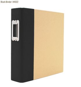
In my first attempt I learned that choosing an album was critical to the project's success.  I knew I wanted a 6x8 album, but which one.  I ultimately chose a kraft Snap album with a black spine.  The size and price were good, it was neutral and easily customizable, there is a large variety of page protectors and it was readily accessible. I got mine at JoAnns.


 Black Snap Binder, 6"x8" - Simple Stories


But what about the kit.  I started with choosing a color palette by pulling out my cardstock and pulling sheets til I had colors I like.  I had done some Christmas layouts lately and think those color choices influenced the colors I chose for my album.. I ended up with pale blue, soft red, lime green, black and pink.


Once I had my color palette, I couldn't wait to get started with the cover.  I knew I wanted to paint it, a pale blue but couldn't find a color that was just what I wanted.  So I mixed a blue, a mint, and white paint til I got just the color I wanted.  I also pulled out my gesso and the Martha Stewart liquid gilding in gold for my cover.


I started by taping off the black fabric spine with washi tape - I'm a messy crafter.  Then I primed the album inside and out with gesso.  I painted the inside with the gold liquid gilding and a foam brush.  aIt looks amazing.  It is shiny and smooth and will provide a perfect backdrop to all my pages. (This picture doesn't really do it justice.)


Then I took on the outside of the cover.  I painted it with the pale blue paint color I had mixed and a foam brush.  I used just one coat because I really like the look (hint - I used an extra piece of chipboard and treated it just like the album cover - that way I could see how it would look with a second coat of blue paint.


The wood veneer tree was from Elle's Studio last year.  The red sequin star is from the Studio Calico Magical sequin pack.  And then a wide line green grosgrain ribbon tied in a bow finished off my cover.

I loved the end result.  It reflects the colors and feel of the products I chose for my kit.  (I'm still thinking about adding the year to the bottom branch of the tree>

Giveway:  While I was making my December Daily kit, I pulled some things that might fit right in with your holiday crafting plans.  Leave a comment on any post this week and be entered to win.  Giveaway closes at midnight on November 23rd.

Here are some of the goodies I pulled.  (This isn't a kit - its an assortment of holiday themed supplies that might fit in with your Christmas supplies,)

I'd love to know what ideas you have for adding the year to my cover - or if you think I should stop where it is.  (I know I will put the year on the spine.)

I'm going to share more about my December Daily kit building and organization later this week.  Hope you stop back. 

Sunday, July 7, 2013

Black and White and Lots of Color

Lately I've been loving bright colors - especially the combination of bright colors and black and white photos. So when I was digging through my pile of photos and came across a black and white 5x7 of my children on Easter morning (a few years ago), I got right to work.  Here's what I pulled together.


I mixed papers and embellishments from lots of different manufacturer's and lines for this - most from my scrap pile.  The base and the red heart journaling card are from the new Simple Stories line, I {Heart} Summer.  The yellow paper is from the MME Collectable line and the white paper is from the MME Indie Chic line. The dark blue paper is from the Dear Lizzy Lucky Charm line, the floral mini bag is from one of the Websters Pages Allison Kreft lines. The red floral paper is from the BG Piccadilly collection and the ledger border strip is from the new BG Capture line.  And the big yellow die cut is from an Amy Tangerine collection.


I also incorporated some ink splatters, a technique that I'm not very comfortable with.  I mixed white and the neon Mister Hueys.   Then I added some tiny enamel dots to help them pop.


This Dear Lizzy die cut (I think from 5th and Frolic) as a perfect shape and dimension.  But it wasn't really bright enough to mix with the rest of the elements on the page.  I added more enamel dots to brighten it up.  Then I combined it with an Amy Tangerine diecut and a fabric heart from the American Craft products you can find at Target.

This was also a great layout to incorporate trims. (I have jars of trims and rarely use them any more, so when I came across a challenge at My Scraps and More to use at least three on a layout, I knew I wanted to give it a try.)  I used a piece of orange stripe twill ribbon as a border strip, tied a piece of yellow ribbon around the white patterned paper and added some aqua crocheted trim to the heart journaling card.  It didn't really make a dent in my stash but it was a good reminder to look at all those trims when a layout needs a little something.

Have  a super Sunday!

Saturday, July 6, 2013

Photo Effects and the Sunday Sketch

I've been having lots of fun playing with the different effects you can apply to photos lately.  And once in a while, I really love the way a picture looks when it prints.  This picture of Nicholas and my nephew Tyler is one of those pictures.


Nicholas and Tyler have always had a special relationship and this picture from Tyler's birthday party captured the joy they find in spending time together.  And when I applied the special effect, I loved the way Tyler's red shirt popped in the photo.


My Roundabout kits were sitting on my desk and I went there first for papers.  But I had to dig into my stash for the base (from MME Miss Caroline) and the red polka dot (Basic Grey Hipster).  I started with this week's Sunday Sketch (I chose the layout sketch) , but the final interpretation is pretty loose.  I can see the connections, but I'm not sure anyone else can.


I did steal the idea of cutting up mini alphas (from a layout in the gallery that I couldn't find - sorry.)  I took my star punch to some Fancy Pants Alphas.  I had lots of fun adding other bits and pieces, like the end of the vintage tag, the basic grey stars, some enamel dots and the airmail twine to finish it off.

Have a great Saturday!

Friday, June 28, 2013

I'm Published!

I'm so excited!  For the first time ever, one of my layouts is published.  You can find it in the online magazine Life Paper Scrapbook on page 71.  Here's my layout.


I pulled this together using the June kits from Studio Calico.  Those kits included great twine and this was the first time I played with letting it just wander across the page.  I used little pieces of wood veneer, little stars, and brads (where I cut off the prongs) hold it in place.  It creates a really great look.
 

I loved these Heidi Swapp alphas and am still using them.  They create sch a unique look.  And the Elles Studio background paper was perfect!


Then it was just about adding little bits and pieces. This leaf was in my stash and was from freckled fawn.


Friday, May 24, 2013

Documenting A Soccer Season

If you read these posts often, you know that I try to do a "year in the life" album for my kids for every year.  As I've worked on my boys' albums, sport seasons have become a huge challenge.

The sports seasons are a huge part of their lives and very important to them.  By the time we go to all those games, there are literally hundreds of pictures.  And I'm just not able to narrow the photos down to pages for one or two pages.  So I always end up with multiple 2 page layouts.  And in the various albums, I've tried to make them look alike, I've tried to use a common design element (e.g., stars) to connect them, and I've just ignored the connection.  All of the approaches have pluses and minuses.

But lately I've been working on Nicholas's senior year album and I tried something different.  I pulled together a kit of papers, cardstock and embellishments that I used for the layouts - there were 7 this year.  After that I didn't worry at all about the connection. The end result was cohesive layouts that were still visually interesting.

The papers were mostly Fancy Pants and Simple Stories, but the green was Echo Park and there is a red chevron from Jillibean. I had themed embellishments, wood, stars, sequins, vellum arrow die cuts and enamel dots in my embellishment stack. 

Here are the layouts (and some things I learned):


By using the same background paper on all the layouts, I created a feeling of "a mini album inside a larger album.


Washi tape was a great addition to the kit - a quick and easy way to add interest to pages and able to be used in a lot of ways.


The Martha Stewart chalkboard labels were a great way to add consistent journaling throughout the series of layouts.  And mixing themed and non themed embellishments created added lots of interest.


Using the same thickers throughout was a great unifying touch.  And use thickers from an coordinating set to add the uniform number to sports layouts as an embellishment.


Experiment with different shapes and title treatments for interest.  This circle layout ended up being one of my favorites.


Combine a frame with a themed embellishment to create an interesting embellishment. 


Think out of the box when your journaling.  I printed the bio he wrote for the senior night presentation on vellum here.

Hope this gave you some ideas for your sports season layouts.  I'd love to hear your ideas too. 

Have a fantastic Friday.

Saturday, May 18, 2013

This Is Me (Still)

Last month I took a great class at Studio Calico - This is Me.  The class was intended to help you put together an album about yourself.  I loved the idea, loved the class -- and got almost nothing done during the month. But I found even thinking about what to include a really rewarding way to think about where I am and where I want to go in the future.

I decided to use a SNAP binder for my album, but turned it on its side so it had a landscape orientation.  I shared the cover and my title page here.  I also did a couple of non-traditional pages about places I want to visit and how things change last month.  But mostly I didn't get past the cover.

The dividers I did broke my album up into a section on the basics (sort of just the facts), The Good (things I feel good about), Needs Work (things I want to improve on in the short run) and Goals and Dreams (big wishes, bucket list, and long term goals).   I don't think I shared these when I did them.


I used gesso, spray inks, washi tape, wood veneer and my favorite Amy Tangerine alphas on these.  And let me admit now that I love picking colors and patterns that appeal to me without considering the personality of people I'm scrapping about.  It is so fun!

Since I didn't get very far in April, I did promise myself that I would work on doing a few pages each month til I felt like I had a finished project.  Because the pages are small (6x8) they really go together quickly.  So yesterday I did two pages about things I feel good about - baking and my nook.

Dear Lizzie, Heidi Swapp, Studio Calico, Freckled Fawn, Simple Stories, Elles Studio - and inspired by the color challenge at Life Paper Scrapbook

Simple Stories, Heidi Swapp, American Crafts, Dear Lizzy, Elle's Studio, Basic Grey, Studio Calico.

Both of these projects started with Planetarium kits and add-ons which I supplemented to finish my pages.  And I have to admit that I am currently addicted to those Heidi Swapp arrows that resist spray inks. 

I have lots more to do in this album and will share as I get pages done.  I'm working hard to keep it fun and not become a task, so you never know when I'll have more to share.

Hope you had a chance to play today.  Enjoy the rest of your Saturday.

Thursday, May 16, 2013

Simple Thank You Cards

I don't make cards very often - I just have a hard time getting the proportions right.  But I needed a couple of thank you cards and didn't have time to go to the store.  And I have a room full of supplies.  So I dug in and got to work.

The first card was for one of my daughter's friends. Elisabeth had some health problems this year and she brought her the homework on every one of the 30+ days she missed this year.  We wanted to give her an ITunes card to show our appreciation.  And the card needed to appeal to a  year old girl. 

So I dug out a kraft card base and an assortment of washi. I covered the card base with strips of washi to create a bright fun base.  Then I decided to use a shipping tag to add the sentiment.  I attached it with some bright color twine that was secured inside the card. 


I used a glassine bag on the inside of the card to cover the place where the twine was attached.  The gift card fit in there perfectly and created a finished look.

I also needed a card for her mother who drove her daughter to our house to drop off the homework all those days.  I wanted to make something pretty and sophisticated.  I started with a card base with a decorative edge on the front.  I added a strip of that beautiful ombre washi from Studio Calico to the insided of the card so the edge really stood out when the card was closed.  Then I went for these Amy Tangerine stitched vellum embellishments (some of my favorites and created a simple border design.  I added a layered sticker from Simple Stories and used Heidi Swapp alphas for the sentiment.


The end result was pretty and feminine.

And I had so much fun making these cards that I asked for a score board for Mothers Day.  I think I'll be making more cards in the future.

Hope you have a tremendous Thursday.