Pages

Friday, June 7, 2013

The Impossible Challenge - No Patterned Paper

My Scraps and More started their summer challenge event on Friday - and the first challenge was tough.  Put together a layout with no patterned paper.  Since I love patterned paper and mixing patterns, I was totally stumped - until I got started.

I used gold lame and primrose colorshine on white cardstock to create the base for this layout.


Then I created a photo block by layering cardstock, vellum and handmade paper.  I added lots of vellum and transparent elements from Studio Calico, Basic Grey, Heidi Swapp and Glitz.


I used ribbon, twine, washi and wood veneer for more texture.


And I finished it with a cluster of vellum and transparent pennants, wood veneer, and of course,  sequins at the top of the page.


By the time I was done I didn't even miss the patterned paper.  This was a great creative exercise.  Give it a try - make a layout without patterned paper. 

Have a super Saturday!

Thursday, June 6, 2013

Roundabout - And a Little Bragging (I just can't help it.)

Roundabout 

I had some time to play today (and will have some more tomorrow) so I dug into the June Studio Calico kit - Roundabout for a simple layout based on the MSM sketch blog challenge from last Friday.  I loved the paper layers at the bottom of the sketch.  And they provided the perfect chance to mix circles and triangles for some fun layers.

Here is my layout - really easy to put together and I adore the cloud paper in the kit - its a Studio Calico exclusive this month.  The black transparencies are kit exclusives too.  And I've been wanting to play with the Crate Paper DIY transparencies.


A Little Bragging

On Sunday Life Paper Scrapbook announced the top three layouts for their May sketch challenge.  It was my son's graduation day so I didn't get a chance to check it out til today.  But was I ever excited to see one of my layouts in the top three.  I shared the two page version of this layout in this post about documenting a soccer season.  But I'm not sure I ever shared the one page version based on the sketch.

This is the first time my work was selected for this kind of monthly challenge so I am thrilled. 

Thanks for sharing my happy news.  I am working on another layout from Roundabout so I am off to finish it up.  Hopefully I can share it tomorrow.  

Hope you have a fantastic Friday!

Wednesday, June 5, 2013

Scrapping About "Not Happy" Stuff

I'm betting you are like me - you have lots of photos and scrap about happy times and feelings.  That is what 99.99% of my layouts are.  But once in a while, I find myself scrapping about unhappy or angry things.  Last night was one of those times.

I wanted to do something for the Chic Tags Sunday Challenge.  It is a photo inspiration challenge this week.

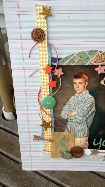
And one of my sons was on my mind.  He seems to be in a good place now after a rocky year or two. So I pulled out the pieces of the May Studio Calico kits that I had left and ended up with a layout about his journey and my frustration with my inability to fix things for him these days.  It was very cathartic and actually is one my favorites in a while.  It seemed like the pieces I had left to use related directly to how I was feeling.  (And it was a great way to use an extra print from his senior pictures.


The journaling is very personal and is in a glassine bag behind the photo block.  You can see the edge of the bag.  It is accented with a Basic Grey clip.


I tried cutting the wood veneer sheet from the kits with my cricut for the title.  It didn't come out perfectly, but I liked the distressed feel.  The wood is colored with spray ink.


the vertical strips are labeling edges from the patterned paper in the kit.  And they provided a perfect anchor for the different embellishments I wanted to incorporate.

Have a great Thursday!  Its the last day of school for my daughter.

Tuesday, June 4, 2013

Grid Design and Studio Calico Weekly Challenge

Its no secret that I love grid design.  Its a great way to mix papers and embellishments while keeping a clean look.  But I always end up with overlapping blocks on my grid.  So this week's Sunday sketch at Studio Calico really inspired me to try a grid design without overlapping the blocks.

Here's my take using elements from the Planetarium, Orion and Lyra kits.  I did a pretty good job of keeping each block separate (except for that wood veneer polaroid frame in the middle of the page.


This was a great way to use up scraps and I had lots of fun mixing embellishments in the different blocks on the grid.


And I like that I could have replaced other blocks with photos if I had had some related pictures in my pile to scrap.  

Hope you have a terrific Tuesday.

Monday, June 3, 2013

The Perfect Alpha for Sports Layouts - From The Pier

If you follow me at all, you know that I do tons of sports layouts - with two athletic sons, it's inevitable.  So I'm always looking for supplies that work well on those layouts.  And the letter tiles from Crate Paper's new line, The Pier, might be the best I've ever found. 

The size, the font, and the color all have a great feel for those sports pages.  Check out this soccer layout.


See what I mean?  I may need about a zillion packages of those letters - and it would be great if I could get some in black or charcoal for some different team colors.


This is one of my favorite sports layouts because it uses no sports themed products at all.  It makes it really different from the other soccer layouts I've done.


And even better, other than the base paper, all of the patterned paper came from my scrap file.

I'd love to see your ideas for using scraps and products for unintended themes.  Leave me a comment and/or link me up.

I'm home today to recover from graduation and hope I get motivated to play in my scrap room.  Hope you have a marvelous Monday!

Saturday, June 1, 2013

A Graduation Card - Let Your Light Shine

I just about never make cards - maybe 3 in the past year.  But I'm a really proud mom this weekend.  My son is graduating from high school, and he has grown into an amazing young man.  This week he shared a speech titled "Knowing and Loving Yourself" that he gave as a senior retreat leader with this quote as a theme:

"Our deepest fear is not that we are inadequate.  Our deepest fear is that we are powerful beyond measure.  It is our light, not our darkness that most frightens us. We ask ourselves, 'Who am I to be brilliant, gorgeous, talented, and fabulous?"  Actually, who are you not to be?  You are a child of God.  Your playing small does not serve the world.  There's nothing enlightened about shrinking so that other people won't feel insecure around you.  We are all meant to shine, as children do.  We were born to make manifest the glory of God that is within us.  It's not just in some of us; it's in everyone and as we let our own light shine, we unconsciously give others permission to do the same.  As were are liberated from our own fear, our presence automatically liberates others."

He originally heard the quote in the movie, Coach Carter, and learned that it was originally from Marianne Williamson.  When I read his speech, I was incredibly moved by his insight into who he is and the journey he has taken to date.  I was impressed by the confidence and maturity it took to share his own strengths and weaknesses with his peers and with his ability to share his challenges with his classmates. 

So I decided that I would not take the easy way out.  I would make him a card - and try to include messages related to the speech I read in that card.  After all, he's pretty amazing and deserves a card as unique as he is.

I started with a scrap of paper and then pulled out a 12x12 sticker sheet from the new MME collection Find Your Wings and Fly.  The sentiments were perfect.

The sentiments on the stickers were perfect and I loved the colors.  But the pennant sticker was two long.  So I cut off the top and used the striped piece as a layering element.  And of course, washi and enamel dots make everything better.


I wanted to continue the positive messages on the inside.  So I combined a couple of Studio Calico Project Life cards with another stickers from the MME sheet - and of course, a little more washi.


And then I tried my first envelope ever.  While it was a bit large for the card, it was perfect for the lottery tickets I was tucking inside. (We will buy him a new computer to take to school in the fall, but the day itself calls for something fun.)  I used a piece of patterned paper from I Lowe Scrap for a really fun look.


I'm excited to have a really special card for Nicholas.  He's certainly made our lives richer and I want him to know how special he is.

Have a great Sunday.

Tuesday, May 28, 2013

Scraplift

I love scraplift challenges - I see so many layouts that are full of inspiration, and the push to put my own spin on some of those great layouts is awesome.  But I never think about lifting myself.  So on Monday I was surprised and excited to see this layout of mine posted as the scraplift challenge at My Scraps and More.


It just so happened that I was sitting at my desk with three sheets of patterned paper and three rolls of washi trying to get started on a layout when I saw the post.  I wanted to do something for this week's washi challenge at Chic Tags.  And I immediately had an idea for this two page layout about a special breakfast I cook for my son on days when he has a big challenge - a big game, a big test, college boards. 

Here's what I came up with.


This layout is so different from the first layout.  I replaced the sequin cluster at the top of the page with a larger embellishment cluster.


The cluster is a combination of Amy Tangerine paper, Crate Paper die cuts (The Pier), sequins, ink splatters, enamel dots, wood veneer and basic grey die cuts.  And because I converted the layout into a two page layout, I wanted to balance this cluster with a cluster on the second page of the project.  I used this horizontal cluster.

 
This cluster included transparencies from Glitz and Basic Grey, the same Amy Tangerine paper, sequins, wood veneer and enamel dots.  The vellum heart is "vintage" Amy Tangerine.  I will be finishing this off with some journaling about making these special breakfasts for my son.

This layout was lots of fun - and I learned an important lesson.  When I'm stuck, I don't always have to go online or look at the work of others.  Just looking at layouts I've done in the past can be enough to give me that push. 

Have a terrific Tuesday.

Monday, May 27, 2013

Layouts Within a Layout

I'm working feverishly on my son's senior album (even if I probably won't get it done before graduation next week), and was seriously stuck on homecoming.  His high school has a week of events, and I had some seemingly unrelated pictures from those events.  And I had only a couple of pictures related to the dance (only from before they left).  I finally decided to treat each photo as its own mini layout.  Here's what I came up with.


It was a interesting chance to apply some of the lessons from Pop Off The Page 2 to a two page layout. 


The first page included two mini layouts.


 I used small alphas to label each picture and Martha Stewart tags from the office supply store to number the pictures.  The journaling block on that page used those numbers to link the journaling to the picture.  And it gave me the chance to document an event without a picture.  I simply added a piece labeled "Not Pictured."

The second page was about the dance - I had a few more pictures, so I treated that page as a full page layout.


 I added my layers along the border of the page at the top and in the block at the bottom of the page that included that round tag.  The journaling again referenced the number.


The embellishments on this layout were really simple - I had a small package of mixed stars from Jolee, cut a few more about scraps of POW paper with my cricut and mixed in the asterisks from my thickers pack.


Hope you enjoy your Memorial Day.  I'm looking forward to a quiet day at home with my family, but will certainly spend some time reflecting on the sacrifice the men and women in our armed forces make for us. Now that my children are older, I have watched many of them join our military with a sense of pride, and it has made it much more personal. 

Have a great day!

Sunday, May 26, 2013

Sequins!

I've long admitted to loving buying and having scrapbooking supplies almost as much as I love using them.  But sequins may be my biggest weakness ever.  They are so pretty, so inexpensive and come in so many colors and patterns.  I have lots of solid colors, different sizes, some with stars on them, some with polka dots and some with other patterns.  I just can't seem to help myself.  What's a girl to do.

Well, first I tackled the issue of storage.  I wanted to be able to store each color separately, I wanted the storage to be easy to use, and I didn't want it to take a ton of space.  So I found these seed bead tubes.  The big ones are perfect for individual purchases and the short ones are great for smaller quantities. 


The short ones will even stand in my "poor scrapper's" version of the harbor freight spinner.  And the large ones stand in a basket.


And then I did what any commited scrapbooker would do - I put together a layout about my sequins - it may not be great art, but seeing all those pretty colors on one layout makes me smile.  And it does remind me to make something every day.


Have a great Sunday!

Saturday, May 25, 2013

Making A Splash With Crate Paper


This week's challenge at Crate Paper was Summer Splash. And I couldn't resist giving it a shot.  The prize is the entire collection from "The Pier" and some American Crafts Basics.  And The Pier is one of my favorite collections ever from any manufacturer.  Your layout has to be mostly Crate Paper and has to use at least three Crate Paper products.

When I've played with The Pier in the past, I've focused on the bright and pastel shades in the line. But this time I was inspired by the B side of the Frozen Treats Paper.  It is a kraft base with a green ombre effect that gets deeper as you move toward the bottom of the page.  It really reminds me of water and sand meeting at the beach.

I wanted to do something that used only blues, green and neutrals to emphasize that feel of water and sand.  First I pulled all the paper I had from the Pier that focused on those colors.  Then I pulled other Crate Paper sheets that were in my color range - I couldn't believe how much paper that was.  I added a sheet of white handmade paper that had great texture and started to layer.

And I knew that I wanted to play with my favorite embellishment from The Pier - the slide frames. I chose pieces in blue, white and brown for my project and used gold spray ink to soften the white ones.  Then I layered them to frame my layout.  I let a couple of them run off the page or under my photo block and cut the ends off them.  Those ends ended up being incorporated into the photo block.


I layered lots of bits of paper for my photo block.  The base is from the Fourteen collection and you can find other papers from that collection and from The Pier in the layers.  A couple of scrap of glitter paper and some pieces of the white handmade paper finished the block.

To finish the layout, I focused on embellishments from The Pier.  You can see a strip of polka dot tape from the washi sheet peeking out here and there and I used a couple of labels and a geotag from the sheet of label stickers. A MME enamel dot accented the geotag.  A clothespin from The Pier clothespin set accents the photo.


I don't usually like clothespins, but have to admit to loving these.  And somewhere I read a tip about taking them apart to reduce bulk which really helped.

I wanted to use a pinwheel, but it seemed to overwhelm my layout.  But when I cut it in half (which turned into three pieces), the smaller pieces worked perfectly. 


Finally I added a title using the fun thickers Crate Paper showed with The Pier.  And, of course, no layout is done without a few sequins scattered around.


And all of it works with the photo of my daughter playing in the Lake Erie waves.  Have a wonderful weekend.  I'm hoping for lots of play time in my scrap room.

Friday, May 24, 2013

Documenting A Soccer Season

If you read these posts often, you know that I try to do a "year in the life" album for my kids for every year.  As I've worked on my boys' albums, sport seasons have become a huge challenge.

The sports seasons are a huge part of their lives and very important to them.  By the time we go to all those games, there are literally hundreds of pictures.  And I'm just not able to narrow the photos down to pages for one or two pages.  So I always end up with multiple 2 page layouts.  And in the various albums, I've tried to make them look alike, I've tried to use a common design element (e.g., stars) to connect them, and I've just ignored the connection.  All of the approaches have pluses and minuses.

But lately I've been working on Nicholas's senior year album and I tried something different.  I pulled together a kit of papers, cardstock and embellishments that I used for the layouts - there were 7 this year.  After that I didn't worry at all about the connection. The end result was cohesive layouts that were still visually interesting.

The papers were mostly Fancy Pants and Simple Stories, but the green was Echo Park and there is a red chevron from Jillibean. I had themed embellishments, wood, stars, sequins, vellum arrow die cuts and enamel dots in my embellishment stack. 

Here are the layouts (and some things I learned):


By using the same background paper on all the layouts, I created a feeling of "a mini album inside a larger album.


Washi tape was a great addition to the kit - a quick and easy way to add interest to pages and able to be used in a lot of ways.


The Martha Stewart chalkboard labels were a great way to add consistent journaling throughout the series of layouts.  And mixing themed and non themed embellishments created added lots of interest.


Using the same thickers throughout was a great unifying touch.  And use thickers from an coordinating set to add the uniform number to sports layouts as an embellishment.


Experiment with different shapes and title treatments for interest.  This circle layout ended up being one of my favorites.


Combine a frame with a themed embellishment to create an interesting embellishment. 


Think out of the box when your journaling.  I printed the bio he wrote for the senior night presentation on vellum here.

Hope this gave you some ideas for your sports season layouts.  I'd love to hear your ideas too. 

Have a fantastic Friday.

Wednesday, May 22, 2013

Poppy!


I read lots of challenges - looking for inspiration - but don't have time to do many of them.  And I read lots of design team calls - looking for courage to apply, but always chicken out.  This week has been no exception.

In the last few days I saw a sketch using lots of  tags. I loved the sketch, but can't find it back.  (I know - I need a better system, but I will share it with you when I find it.)  Then I read the Chic Tags Sunday challenge - incorporate gold into your project.  And then, to top it off, I saw a DT call from Little Yellow Bicycle looking for team members for a new line.

Then I happened to be in my LSS and saw the new LYB line, Poppy.  The colors are so bright and fresh, but still have a softness about them.  They really were my perfect summer palette.  I bought almost every piece of the collection they had.  Then I came home and made this layout.


I used papers from the collection and almost the entire package of these journaling tags - they were so much fun to layer. I used gold ink on some of the edges to help make them pop.   And I used the cardstock stickers to embellish one of the cork tags from the LYB Naturals line.


But my LSS didn't have the full line and since I am have tons of fun with transparent elements lately, I especially missed the clear cuts.  Fortunately I was able to add pieces from the clear cuts for the Just Because and Hello Fall Collections.


The colors in the Hello Fall pack were really perfect.

I also played with the vellum tape strips (a new product for me) and added some gold sequins and some MME Boy Crazy enamel dots (because who can do a layout without sequins and enamel dots).


Now I'm off to find that sketch and to read that DT call again.  Maybe this will be the time I enter?

Have a wonderful Wednesday.