Pages

Showing posts with label Amy Tangerine. Show all posts

Sunday, March 26, 2017

Black and White

If you visit here much at all, you know that I love mixing colors, patterns and textures.  It is my favorite thing about scrapbooking. But sometimesa challenge helps nudge (shove) me out of my box.  This week I came across two challenges that would take color (mostly) out of the mix. 

One of the March "Layout A Week" challenges at Studio Calico asked that you make black and white the focus of your project.  And one of the challenges at the Paper Issues Spring Crop called for a monochromatic layout.  So I went for it.....

I limited myself to black and white (and a little gold) for a layout.  And to be honest, I kind of love it.

I focused on mixing patterns and textures while trying to maintain a "light" feel.  The black plastic grid was from an ancient Studio Calico kit and had been hanging on my peg board forever.  When choosing papers I used two vellums (because they add lots of texture without adding much visual weight) and patterns that were predominantly white.  A chalkboard shipping tag added a different texture and a pop of black.  And the black and white photo really pulled it all together.

I'm not giving up all those pretty patterned papers but this was a fun exercise with a great end result.  And that nudge out of my box is the reason I love creative challenges.  It pushes me to try something different I never would have tried.

I hope you're finding your own scrappy time.  Try something new the next time you sit down to play.  You might just love what you make.


Tuesday, May 10, 2016

Mixed Media Effects With Rub Ons

I love the fun backgrounds I see people create with all the amazing mediums available.  But I am a little bit scared of paints and other mixed mediums on my layouts - I don't use them enough to be really comfortable and I feel like I don't have control of what I'm creating.  So I've come up with a fun technique using rub-ons that creates a similar effect. 

I love rub-ons and almost always snag them when they come out these days.  But I don't always remember to use them.  And I've learned - the hard way - that rub-ons get old.  Eventually they either don't want to release onto my project or they leave part of the image on the protective sheet in the packaging.  But they are still a great source of color and are fun to use.

Here is a layout where I used lots of old rubons - I started with a pretty piece of patterned paper from Pinkfresh Studio along one side of my layout.  Then I pulled out rubons that seemed to coordinate to create a mixed media effect.


There are a couple tricks to this technique -
  • Make sure you get incomplete images - you are creating color and texture and not shapes or images in most instances.
  • Layer the rub-ons over each other.  It creates a more irregular effect and adds dimension.
  • Adding in some black and white words or images helps anchor the effect
  • Make sure some of the rubons go on to the patterned paper to tie the two elements of the layout together.
I added some ink splatters in coordinating colors to finish the layout.  And I didn't do it here (mostly because I was lazy) but adding in tiny enamel dots, sequins or bits of wood veneer can really make the whole thing pop.

So there you have it - a mixed media effect with no mess.  It's super easy and a great way to use up those rub-ons in your stash. 

Thanks for stopping by - have a great Tuesday.


Monday, May 2, 2016

Those Words

Every so often I read a blog post where someone is talking about being inspired by product.  And I never quite understand - I love all my pretty paper and embellishments but they don't really inspire a project. 

But then I got my hand on these acetate words from the Life Noted Collection by Pinkfresh Studio. 


I had a pack in my stash but haven't cracked them open.  But a partial pack came in my April Citrus Twist kits - And they are amazing.  The colors are bright and fun, but the translucent nature of the product adds a certain lightness. I immediately tried to use as many of them as I could on a single layout.

My first idea was to use them to create a patterned paper feel across the bottom of my layout - and that looked pretty awesome, but I couldn't figure out the rest of the layout.  So I ended up with a basic grid design.

Products from April kits at Citrus Twist kits

They were so much fun and really framed the photo perfectly.  I was also excited to see how well they worked with other embellishment pieces - especially the Amy Tangerine Better Together rubber bits. 

I've just about used up the ones that came in my kit - now the challenge is to keep myself from hoarding the pack I have in my stash.  Oh - and when I was looking for a product photo for this post, they were gone at most of my favorite online stores.  But it turns out they are on sale at Scrapbook.com.

Hope you have a great Monday. 

Sunday, May 1, 2016

Turn It

My Creative Sketches is one of the first places I check when I need a little inspiration.  But this month I really struggled to make the sketch work for me.

I really don't know why - the design seemed to provide for lots of layers and embellishments - my two favorite things.  But I was stuck.  Then I turned the sketch on its side - literally.  I printed it and turned it on its side.  The layout practically flew together then.

Most supplies from April kits at Citrus Twist kits

After I created the basic design with the circle shapes and paper strips I played with embellishments.  My favorite thing here is the large Pinkfresh Studio acetate word that layers over the photograph and several of the patterned papers.  I feel like it really brings the whole thing together.

Hope you're having a great Sunday.  Thanks for stopping by.

Monday, November 9, 2015

Repeating Shapes

Paper Issues sponsored an online crop over the weekend that was filled with great challenges.  (If you want to play along, the challenges aren't due til midnight Saturday, so there is plenty of time.)  One of those challenges was to use at least 10 circle, triangle or square shapes on your layout.  Now this sounds pretty easy, but I was stumped.  (And yes, I know I do a lot of grid design, but nothing was working.)

I decided to use squares and knew I wanted to vary the size of the squares on my layout.  And I picked a picture.  But I spent more time than I want to admit staring at the piece of paper I thought I wanted to use as my base.  Finally I pulled out some scraps of white cardstock and cut them into 3, 2 and 1 inch squares.  Then I moved them around on the base paper until I was happy with the design.

Next I replaced one of the 3 inch squares with my photo.  Then I started digging through my basket of small scraps for papers that coordinated with my photo.  (The photo was of beach glass, so I was looking for a "beach-y" mix of colors.)  Each time a scrap caught my eye, I pulled it out and cut it into a square.  Then I would replace one of the white cardstock squares I had used to develop my layout.  I repeated this process til all the cardstock squares had been replaced with patterned paper.


I used some Evalicious puffy alphas - these are white with gold polka dots - to fit my title into the grid.  Next I added a few trips of washi tape and a puffy rectangle sticker to break up the squares just a bit and link to the rectangular title.  I added just a few embellishments to finish off the project, trying to coordinate with the colors in the patterned paper.  Some gold splats and I was done.

How do you use your scraps?  Link me up to your projects - I can always use some new ideas.

Thanks for stopping by.

Saturday, November 7, 2015

Using Old Rub Ons

Rub-ons are one of my favorite embellishments.  But sometimes I keep them too long.  (You know - saving them for the perfect project).  And then they crack or some of the images stick to the paper backing that is supposed to protect them.  I hadn't had this package of Amy Tangerine rub-ons that long - but when  opened them they looked like a supply I had hoarded too long.


 But these were really pretty and I am a frugal scrapbooker - I hate throwing away any supplies.  So I used them to make a fun background for this layout.


 First I created the two photo blocks and attached them to the base paper.  Then I added gold and teal ink splatters - cause I can't make a layout with splatters.  I used a couple of rub-ons for another package that were still in good shape to start to build the backgournd.  Other embellishments went next.  Then I randomly place the sheet of damaged rubons on the layout (trying to create a connection between the two photo blocks) and added bits of color and pattern.  I didn't worry about overlapping the rub-ons with themselves or with ink splatters.  The title went next.

And there you have it - a beautiful mixed media background using supplies that were headed for the trash.


Saturday, October 31, 2015

Big and Subtle

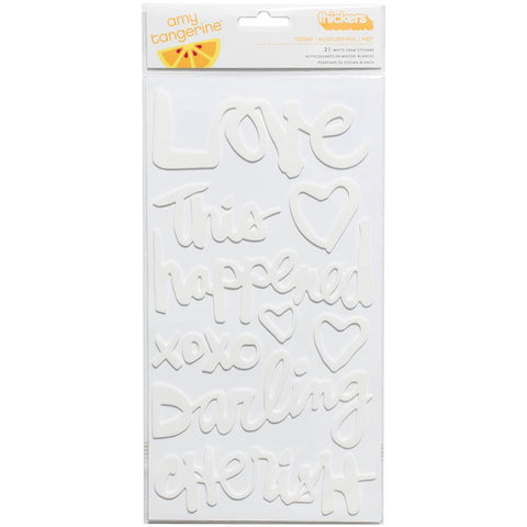
Big titles seem to be on trend right now.  And they can be fun.  But I have to admit to struggling with them sometimes.  I love playing with patterned paper and little embellishments and sometimes a big title just seems like "too much."  But these white Amy Tangerine thickers came with a recent kit
At first I wasn't sure what to do with them since I tend to use light backgrounds for my projects.  But it turns out that they are the perfect way to add a big title without overwhelming a layout.

This layout was inspired by the 4 part scraptober fest challenge - a sketch, a color challenge, a stash callenge (2 kinds of washi) and a photo of yourself
I used a piece of subtle grid paper for my layout base and the big white words pop of the page without overwhelming my picture - or the simple layout design.  And I love that phrase -  "to be continued" - for a layout about me and who I am today.  Because - even at 53 - I think I am most definitely a work in progress.

I'd love any ideas you have for the white thicker words .......I have the rest of the package to use up.

Thanks for stopping by.


Monday, October 26, 2015

A Photo On Vellum

I almost always order my prints - for the past 18 months or so it's been from Persnickety Prints.  But I've been wanting to experiment with printing photos on vellum (I think it might be a great technique to incorporate into a December Daily.)  So when we went apple picking, I decided to give it a try.  (I have a fairly basic inkjet printer.) 

I picked a photo of two apples and gave it a go.  The ink was visibly wet when it came out of the printer so I set it aside to dry for about an hour.  The end result was definitely worth waiting for - it have a beautiful soft feel that I wouldn't have achieved on cardstock.

products from October Citrus Twist kits.

I did run into a problem when I started to build my layout.  If you visit very often, you know that I like to layer lots of patterned papers.  And I found the patterns showing through my photo and changing the look of the image.  (In some instances I think this would be a great effect, but not what I was going for here.)

 I tried placing it on white card stock, but I lost a lot of the translucent feel the vellum brought to the table.  So I ended up layering a second piece of plain vellum under the photo and that worked perfectly.  And you can see where I used my tiny attacher to add the photo to my layout.  (I didn't want the adhesive to mar the image.)

I definitely will play with this technique again - it is so much fun and creates a unique look for the photo.  If you have any tricks you use to print photos on vellum, I'd love to hear them.

Thanks for stopping by.

Tuesday, July 28, 2015

Quick and Easy

I spent last Thursday - all day - cleaning up my craft room.  My daughter (who is only 15) could be a professional organizer. She helped me empty it out, sort through baskets, purge, and put it back together.  Late that night I had a clean space and was ready to play.  But after 1 quick layout, we went out of town. 

And when we came back I had to do something about the purge piles in the living room.  So it wasn't til last night that I had a chance to play again in my clean space.  I pulled together a quick layout using the newest sketch at Stuck!


I started with my July goodies from Citrus Twist (which currently hold the place of honor in the top of my Raskog).  I added a few scraps from my stash and couldn't resist the sevenpaper puffy hearts. 

Some gold ink splatters and I was done.  I'm hoping to play some more this week, but have a feeling my scrap time is limited until the weekend. 

Hope you are finding time to play.  Thanks for stopping by.

Monday, June 29, 2015

Kit Review: Hip Kit Club

This is the second post in my weekly kit review series.  Last week I looked at the June Citrus Twist Kit Club scrapbook kit.  This week I'm focusing on Hip Kit Club.  I had the May scrapbook kit to play with.
The kit was a great mix of products and colors from Dear Lizzy, Pink Paislee, and Chickaniddy Crafts. I especially liked the addition of the Chickaniddy Crafts papers and embellishments, because it is a line that I rarely purchase.  Its always fun to play with something knew.    The kit came with two alphas - both a package of Thickers and a Pebbles mini alpha.  Since I am something of an alpha addict, I loved that.  And this kit also included Evalicious puffy stickers and wood veneer phrases.  I'm a huge fan of including small business products in kits and Evalicious is a favorite of mine.  This kit did not include a stamp (not a big deal for me but something to consider if you really love stamping.)

So the test - could I make a layout.  Here is what I came up with using only the main kit. 

design inspired by sketch at My Creative Sketches
The mix of papers, Citrus Bliss die cut pack, and the Evalicious wood veneer pieces worked perfectly with this picture of a favorite piece of beach glass (a heart made from a beer bottle - too cool right?).  I used pop dots and inked the edges of some of the die cuts to help create interest.  The layout came together quickly and I have lots of  supplies leftover.

The kit is $29.95 for subscribers and $34.95 for non-subscribers. Subscribers get a 15% discount on add-ons which is a great perk.  If you subscribe, the initial commitment is for 3 months (which is probably the right amount of time to decide if a kit subscription is working for you).  After the first 3 months, you can cancel at any time with 30 days notice.

Hip Kit Club offers a number of add-ons each month.  There is an embellishment kit that can really stretch your kit, a patterned paper kit which provides an extra sheet of the paper in the main kit and a cardstock add-on.  (The main kit doesn't include cardstock but I rarely use cardstock so that's a win from my perspective.)  They also offer a "Color Kit" which would be a great way to experiment with multi-media products and techniques and a project life style kit.

The kit was bright and fun.  I had a great time experimenting and the pieces I didn't use moved right into my stash.  The products were things that were versatile and that I would use.  It is definitely a great kit option, especially since you only need to make a 3 month commitment to get the lower price. 

I still have Studio Calico, Scrapbook Circle and Felicity Jane kits sitting here to review.  I am also looking at adding others to my list.  I love the suggestions you all have made.  Keep 'em coming. 

Thanks for stopping by.


Monday, June 22, 2015

Kit Review: Citrus Twist Kits

Note:  This series was in the works before the recently announced changes at Studio Calico.  

I celebrated my three year anniversary as a Studio Calico Subscriber this month.  In addition, the 36 main scrapbook kits, I've purchased tons of add-ons, card kits, and project life kits over that time.  I still remember how excited I was when that first kit showed up on my front step (it was So Cal).  And I still get that same thrill each month.  But it seems like there are many more kit choices these days.  And I have to admit to being curious about the choices out there - is Studio Calico still the best fit for me?  So I am beginning a weekly series where I will look at one of the kit offerings each Monday. This week I am focusing on the June offerings from Citrus Twist kits.

In an effort to make fair comparisons, I am going to focus on the main kit each week.  The June kit from Citrus Twist is just lovely!  The colors are bright and fresh and its a great mix of manufacturers/  There were patterned papers from Pink Paislee, Amy Tangerine, SevenPaper, and Crate Paper.  The mix of embellishments is great too - I especially loved the Evalicious puffy stickers and the frames (a partial pack from Crate Paper).  They also include exclusive wood veneer pieces and an exclusive stamp in their kits. 


For me the ultimate test of a kit is whether it is easy to work with.  Now I struggle with limiting myself to a single kit when I scrap, but I am making a real effort for this series.  Here's the layout I made - I added a piece of vellum from my stash but the rest of the supplies were from the Citrus Twist Scrapbook kit.


The kits was super easy to play with and lots of fun to work with.  And check out the glittery pink and orange stars.  They were such a fun touch!  I had tons of product left after I finished this layout too.

The pricing structure is based on different commitment levels ranging from $26 for a six month commitment to $32 for a one time purchase. Shipping is additional.

And while I'm focusing on main scrapbook kits (mostly) in this series, I wanted to mention the add-ons here.  I really loved the different kinds of add-ons and the choices it provides.  There is one traditional add-on, two different patterned paper add-ons (which I love since I am a bit obsessed with pretty paper), an embellishment add-on, a "sprinkles" add-on which is a mix of bits and pieces (often partial packs), a stamp add-on, and a couple of cardstock add-on choices.  I love that I could pick the kinds of products that would really help me stretch my kit within my style.  ( I got the traditional add-on, the sprinkles add-on, the embellishment add-on and both patterned paper add-ons).  But I rarely use cardstock or stamps, so I left those there.  Citrus Twist kits also offers a project life style kit.  (Yesterday I shared a layout mixing products from my entire CTK haul)

So I loved my Citrus Twist kits and actually made a 3 month commitment.  And I'm thinking about switching to a 6 month commitment.  Oh - and I should add - your 13th kit is free!

So I have stashed away kits from Felicity Jane, Hip Kit Club and Scrapbook Circle already.  And of course I will be reviewing a Studio Calico Kit.  But what others are you interested in or do you think I should try? There are just so many choices.  I'd love to hear your thoughts. 

Thanks for stopping by.

Tuesday, May 26, 2015

Two Layouts with the Same Paper

So I know you are sick of hearing about The Big Purge.  But one incentive for finishing up the project is trying to reduce the amount of time I spend choosing supplies for a layout.  Picking the paper can take longer than actually coming up with a design and putting it together. 

But what happens if you try to get two layouts out of the same papers - I almost never use a whole sheet unless it is a base for the design.  So Friday night I wandered into my scraproom to play and picked two papers.

This pretty pink from the Amy Tangerine Rise and Shine Collection - I love the way the pink shades toward peach shades.


And this yellow from Fancy Pants Office Hours (I love the texture of this paper)


Then I pulled a brand new sheet of vellum from the Crate paper Poolside collection from my stash.  It has a great weight and the glittery swiss crosses add something special.
And while I was going to embellish from my stash as it made sense, I did pull a doily and this chipboard pack from the Pink Paislee Citrus Bliss Collection.  The bluses, pinks, yellows and golds seemed to work perfectly with the papers I chose. 


And of course, I had a basket of scraps on my desk to use to add layers - and all the other treasures buried in my scrap room.

The first layout I came up with was this soft dreamy layout using an old picture of my oldest son and daughter on the beach.  The design was inspired by a sketch at Citrus Twist Kits.


I love the extra detail the patterned base sheet adds.  And then I saw a grid layout that caught my eye - and you know I love a good grid.  So I made this layout. 

I added some dear lizzy scraps and some labels and other bits, but came up with a layout with a totally different feel. But using the same papers as my starting point meant I put two layouts together in about 3 hours - super fast for me.   And there was less to clean up. 

Thanks for stopping by.

Tuesday, May 5, 2015

3 Cards

I'm a scrapbooker, but I really love making cards.  For me they are super quick and easy - and a great way to use up scraps.  So I took a few minutes to make some mother's day cards - for my mother-in-law, for a special aunt, and of course for my mom. 

The first one uses some paper from the Studio Calico Lisse Street 4x6 pad, a scrap from my scrap basket, a piece of doily, a sticker, and a dear lizzy thicker word.  I used pop dots to add different pieces so the card has a lot of dimension.  That meant stacking popdots in some cases so that pieces were supported as I overlapped layers. And that glittery tag - it's from Ashley Calder's etsy shop.


The next one was even easier.  I used no tools - not even scissors.  I just dug for scraps that worked together and were the right size.  The flower was from an old Studio Calico cut file and was just hanging out on my desk.  I think the pink ink inkspatters pull this all together - especially the way that some landed on top of the flower.


The third card was super easy too. The three patterned papers came  right from my scraps and needed just a little bit of trimming.  That big gold rose was on a Crate Paper sticker sheet that is almost used up.  And the rosette was left over from another project.  And that label - it is from Studio Calico and was perfect for this card!


So dig into your scraps and put together some quick cards.  And link me up so I can see.  I always like some new inspiration.

Thanks for stopping by.

Monday, May 4, 2015

Trying New Things - Silkscreen

Did you have a chance to play this week in celebration of National Scrapbook Day?  I love all the challenges that get posted around the world - they tend to push me out of my comfort zone so that I try new things (or at least experiment with products and techniques I rarely use.  Silkscreens are a great example.

I have a few silkscreens - mostly from Studio Calico kits - but I rarely use them.  I love the thought of them and I love the look you get, but I'm not very confident with them.  And I rarely want to take time to let a project dry.

But this weekend, I got those babies out - twice.  I use done with acrylic paints here and it was super easy.  I figured out approximately where I was going to put my photo and then laid the silkscreen down next to it.  I put little dabs of color theory blush crush and 24K paint on the silkscreen and then smeared it around so the colors blended and I had a random mix of pink and gold.  The only problem I had was that my silkscreen was small and I had to reapply it several times to cover enough of the background for the look I wanted.


The second time I got out my silkscreens, I used them with watercolors. I used a small piece of watercolor paper and adhered my silk screen.  I then applied different yellow, orange and pink colors across the silkscreen to create a title block for a simple grid layout.


Oh - and those clouds - a stencil with gesso.  And I painted that veneer butterfly.  I was using those supplies.  Now the trick is to keep the momentum going.

So did you try anything new this weekend?  Link me up.  I'd love to see.

Thanks for stopping by.

Sunday, April 26, 2015

Top and Bottom

Sometimes I feel like my layouts all look alike - either grids or a slightly off-center photo block - or some combination of the 2.  So the current sketch at Stuck! was a great jumping off point for something different.


The sketch placed the design elements at the top and bottom of the page.  I had several false starts before I actually managed to put a layout together.  But it was really perfect for me - different but I still got to play with lots of layers and little bits..


I moved the layers on the top so that they were diagonal from the photo block in the bottom of the page.  It felt more balanced to me.  And the title in my layout ended up (more or less) centered. 

I found that using a sheet of patterned paper with pattern and texture helped make the sketch work for me.  I am definitely white space challenged.

So am I the only one who feels like they are in a design rut?  How do you keep your layouts fresh?

Thanks for stopping by.


Saturday, April 25, 2015

Vellum!

I have lots of scrap related obsessions, but lately vellum has been on the top of the list.  I love that it has been included in collections in lots of colors, prints and textures lately.  And I have quite a stash.

Most often I use it for layering in a photo block.  But when I saw the current sketch on the My Scraps and More Sketch Blog, I decided to try using vellum as the inspiration for my layout.  The sketch uses lots of strips of paper and I thought it would be fun to layer strips of vellum.


The layered vellum strips created a light girly look that i really like.  I mostly used strips from my scraps. And I added in a few strips of white and gray patterned paper to make the strips feel more substantial.   More vellum and a glassine bag to create a photo block finished off the layers across the page.


I dug out some old Basic Grey chipboard alphas for the title and added some embellishments.  And I just couldn't resist that floral stamp from the Studio Calico Lisse Street kit.  I lvoe that it looks like a doodle.

Thanks for stopping by.

Wednesday, April 1, 2015

No April Fool's Trick - The Blog Is Back

So I've been away - for months - after planning and being sure that I could maintain my blog.  But this winter did me in (not quite literally).  We had the Christmas chaos and then just before the holiday I started getting sick.  And I stayed that way til early March.  I fell on the ice and snow walking the dog (more than once).  And through it all I wasn't feeling very creative or productive.  So I didn't really have much to blog about.  But in the last couple of weeks my scrappy mojo seems to be back.  So I am ready to get back to my blog. 

First thing's first - I have an open giveaway from way back in November/early December and I need to pick a winner.  (I know its Christmas supplies, but if you are like me, Christmas themed pages and projects cross your desk throughout the year.)


On November 17, penny said:

Wow! Great giveaway. I can't wait to see how your album progresses. I have never done a holiday book. 

Penny, email me at juliee181 at gmail dot com to claim your prize.  And guys, I really apologize for the time it took me to name a winner.  I promise to do better.

Now - what have I been working on?  Lots of good stuff. Last week I was playing in the Paper Issues crop.  My projects included three quick cards I though I would share.

The first challenge I am sharing required the color orange and stamping.  Here's what I came up with.

 
The design is super simple - the patterned base paper does most of the work.  I just added a label, a frame, and a tag.  Epoxy stickers from the new Amy Tangerine collection were the perfect finishing touch.

The second was for an alphabet challenge.  I used the awesome ampersand vellum from Webster's Pages and the bold tile thicker for my basic design.  The fun part was punching stars from tile style mini alphas to finish it off.


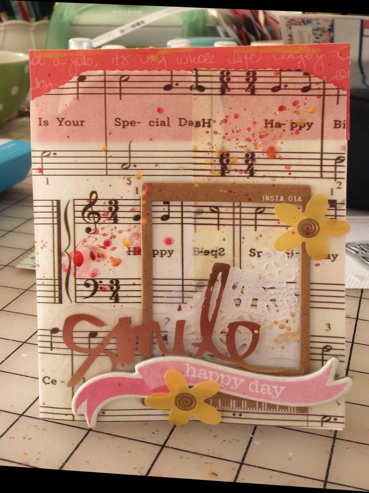
The third card was to make something connected to music.  I had a bag printed with the music for happy birthday that had been hanging out in my stash for a really long time.  So I cut it apart to serve as the base of my card.  Then it was all about the layers.  I love that I used lots of bits from my stash for this card and ended up with something fresh and pretty.


 Thanks for visiting.  I'll talk to you soon.

Saturday, November 29, 2014

Obsessing Over Die Cuts

I love adding layers and little details to my layouts.  So I am thrilled with all of the die cut and ephemera packs that have been coming out with the new collections.  They provide quick and easy layers, can provide places to journal and add details that pull your eye through a layout.  I think thee are die cuts on almost every layout I do these days.

I sort my die cuts by color and store them in Elle Avery envelopes that way.  So most often I mix and match die cuts from different manufacturer's and collections.  But this layout was a layout I made using the November Studio Calico kits.   One of the add-ons included the ephemera pack from the newest Maggie Holmes collection - Open Book.

 
When working with a kit, I usually start with the patterned papers.  I pick 3-5 that I really like together and lay them on the desk.  For this layout I had 3 papers picked - the navy text, the pink dot, and the mossy green chevron.  I had a scrap of the purple Basic Grey paper sitting there from a prior project.

My initial idea was to layer the three papers I'd chosen on the picture.  But I couldn't get it to "work."  Eventually I pulled the layers apart to create a horizontal block across the layout .  I really liked that, but the picture didn't look right (I'd already cropped it with my original concept in mind and I had way to much space on one side of my layout)  

I started by building up the photo block, adding a piece of the purple Basic Grey scrap and another paper from the kit - the white with cork polka dots.  I folded a glassine bag that was used to pack kit embellishments in half under the photo  - this is a great way to add texture and dimension and to reuse packing material.  This gave the photo more weight but I still needed to balance it on the other side of my layout.  

Those die cuts really came to the rescue - I took a smaller piece of the purple scrap on my desk and placed it opposite the picture.  I layered three die cuts to create an element on my layout that balanced the photo.  I added a gold polka dot tag from Pebbles to the cluster and placed a kraft thicker heart from Amy Tangerine on top of the tag.  I used enamel dots to hold the tag string so it looks like the tag is hanging on the layout.


To finish I added another diecut cluster at the top of the page, mixing in antoher one of those kraft thickers and a label from my kit. I love that floral banner


 A shipping tag die cut went under the photo, a phrase label from the kit went on top of the photo and I added one more die cut to create a third element in the large horizontal piece across my layout.  I pulled some old thickers from my stash for the title and created some hand-written journaling strips to finish off the the design.  (I may be the last person in the world to figure this out, but those journaling strips don't have to be white - I used pale blue cardstock and love the softer look.) And of course, every layout needs some ink splatters (I just need to learn to let them dry before I touch them.I used navy color shine from Heidi Swapp here.


Thanks for stopping by today.


Friday, November 28, 2014

Leather Feathers and Old Photos

I am more than a little addicted to my Studio Calico kits - I get super excited for sneaks, presale and getting that box each month.  One of the biggest reasons is that those kits often push me in new directions.  For example, I am pretty sure I never would have tried doilies or sequins without those kits - and now those are crafting staples.  Same goes for shipping tags.

But this month was really out there.

When sneaks came out, the Concord add-on was super expensive.  And I already had most of the papers.  I did love the Amy Tangerine kraft thickers and I really liked the stamp set, but I still wasn't sold.  But at reveal there were two items that sold me.  The first was the wood veneer world mask.  And I will admit that I'm hoarding that, waiting for the perfect photo and layout.  The second was the leather feathers.  I was fascinated by the idea.  I was pretty sure I wouldn't be able to figure out how to use them, but still couldn't resist.  That kit went right in my cart.

Picture 1 of Concord

And when it came it was beautiful - and I loved the leather feathers -- and I had no idea what  I was going to do with them.  Until Tuesday night.

My son was driving through the night with friends to come home from college in South Carolina for Thanksgiving.  I knew I wouldn't sleep (that mom worry gene)  and was hanging out in my scrap room.  And old picture of Nicholas (he's about 1 in the photo) caught my eye and I decided to pull together a layout to help pass the time.

I started with this week's sketch at Studio Calico.  I loved all the horizontal lines (and am now thinking about trying a vertical version).


I pulled out some papers from my kit and got to work.  As the layout came together I kept thinking about those 3 leather feathers.  They seemed like the perfect finishing touches for this layout.  So before I knew it, the first one was highlighting the journaling.


The second one found its way onto the layout too - it accents the photo block.  And the third and largest feather created the final horizontal element on the layout.


But I was out of feathers and felt like I needed something at the top of the page.  I pulled a wood veneer heart that said love from my stash, colored it with navy colorshine  and added it with a paper strip.


And then the layout was finished


 - and Nicholas pulled in the driveway about 30 minutes later.

Think about scrapping some of those old photos.  Its so much fun to play with those memories.  And it helps remind us of why we love scrapbooking so much!

Thanks for stopping by!

Monday, October 21, 2013

Five Easy Cards

For Studio Calico stamp sale list go here.

More often than not, making cards just frustrates me.  I struggle with the scale and am rarely happy with my end results.  So no one was more surprised than me when I took on the five World Card Making challenges at Studio Calico.  And I had a good time with the challenges - they really helped me focus on specific elements and put together some quick and easy cards. Here's what I came up with.

The first challenge was to use this mood board.

Here's what I came up with.


The second challenge was to incorporate an ombre element.  I used some awesome pink and green ombre washi from Pinkfresh Studio and Amy Tangerine chipboard for this simple card.


The third challenge was to use your scraps.  I used a couple paper scraps, the end of a piece of trim, some Freckled Fawn leaves and a few sequins for this quick thank you card.


The next challenge was to use five of something.  I added five pieces of wood veneer from the Licorice add-on for this fun Halloween card.  I loved adding aqua, a non-traditional color to the mix.


The last challenge was a sketch challenge.  There were several choices, but I chose this one
for this quick card using a Glitz 6x6 card, a strip of washi from the Container Store, some wood veneer and a Fancy Pants tag.


These were so fun and easy I might just be inspired to make some more cards some day soon.  Thanks for looking.  I hope you have a marvelous Monday!