Pages

Showing posts with label Dear Lizzy. Show all posts

Monday, January 16, 2017

Stuck?! on an Angle

I am trying to get back to some of my creative habits that helped keep me scrapping.  One of the best of those was following the challenges at Stuck?! Sketches.  They publish two sketches each month and they usually provide lots of opportunity to play with layers and details.

So while I am wrapping up my amazing 4 day weekend, I decided to check out the current sketch.  I was excited to see that it was a fun diagonal design.


My layouts tend to be either horizontal or vertical in design so this sketch provided a fun challenge.

I started with the January kit from Citrus Twist Kits (my last one for a while) and a photo that brings back all those summer feelings.   I added lots of bits from my stash and created this layout.  There are quite a few pieces from Crate Paper Wonder, an older Crate paper line, Simple Stories, Dear Lizzy and Studio Calico kits mixed in with the pretty supplies from the kit.


I stuck really closely to the sketch and used layers and embellishments to tell my story.  And my tip for the day - check out the packaging - that fun yellow piece with the blue scalloped edge that is one of the bottom layers - that was the backing in the die cut pack from the Fancy Pants Joy Parade collection.  It is so cute and perfect here. 

I will be returning to work tomorrow but am definitely going to squeeze a little scrapping time in.  And you never know - maybe another blog post.   In the meantime, thanks for stopping by!

Sunday, May 22, 2016

Using a Transparency

Transparent elements are big in scrapbooking right now.  And I am a huge fan - I love that they provide opportunities to add color and texture but generally maintain a light feel.  But 12x12 transparencies are coming with lots more color and pattern than ever before - and I think they can be a bit challenging to use.  In fact, my stash is growing quickly - they are so pretty but I end up not using them. 

So when the Spoonful add-on at Studio Calico came with this Dear Lizzy transparency I was determined to use it.


I found the perfect inspiration is a sketch at Citrus Twist Kits. The diagonal design seemed to provide a great opportunity to incorporate the transparency to add color and pattern as a background element.


It turns out - that wasn't as easy as I thought it would be.  I ended up piecing together several patterned papers, including the transparency to create a custom background.


Once the background was done I worked on a photo block.  And I'll admit that I had a hard time with placement - the vertical orientation in the sketch just didn't work well.  I think I moved the block around for 15 minutes and it just didn't look right.  I added the pink and white striped paper from my scraps on a whim - and was really surprised that it seemed to work to anchor the whole thing. 

Because the design was busy and I had used a number of bold patterns, I kept embellishments to a minimum (a challenge for me).  But I thought it was really fun to add a second transparent element with the acetate word from Pinkfresh Studio.  And I was really surprised at how well the hot pink thickers worked on top of the transparency. Finally, I couldn't call it done without a few ink spatters.

So what's accumulating in your stash because you love it but can't quite figure out how to use it.  Challenge yourself to put it on a project this week.  You might just be surprised with the end result.

Have a great Sunday.

Monday, May 16, 2016

Jolly Holiday

My May Studio Calico kit - Jolly Holiday - came last week.  I have to admit that when I opened it, I was seriously underwhelmed.  It just didn't seem to fit my style well, I didn't think the "specialty paper" was special and it seemed light on embellishments.  But I have had it since Thursday and made 5 layouts so far.  Admittedly, I have mixed in bits from my stash with the kit (but I tend to do that anyway).  So I have to say that the kit has been pretty darn inspiring.

The first layout I made was inspired by last week's scrapbook sketch (May 8th) at Studio Calico.

 It is such a fun take on a grid design.  And I had a picture of some pretty macaroons on my desk that I had been waiting to scrapbook.  So between the sketch and Jolly Holiday, I came up with this.


I didn't try to copy the sketch exactly.  Instead I went to my desk and created my own design with the sketch in mind.  The elements that really stuck with me was the series of elements running horizontally across the page, the use of some circles, the strips above the main block of squares and the title placement.

Most of the bits here are from the Jolly Holiday kit and Spoonful add-on.  I am super excited by the bright pink thickers I used for the title.  I wouldn't have ordered them, but they are seriously the perfect pink.

I am still totally in love with the big acetate words from Pinkfresh Studio and was excited to get more of them.  But I tried attaching it with a liquid adhesive here and it didn't work well at all (as you can see) - so I am back to the tiny attacher or an adhesive roller.

And the acrylic bits I added - they were perfect and from a recent haul from Colorcast Designs.  It was hard to part with the asterisk (I get a gold star for not hoarding), but it was just the thing for this layout.

I'm super excited about the kit now - hope you are finding inspiration in your supplies too.

Thanks for stopping by.

Tuesday, May 3, 2016

All the Colors

Sometimes I get stuck in a color rut - lately its been all about blue and yellow.  But the April kits from Citrus Twist had lots of bright, fun colors.  So I went looking for a picture that would work with a layout that uses all the colors.  I found an old one of my daughter looking through her haul on Halloween.

Then I hunted down a sketch that provided the chance to use lots of layers and bits so I could pull out the colors in the photo.  The April sketch at Paper Issues was perfect!


I focused on the layered horizontal elements, the large circle, the banner and the tag for my layout. 


I started with papers from the April Citrus Twist kits - the green, the black and white stripe and the small piece under the tag.  Then I went to my scraps and stash to pull out other pieces.  .  I was excited to used the acrylic "hooray" from a recent haul from Colorcast Designs.  Then I kept adding bits from both the Citrus Twist kits and my stash til I felt like the layout was balanced.  The bit of black and white polka dot paper was the last thing I added - and it made all the difference - it seemed to ground the whole layout.

I hope your Tuesday is filled with all the colors - thanks for stopping by.

Sunday, February 7, 2016

Using Scraps

No secret - I love patterned paper - and I hate to throw even small pieces away.  They are great for making cards, for layering and for my occasional foray into pocket pages. And sometimes its fun to challenge myself to pull a layout together from just scraps - other than the layout base, no cutting into new papers allowed.

The first sketch of the month at Stuck?! was perfect for a "scrap only" layout.  It used several papers and showed three photos.  Since I rarely use three photos on a layout, some of those photos provided opportunities for adding more scraps.


I started with the paper scraps I had left from my January Citrus Twist kits.  Then I went to my scrap baskets to find some other papers to add - using the heart paper as a guide, I chose a piece of red and a piece of navy left from other projects.  From there it was just a matter of using the sketch as a a guide and pushing the scraps around until I layered them in a way that appealed to me.


Because there is so much going on with all the patterned papers, I needed to keep the embellishments pretty simple.And you can never go wrong with hearts and arrows, right?

Do you through your scraps away or hoard them?  How do you store them?  I'm planning a Workplace Wednesday post that focuses on storing scraps but I'd love to hear your ideas.  You know organizing supplies is almost as much fun as using them.

Have a great Superbowl Sunday!


Tuesday, February 2, 2016

A Different Look

One of the best indicators of a great kit is the ability to create layouts with different moods from the same set of supplies (at least in my opinion).  The first two layouts I shared from the January Citrus Twist kits were bright and fun.  The third layout I made with just supplies from my January box has a totally different feel.

My daughter took a selfie of us together at dinner a couple of weeks ago.  I love that we are close and that she likes to post pictures of us together on her social media accounts.  And those pictures are some of my favorite to scrap. 

We were both wearing shades of black and gray and the photo was pretty neutral - I was afraid all those bright colors would overwhelm the picture.  But I found lots of papers in blues and greys in the kit.  They kept the focus on the photo and the story. 


It's hard to believe these products came from the same set of supplies that I used to create the last couple of layouts I shared.  But I love that the kits gave me the option of bright and fun or soft and pretty. 

What do you think makes a great kit?  I'm currently subscribing to both Citrus Twist and Studio Calico and have to admit to loving them both.  But this year is supposed to be one where I use more than I buy in my scraproom.  So I keep trying to choose (so far with no decision made.)  I'd love your thoughts.

In the meantime, I will just keep getting both and splitting the month.  And at least I am (mostly) not shopping outside my monthly boxes from SC and Citrus Twist. 

Hope you're having a great week.

Sunday, December 13, 2015

A Title Page

I like to start each of my kid's albums with a year that ties it to a year in school.  But I dread these pages - for whatever reason, they are almost always a struggle.  And my daughter's sophomore album is no exception.  I've been adding layouts but the first page is blank.

When I saw this month's sketch at My Creative Sketches, I decided to use it as inspiration for the layout I kept putting off - and I still put it off til the sketch link-up is almost closed. 


But I took the time for one tradtional layout last week and this was it.  I took lots of inspiration from the sketch and the opportunity to play along with one of the Christmas Carol challenges at My Scraps and More.  (These challenges are fun because they are inspired by Christmas carols but don't require holiday layouts.)  The O Christmas Tree Challenge was to use a tree, branch or leaves on your layout.

 I used bits from my Canyonlands kit from Studio Calico, my November kits from Citrus Twist kits, and other bits from my stash.  The end result was a fun page using one of her school photos. 


I think it is going to work perfectly as a title page.  And the sketch gave me a chance to use lots of bits from my stash - both old and new.

I am going to try to sneak in some more scrap time this week.  Hopefully I will have some layouts to share and some pages from my December Daily finished.  Hope you are having a great weekend.  Thanks for stopping by.

Sunday, November 29, 2015

A Baby Collection For My Teenager

My baby is going to be 16 this month.  So when the Citrus Kit add-on featured the newest baby collection from SevenPaper (Clara) I thought it was something that I could pass on. 


But it turns out - I couldn't really resist the kit.  Included some products from other lines that weren't so themed, the b sides of the papers were generally very versatile, I loved the phrase stickers and who could pass up those amazing vellum star die cuts.  And it turns out that some of the first products I used from my Citrus Twist November kits were from that add-on.

I started with the November 15th sketch at Stuck?! Sketches.
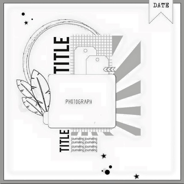


As usual, my layout seemed to take on a life of its own.  I started with an idea that was pretty close to the sketch, but the elements that stood out to me were the horizontal layers under the phtoo and the embellishment clusters.  And I ended up here.


 But I think that is why I love sketches so much - they provide a ton of inspiration and give you lots of room for creativity.

The stars, the text paper, and both the pink and white phrase stickers all came from that baby themed kit.  And they were perfect for this homecoming dance photo of my daughter and her friends.  (I love that she is willing to share photos she and her friends take so that I can include them in her albums.) 

So don't forget to check out those baby products - you might be missing out on something that is perfect for your next project.

Thanks for stopping by.

Sunday, November 8, 2015

When A Circle Becomes A Square

The sketch this month at My Creative Sketches is great.  The design has lots of layers and is really versatile. 


But that big circle behind the photo block really challenged me.  I have lots of tools to make cutting the circle easy, but I was feeling super lazy.  So I made it a big vellum square - this anchored the layout without adding a lot of weight.  I layered frames, labels and tags under the squares to add some of the visual interest the circle added to the original design.


The papers are mostly pink paislee - a mix from the Cedar Lane and Memorandum collections.  They are two of my favorite collections ever!  The colors and patterns are really versatile.  And that paper that is all the patterned stripes adds tons of dimension and interest.

If you use the sketch, link me up - I'd love to see.

Thanks for stopping by.

Saturday, November 7, 2015

Using Old Rub Ons

Rub-ons are one of my favorite embellishments.  But sometimes I keep them too long.  (You know - saving them for the perfect project).  And then they crack or some of the images stick to the paper backing that is supposed to protect them.  I hadn't had this package of Amy Tangerine rub-ons that long - but when  opened them they looked like a supply I had hoarded too long.


 But these were really pretty and I am a frugal scrapbooker - I hate throwing away any supplies.  So I used them to make a fun background for this layout.


 First I created the two photo blocks and attached them to the base paper.  Then I added gold and teal ink splatters - cause I can't make a layout with splatters.  I used a couple of rub-ons for another package that were still in good shape to start to build the backgournd.  Other embellishments went next.  Then I randomly place the sheet of damaged rubons on the layout (trying to create a connection between the two photo blocks) and added bits of color and pattern.  I didn't worry about overlapping the rub-ons with themselves or with ink splatters.  The title went next.

And there you have it - a beautiful mixed media background using supplies that were headed for the trash.


Saturday, October 31, 2015

Big and Subtle

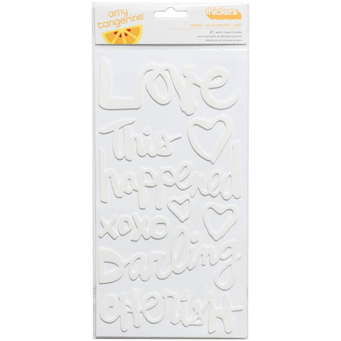
Big titles seem to be on trend right now.  And they can be fun.  But I have to admit to struggling with them sometimes.  I love playing with patterned paper and little embellishments and sometimes a big title just seems like "too much."  But these white Amy Tangerine thickers came with a recent kit
At first I wasn't sure what to do with them since I tend to use light backgrounds for my projects.  But it turns out that they are the perfect way to add a big title without overwhelming a layout.

This layout was inspired by the 4 part scraptober fest challenge - a sketch, a color challenge, a stash callenge (2 kinds of washi) and a photo of yourself
I used a piece of subtle grid paper for my layout base and the big white words pop of the page without overwhelming my picture - or the simple layout design.  And I love that phrase -  "to be continued" - for a layout about me and who I am today.  Because - even at 53 - I think I am most definitely a work in progress.

I'd love any ideas you have for the white thicker words .......I have the rest of the package to use up.

Thanks for stopping by.


Monday, October 26, 2015

A Photo On Vellum

I almost always order my prints - for the past 18 months or so it's been from Persnickety Prints.  But I've been wanting to experiment with printing photos on vellum (I think it might be a great technique to incorporate into a December Daily.)  So when we went apple picking, I decided to give it a try.  (I have a fairly basic inkjet printer.) 

I picked a photo of two apples and gave it a go.  The ink was visibly wet when it came out of the printer so I set it aside to dry for about an hour.  The end result was definitely worth waiting for - it have a beautiful soft feel that I wouldn't have achieved on cardstock.

products from October Citrus Twist kits.

I did run into a problem when I started to build my layout.  If you visit very often, you know that I like to layer lots of patterned papers.  And I found the patterns showing through my photo and changing the look of the image.  (In some instances I think this would be a great effect, but not what I was going for here.)

 I tried placing it on white card stock, but I lost a lot of the translucent feel the vellum brought to the table.  So I ended up layering a second piece of plain vellum under the photo and that worked perfectly.  And you can see where I used my tiny attacher to add the photo to my layout.  (I didn't want the adhesive to mar the image.)

I definitely will play with this technique again - it is so much fun and creates a unique look for the photo.  If you have any tricks you use to print photos on vellum, I'd love to hear them.

Thanks for stopping by.

Sunday, October 25, 2015

A Blurry Photo

Sometimes (a lot of the time) it seems like the photo that captures my imagination is blurry or otherwise poor quality.  I used to discard those pictures, but I've come to realize that those photos might best tell the story in my heart.  So I've given myself permission to use them.

This photo of my 15 year old daughter swinging is a great example.  I love that she still appreciates the joy and freedom that can be found when you "swing high" and I felt like the blurry feel gave a sense of motion that helped tell the story.


I printed it as a 4x4 with a white border in black and white for my layout.  Printing in black and white is one of my best tricks with blurry photos - somehow it makes the blurry feel seem intentional.  And the white border helps the picture pop and adds a bit of a vintage feel.

design inspired by sketch from Citrus Twist kits

This layout is also put together using the October Citrus Twist kits (I added the sequins and vellum from my stash).  I was so excited to get those Dear Lizzy rub-ons .  I used them in two ways on this layout - first too help add depth to  and to stretch an embellishment cluster.  And the second is a recent favorite - I love layering a large rub on over patterned paper.  The word "love" is so soft and pretty and seems to belong on that pretty floral print.

So how do you feel about photos that aren't great quality - do your trash them or treasure them?

Thanks for stopping by

Saturday, October 17, 2015

Oh No - I Don't Have A Kit to Play With.......

For years, my favorite part of scrapbooking was building a diverse stash and mixing and matching products for each layout.  Then I became a kit subscriber.  I was still mixing and matching, but from the kit (already curated by someone very talented).  And, for the most part, my stash just sat.

Currently I sub to 2 kits - Studio Calico and Citrus Twist Kits.  I feel like I am in a period of transition - the Studio Calico kits have not been clicking with my style lately and I have been experimenting with the Citrus Twist kits (for quite a while now).  For whatever reason,  I am having a hard time canceling my SC subscription. 

So last week I received my SC kit - and I mostly hated it.  I made one layout and then incorporated it into my stash.  (Maybe I will finally cancel?)  But my Citrus Twist kit is still on the way.  And on Thursday, I was home with time to play -

So I had to go to my stash and mix product from scratch.  I ended up pulling a piece from Dear Lizzy Documentary for my base.  Then I added bits from studio calico kits, seven paper, pinkfresh studios, pink paislee and crate paper.   And I made this......
design inspired by sketch at Citrus Twist kits


I had a great time picking papers and embellishments to use.  And I love the final project.  It has exactly the bright, fun, pretty feel I was going for.  And I used lots of bits from my stash. 

So Thursday I remembered how much fun it is to mix products all by myself.  Maybe I need to scrap this way more and rely on kits less?

Thanks for stopping by.

Tuesday, October 6, 2015

Scraplift Sunday

Paper Issues posts a scraplift challenge every Sunday.  And last week's layout included my two favorite things - layers and a grid.  So you know I was in. 

This is the inspiration layout by Heather Joyce.  It is totally amazing  with all those bits and pieces.  


My version is simpler - I focused on a large layered photo block with a grid underneath. 

I started with my September Citrus Twist goodies and added from my stash.

I used my new favorite trick and trimmed from the top of the page so I kept the detail in the branding strip.  And I have to tell you - those arrows from Pink Paislee might be my new favorite thing. 

Thanks for stopping by.

Tuesday, September 29, 2015

Brimfield Is My Favorite

It's no secret - I haven't loved the Studio Calico kits lately.  Far Far Away (back in January I think) was really pretty though there were pieces I struggled with and I really enjoyed Lisse Street (maybe March or April), but the rest of the kits have been challenging for me to use or just totally not my thing.  But Brimfield is a home run!  (Yes I still think the kit should have some more stuff for the price, but it was beautiful and fun to use.) The papers are gorgeous - beautiful color and patterns that are classic and versatile.  It felt like the kits that inspired me to become a subscriber three years ago.


Which made me think - what really makes me love a kit - it's not the stamp (in fact I sold the stamp in this kit.)  I think it is versatility - I made five layouts with the goodies in my September box before I broke it up into my stash.  And I when I look at them they all look unique.

Four of the layouts were in prior blog posts - one is soft and romantic, one features a train and has a little bit of a vintage feel, one is super bright and fun, and the fourth one features soft colors and feels classic.  And the fifth one (at least to me) captures a sense of contentment, mixing bright colors with pastels.

inspired by sketch at Citrus Twist kits
So I'm putting away Brimfield after five layouts - but it was a good one!  (That star transparency is going to end up in a December Daily) In fact if it goes on sale down the road, I will be trying to nab another one.

Thanks for stopping by.

Monday, September 28, 2015

I Do It For Me

Sometimes I think all my layouts start to look the same - I like patterned paper backgrounds, lots of colors and patterns and bits, layers and grids.   Some or all of those elements are in all of my projects.  So then I think I need to do something different - but I don't even know what that is.  And I end up with no layout or a layout that I don't like - I think because I tried too hard. 

This summer I have really struggled with inspiration and motivation.  I've spent a lot of time thinking about why and trying to get back on track  -- which leads me to why I scrap.  Sure the memorykeeping and story telling is great, but that's not why I scrap.  And I love it when people like my projects and I get compliments and recognition in online communities.  But mostly I scrap because the act of doing it makes me happy.

So not all my projects have to be works of art.  I would love to be on a design team someday, but every layout is not an audition.  I will get that opportunity when and if its meant to happen.  And the truth is my favorite layouts (and probably my best ones) are the ones that make me happy while I am creating.  So its ok if I stick with mixing colors and patterns, grids and layers -- in fact its perfect since I will find the joy in creating again.  And if they all look alike, that's just the way it is.  I guess you would call it "my style."

So here you go - a layout with a patterned paper background, lots of layers, little bits and pieces and it's a variation of a grid design.  And I love it.  I smiled while I made it and I smile when I look at it.  (Who knew I would end up loving those transparent bird die cuts?)

Design inspired by sketch at Studio Calico

Thanks for listening to me ramble on.  I'm off to play with paper.


Saturday, September 26, 2015

Layered Labels

I have always loved labels.  They are pretty, fun and versatile.  But they don't always work for journaling.  Sometimes I have too much to say and sometimes I don't have much of anything to say.  So I either end up with tiny little writing crammed onto a layer so that you can hardly read it or awkward blank space where it looks like I forgot to write something.  And so my label stash grows and grows and .......you get the picture.

But layered labels are my new favorite thing.  I pull several labels in different shapes and sizes and stack 'em up.  Maybe I add a few stickers, enamel dots or other small embellishments. Foam squares and glue dots can add extra dimension.   Or those phrase stickers that are all the rage - they are perfect for this.  Then I end up with a dimensional embellishment using up some of my favorite things in my stash.  And I can customize it to fit both the story I'm telling and the space I have to fill.


A little washi can anchor your cluster and add extra dimesion and texture too.

design inspired by sketch at Citrus Twist kits
 So you probably knew all about layered labels.  It is such a great way to build a custom embellishment.  But just in case you didn't...........

Thanks for stopping by

Thursday, July 30, 2015

Do Over

There aren't too many times when we really get do overs but scrapbooking is one of those places where it is totally possible.  I try not to do it too often but sometimes I just really don't like my end product.  This was one of those days.

Sunbursts are all the rage but I have a really hard time with them.  But when the sketch this week at Citrus Twist Kits featured a sunburst I thought I would give it a try. 


I thought about what I didn't like on past projects when I tried to use a sunburst and realized that they seemed to look heavy on my layouts.  So I decided to cut my sunburst from vellum


But I didn't like it and I'm not sure why.  My daughter thought it was because I needed more rays...

I set it aside but kept thinking about it and really didn't like it.  Then I remembered some vellum leaves in my stash (The advantage of a big purge is that you remember what you have.)So I lifted the photo block off the original layout and started over.


And I like it so much better!  And it took me about  minutes since I left the photo block intact.

Now I don't recommend frequent do-overs - after all there are so many photos waiting for love.  But once in a while it is definitely worth it!

So am I the only one who starts over?

Thanks for stopping by.....

Tuesday, July 28, 2015

Quick and Easy

I spent last Thursday - all day - cleaning up my craft room.  My daughter (who is only 15) could be a professional organizer. She helped me empty it out, sort through baskets, purge, and put it back together.  Late that night I had a clean space and was ready to play.  But after 1 quick layout, we went out of town. 

And when we came back I had to do something about the purge piles in the living room.  So it wasn't til last night that I had a chance to play again in my clean space.  I pulled together a quick layout using the newest sketch at Stuck!


I started with my July goodies from Citrus Twist (which currently hold the place of honor in the top of my Raskog).  I added a few scraps from my stash and couldn't resist the sevenpaper puffy hearts. 

Some gold ink splatters and I was done.  I'm hoping to play some more this week, but have a feeling my scrap time is limited until the weekend. 

Hope you are finding time to play.  Thanks for stopping by.