Pages

Showing posts with label Theresa Collins. Show all posts

Saturday, October 31, 2015

Big and Subtle

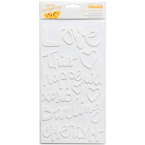
Big titles seem to be on trend right now.  And they can be fun.  But I have to admit to struggling with them sometimes.  I love playing with patterned paper and little embellishments and sometimes a big title just seems like "too much."  But these white Amy Tangerine thickers came with a recent kit
At first I wasn't sure what to do with them since I tend to use light backgrounds for my projects.  But it turns out that they are the perfect way to add a big title without overwhelming a layout.

This layout was inspired by the 4 part scraptober fest challenge - a sketch, a color challenge, a stash callenge (2 kinds of washi) and a photo of yourself
I used a piece of subtle grid paper for my layout base and the big white words pop of the page without overwhelming my picture - or the simple layout design.  And I love that phrase -  "to be continued" - for a layout about me and who I am today.  Because - even at 53 - I think I am most definitely a work in progress.

I'd love any ideas you have for the white thicker words .......I have the rest of the package to use up.

Thanks for stopping by.

Sunday, April 26, 2015

Top and Bottom

Sometimes I feel like my layouts all look alike - either grids or a slightly off-center photo block - or some combination of the 2.  So the current sketch at Stuck! was a great jumping off point for something different.


The sketch placed the design elements at the top and bottom of the page.  I had several false starts before I actually managed to put a layout together.  But it was really perfect for me - different but I still got to play with lots of layers and little bits..


I moved the layers on the top so that they were diagonal from the photo block in the bottom of the page.  It felt more balanced to me.  And the title in my layout ended up (more or less) centered. 

I found that using a sheet of patterned paper with pattern and texture helped make the sketch work for me.  I am definitely white space challenged.

So am I the only one who feels like they are in a design rut?  How do you keep your layouts fresh?

Thanks for stopping by.


Friday, May 24, 2013

Documenting A Soccer Season

If you read these posts often, you know that I try to do a "year in the life" album for my kids for every year.  As I've worked on my boys' albums, sport seasons have become a huge challenge.

The sports seasons are a huge part of their lives and very important to them.  By the time we go to all those games, there are literally hundreds of pictures.  And I'm just not able to narrow the photos down to pages for one or two pages.  So I always end up with multiple 2 page layouts.  And in the various albums, I've tried to make them look alike, I've tried to use a common design element (e.g., stars) to connect them, and I've just ignored the connection.  All of the approaches have pluses and minuses.

But lately I've been working on Nicholas's senior year album and I tried something different.  I pulled together a kit of papers, cardstock and embellishments that I used for the layouts - there were 7 this year.  After that I didn't worry at all about the connection. The end result was cohesive layouts that were still visually interesting.

The papers were mostly Fancy Pants and Simple Stories, but the green was Echo Park and there is a red chevron from Jillibean. I had themed embellishments, wood, stars, sequins, vellum arrow die cuts and enamel dots in my embellishment stack. 

Here are the layouts (and some things I learned):


By using the same background paper on all the layouts, I created a feeling of "a mini album inside a larger album.


Washi tape was a great addition to the kit - a quick and easy way to add interest to pages and able to be used in a lot of ways.


The Martha Stewart chalkboard labels were a great way to add consistent journaling throughout the series of layouts.  And mixing themed and non themed embellishments created added lots of interest.


Using the same thickers throughout was a great unifying touch.  And use thickers from an coordinating set to add the uniform number to sports layouts as an embellishment.


Experiment with different shapes and title treatments for interest.  This circle layout ended up being one of my favorites.


Combine a frame with a themed embellishment to create an interesting embellishment. 


Think out of the box when your journaling.  I printed the bio he wrote for the senior night presentation on vellum here.

Hope this gave you some ideas for your sports season layouts.  I'd love to hear your ideas too. 

Have a fantastic Friday.

Monday, May 20, 2013

Going Pink with Atlantic and Lily Bee

I've never been a big fan of pink - it was just too over the top girly.  And my daughter was never very into pink either.  So the color pink rarely found its way into my stash or on to my layouts.  But then I got the papers in Studio Calico's new collection, Atlantic.


I love all of the papers - the kraft and gold is amazing and the vellum is my all time favorite vellum.  But I can't get enough of the pink and yellow papers in the collection.  They remind me of a sunrise on the beach. 
Seabrook
New Haven
South Hampton - I love the B side
Rockport - again I love the B side

And this piece of Lily Bee paper could have been made to coordinate,

Sweet Shoppe - Marshmellow

I've dug out lots of old beach pictures of my daughter when she was young to scrap with them - the soft colors in the photos and papers seem to be made for each other.


This is one of my favorites - I actually used the Heidi Swapp gold lame color shine like a pint to add the gold glimmer to the base sheet.  And I combined cameo Mister Huey's with the Color Shine to color the arrows to match.  And of course, no layout is complete without sequins and enamel dots (from Theresa Collins Summer Stories Line).

I'd love to know what papers are inspiring you lately.  Have a marvelous Monday!

Tuesday, May 14, 2013

Atlantic and Arrows

 Mothers Day Giveaway here


I love the new Atlantic collection by Studio Calico.  And my favorite part is the soft pinks, yellows and peaches used in some of the patterned papers.  This totally connects with my girly side.  So I was thrilled when the weekly designer challenge at Studio Calico was a color challenge focused on those colors.  And since I am currently loving arrows, I was equally excited to see that the Sunday challenge at Chic tags was to use arrows.  So I thought I would try to combine the challenges.

I dug out an old photo of my daughter at the beach for the layout and went to work.  I pulled patterned papers in the colors I wanted to use to get started - mostly from Atlantic, but the heart paper is from Lily Bee.  I used pink and gold spray ink to soften the background paper and emphasize the colors.  I used the same inks to color arrows from Pink Paislee.  Here's what I came up with.

 I even painted the sunrise thickers with some gold ink to add that glimmer.  Here are some close-ups of the embellishment clusters.

This cluster uses the Atlantic vellum die cuts, sequins and enamel dots from the Theresa Collins Summer Stories line/  The vellum die cuts are the perfect soft touch for this color scheme.

The pink pasilee arrows took the gold and pink colors perfectly.  And by layering the inks, I was able to get different shades with just two ink colors.  I attached my sequins with mini glue dots.

The mix of pink and gold inks on the page with ink spatters, sequins and enamel dots reminds me of sunrise on the beach.  (Wish I was there.)

I'm loving these papers and have a pile of scraps on my cropping station that I keep going to. I think I'm going to have to print more of these old beach pictures.  I love the way they work with these papers.  Working on these layouts is bringing back memories of those lazy beach days when my daughter was young.

Hope you have a terrific Tuesday.

Saturday, January 12, 2013

Wish I Was There

The Winter Craft and Hobby Association show (CHA) starts today an i wish I was there.  I've been watching all the sneaks and can't believe the great lines coming out.  (I hope my lottery ticket wins!)

Since I can't be there, I thought I'd share some of my favorite sneaks with you - these are line I know will find their way into my stash.

DIY by Crate Paper - I think this is my absolute favorite - look at the transparencies and other great embellishments!
DIY_Embellisments 2

Snippets by Studio Calico - love the colors, patterns and wood veneer


331367_SC_Snippets_CollectionPack_PKG_F-01

 331341-WOOD VENEER-01

Daily Flash  by October Afternoon - they are just starting to show sneaks but I love this one - especially the die cuts and alphas.

_DF Sneak Peek v2-01

Composition and Color by Websters Pages - This is an Allison Kreft design and gorgeous.  I love the colors and patterns, those little bags and nini folders - and think I need it all.

 Allisonpresentation (2)


Hipster by Basic Grey - I love the colors, the acetate alpha and the wood veneer is amazing!


Day To Day by Elles Studio - the collection has great patterned paper, colors and design elements.


by Theresa Collins - inspired by memories of her mom - I love the colors and those enamel dots


Screen shot 2013-01-10 at 8.57.29 AM
Screen shot 2013-01-10 at 9.05.22 AM
 Screen shot 2013-01-10 at 9.07.15 AM

Collectable by My Minds Eye - I love the way MME brings out different themes within a collection; it provides so many opportunities to mix and match product and create your own look.  And they have lots of new enamel dots colors (which are one of my big weaknesses.)
 IMG_1461

 IMG_1431


 IMG_1409

 MME Collectable-Unforgettable

Since I'm not there, I'm just going to keep checking things out online and building my giant wish list.  And I think I'll play along with the CHA events at 2Peas and Studio Calico.  Are you paying attention to all the great new releases?  What are your favorites?