Big titles seem to be on trend right now. And they can be fun. But I have to admit to struggling with them sometimes. I love playing with patterned paper and little embellishments and sometimes a big title just seems like "too much." But these white Amy Tangerine thickers came with a recent kit
At first I wasn't sure what to do with them since I tend to use light backgrounds for my projects. But it turns out that they are the perfect way to add a big title without overwhelming a layout.
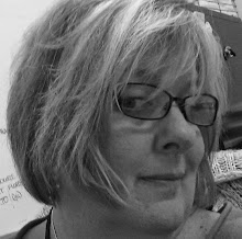
I used a piece of subtle grid paper for my layout base and the big white words pop of the page without overwhelming my picture - or the simple layout design. And I love that phrase - "to be continued" - for a layout about me and who I am today. Because - even at 53 - I think I am most definitely a work in progress.
I'd love any ideas you have for the white thicker words .......I have the rest of the package to use up.
Thanks for stopping by.
At first I wasn't sure what to do with them since I tend to use light backgrounds for my projects. But it turns out that they are the perfect way to add a big title without overwhelming a layout.
 | |
| This layout was inspired by the 4 part scraptober fest challenge - a sketch, a color challenge, a stash callenge (2 kinds of washi) and a photo of yourself |
I'd love any ideas you have for the white thicker words .......I have the rest of the package to use up.
Thanks for stopping by.

 "
"


Great layout. I'm not much younger than you (47), and I am a work in progress, too. I like that you documented this part of yourself, I know how hard it can be. Anyway, to answer your question, do what you did here, use another phrase as a big title with a subtle background. Or, color them, and use them as a background, or one word colored as an embellishment. I do that with a Dear Lizzy pack I bought and then couldn't figure out what to do with them. They weren't Thickers, they were in a package not adhesive backed. Anyway, sorry to go on, great stuff here. Michelle t
ReplyDeleteWell I'm considerably older than you and I love this idea of being a work in progress. And I agree the large white title letters are perfect and balance the page totally - I'll be trying this myself. Thanks for sharing at The Memory Nest.
ReplyDeleteGreat title, those large letters worked great!!! Terrific page, great job with the sketch and thanks for joining us at The Memory Nest!
ReplyDeleteWonderful page and take on all (4) ScraptoberFest challenges! Thank you so much for linking up with Scrap Our Stash!
ReplyDeleteThis is great Julie! Love the white on white with the background paper and title. Perfect pp choices too. Thanks for joining in with Scraptober Fest at Challenge YOUrself
ReplyDeletelove the title and the layout - great job on the 4 Scraptoberfest challenges! - Sherri (ST) Challenge YOUrself, Scrap Our Stash & The Memory Nest Blogs
ReplyDeleteI agree-50's are still years of progress work! Clean but definitely not simple; LOVE this! White title is a great choice :) Kate (CY)
ReplyDeleteWOW!! LOVE this page!! Product really accentuates the picture!! Love the title!! Thank you for playing along with the scraptober fest challenges and using tMN’s sketch. Hope you will play along with some of our monthly challenges!!
ReplyDeleteLove your page and the design! Thank you for joining us at Challenge YOUrself!
ReplyDelete