Pages

Showing posts with label Pebbles. Show all posts

Thursday, March 10, 2016

Using a Sketch From Memory

I haven't been around  for a bit - mostly because we've been having computer and internet problems.  Thankfully, they are all fixed now and I can share some of my projects.  And the good news - the computer problems inspired me to use a sketch a different way.


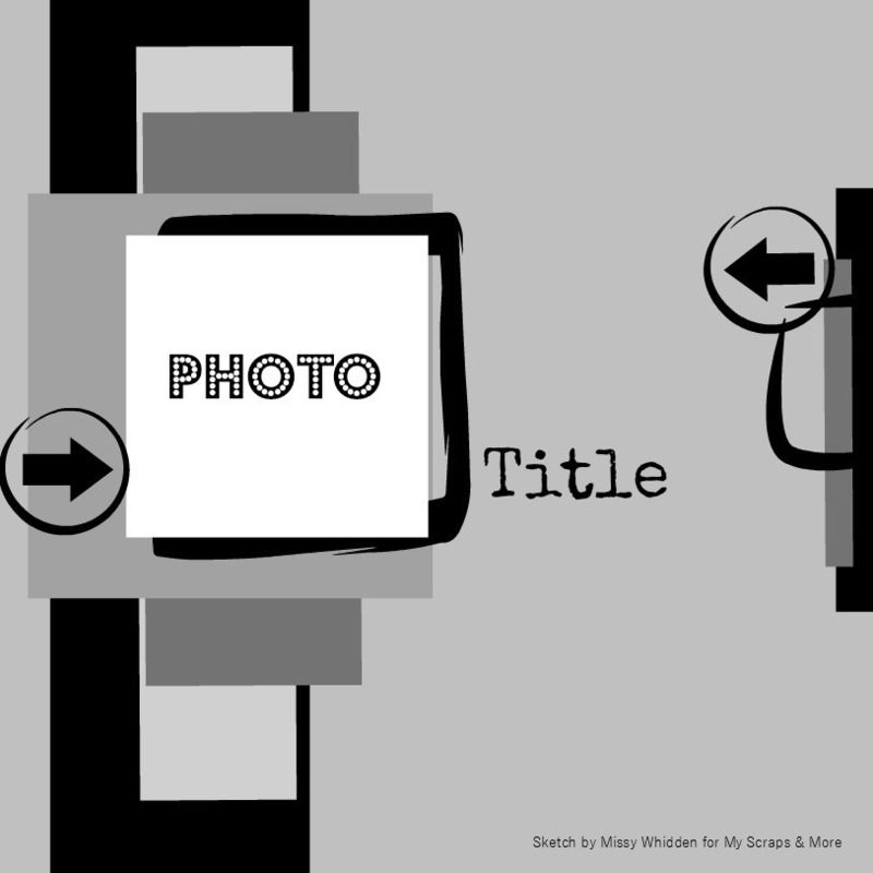
This is the first sketch for the month at Stuck?!  I checked it out and then lost consistent internet connectivity.  Generally I print out the sketches and have them on my desk when I work.  As a result my design usually stays close to the sketch or I make conscious decisions about moving or replacing elements on the sketch.  This time, I worked from my memory of the sketch.

Here are the elements that stood out to me.
  • circles
  • vertical layers
  • a horizontal layer
  • embellishment clusters
So  I used those elements to build my design.  (I did go to my stash for some pieces.)  Here was what I came up with


So instead of working directly from the sketch, I worked with my memory of the sketch.  I used two circles but didn't layer them directly - instead my vertical layers acted more as a link between them.  And I really only had one embellishment cluster that i used in combination with the title to create the horizontal element in the sketch. 

It was a fun way to work with a sketch - I'm glad circumstances nudged me in a new direction.  And I was really happy with the  finished product - it was fun and unique.  I will definitely take this approach again at least some of the time when I am working with a sketch.

I have lots more to share - keep an eye out. 

Thanks for stopping by.

Thursday, January 21, 2016

Mixing My Kits with My Stash

One of the goals I set for myself this year is to use more of my stash.  I belong to two kit clubs so I get lots of pretty new things every month (even if I manage not to hit up the Paper Issues store for products I just can't resist).  And I'm a little bit like a child - the shiny new things in my craft room tend to capture most of my attention - and my stash keeps growing and might collect some dust.

So this year, after I make one (or a few layouts) with just my kits, I am going to trying to mix pieces from my stash in with the products in my kit.  I'm not sure I will accumulate less, but at least I will use some things that aren't brand new to my craft room. 

This layout (my current favorite project ever) is a great example of this strategy.  I started with the Arendal products from Studio Calico.  The layout base is a piece of white cardstock with the vellum (which is to die for) from the main scrapbook kit layered over the top.  It creates a soft neutral base for the project but still adds a lot of dimension and texture. 

My layout was inspired by the same sketch as my Merry layout - I used the diagonal lines to create different layers in my photo block - it was a fun way to add lots of patterned paper without overwhelming the photo. 


Here is a step by step of my process.

  • I started by building the layers that used diagonal pieces of papers.  The papers that came in the Arendal kits were my starting place, but  I pulled the mint piece from my stash when nothing seemed to work with the heart paper - it was perfect. 
  • Next I build the full photo block, attaching the photo to the smaller block I created by piecing two papers together.  I added some strips of patterned paper to the layers I constructed using triangles until I was happy with the general look of the photo block.  I felt like it really needed some green so I dug in my "small scrap basket" for that green stripe paper.
  • I attached the vellum to the cardstock (proud of myself for not hoarding the vellum) and added the photo block to the page - I moved it around til I liked the placement.
  • I used some Thickers from Pebbles to add the title (3rd stash product) and added a gold arrow from the same pack.  This helped frame the photo with the gold elements.
  • I added phrase stickers from the Maggie Holmes Shine collection (4th stash produt) in between layers at the top of the page - this effectively creates extra layers without a lot of bulk or patterns.  And the phrase stickers help capture the story I was trying to tell.  I added a gold arrow to the embellishment cluster at the top of the page.

  • Next I build the embellishment clusters at the bottom of the page and along the side of the photo block using label stickers from the same Maggie Holmes sheet and some vintage Crate Paper stickers in my stash (5th stash product).
  • I finished the layout with gold spatters and some Lemon Lush sequins (my all time favorite sequin mix that I hoard and the 6th stash product).
 I'm not sure the photo does this layout justice - it really is my favorite project in a long time.  And it was so much fun to see what I had in my stash that would work well with the kit to tell my story.  I love my kits because they mean I spend less time choosing coordinating products.  But picking the papers and embellishments was always one of my favorite parts of scrapbooking - this might be the perfect way to have the best of both worlds.

Hope your having a great week - I'm fighting a nasty case of bronchitis so I am not really scrapping much at all.  But I do have a few things to share with you, so stop by again soon. 

Sunday, December 27, 2015

Squeezing in Some Scrap Time

I love the holidays but there never seems to be enough time.  Still, I managed to make a few layouts this month and am hoping to share a few this week.  Since I only had a bit of time, I used a sketch to get me started.  This one from Stuck?! is awesome.


I turned the sketch on its side and put together a quick layout for a Christmas Caroling challenge at My Scraps and More.


The challenge was to use a large number on your page and the "2" from Pebbles was perfect for this title.  I had fun with my journaling too - I used my new typewriter (yay!) to create a conversation I thought my daughter and her dog might be having - way out of the box for me but lots of fun. 

Hope you squeezed in some crafty time during the holidays.  Thanks for stopping by.
Saturday, April 11, 2015

Making Patterned Paper

So I think I mentioned the 30 minute layout class at Big Picture Classes before.  I finished the class today (it took me exactly a week - and I did all the assignments).  The last lesson was about using a single color of ink and a stamp to make your own patterned paper.

Now I have a lot of stamps from kits, but almost never use them.  So I considered marking the lesson complete and moving on.  But stamps are a big investment and I did "have to have" all the Color Theory ink pads (because that would motivate me to use my stamps - talk about rationalization).  So I rummaged through my stamps to see if one would catch my eye. 

The floral stamp from the Yeats, a September Project Life Add on At Studio Calico caught my eye.  This was strange since I almost never use floral paper, but I went with the impulse.


I started with a sheet of smooth white cardstock and selected the Gray Area Color theory ink.  I like the soft gray and thought it would keep the floral from being too overwhelming.  I stamped the darker images first.  Then I went back through and added the lighter images by stamping off some of the ink on a piece of scrap paper.  I ended up with this - which I loved.


In the class the hand stamped paper served as the base of the layout.  But I had a hard time making that work for me.  So I cut a piece to serve as the base for the large photo block and a strip for the bottom of my page.  I kept the color scheme super simple - working with aqua, gray, black and white - and touches of gold of course.  I added lots of paper layers trying to get a mix of textures and patterns.  I mean we don't have to talk about how long the white corrugated paper might have been living in my scrap room.  And the gold foil heart layer is a project life card from Pinkfresh Studios.


I loved this photo of my daughter (who bought the same shirt for my mother and herself so they could twin - I mean how many teenagers want to "twin" with their grandmother?  The title is from a Valentine my mother sent Elisabeth (several years in a row).  I tried to add embellishments that captured the love and fun I saw in the picture they are mix of studio calico, kit exclusives, sevenpaper, crate paper, freckled fawn and elle's studio.  And lately I don't seem to think a layout is done unless I've added rub on and splatters.

Maybe this will inspire you to dig out those stamps.  Thanks for stopping by.

Tuesday, April 7, 2015

Adding Texture and Dimension

I love pretty paper, but lets face it - it is flat.  So I am always trying to add dimension and texture to my layouts.  Those heavy textured papers are always favorites for just that reason.  But they seem to be harder and harder to find.  And since my LSS closed, I am having to guess at the texture of a sheet of paper based on online descriptions and knowledge about specific manufacturers.

As a result, I am looking more at my stash to find ways to use layers and embellishments to add dimension and texture to layouts.  When I worked with this sketch from MSAM, I really tried to focus on texture and dimension as a way to make the design my own.


I started with a patterned paper background.  The large polka dots were fairly bold for a background, but seemd to go with the feel of my page and added a lot of dimension before I did anything else. 

Textures - Crate Paper - Craft Market
Then I started building the layers.  I pulled the peach and the floral papers from the March Studio Calico kits.  Then I dug through my scraps and found a piece of navy corrugated paper (maybe Fancy Pants?) and added that.  I also used a glassine bag that was leftover kit packaging under my photo - those pabs are a great way to add dimension and texture without spending an extra dime!


I added die cuts from Pinkfresh Studios (Up In the Clouds) and Elle's Studio (Cierra) and a glittery piece of wood veneer that was in my stash.  I dug out those gold foil alphas from the Studio Calico Lemon Lush line for the title.   Some ink splatters (using teal, peach and primrose colorshine) finished it off.

The finished layout had lots of dimension without burying the picture. 

Thanks for stopping by.

Sunday, November 30, 2014

Repetitive Stamping

I want to use my stamps and my ink pads.  I have all the Studio Calico Color Theory stamp pads and the colors are gorgeous.  And I get stamps in my kits each month, so my stamp collection is a little out of control.  But I have to admit that using my stamps is not my first instinct.  So I almost never buy a stamp set outside the kits.  I just don't use them enough.

But a few months back, I couldn't resist this stamp set offered at Studio Calico as an add-on to the card kit.  It is called the Circles set by Splendid Finn,

Picture 1 of 4x3" Circles Stamp Set by Splendid Fiins
I couldn't tell you exactly why, but I fell in love.  And it turns out that so far the solid circle is my favorite stamp in the set.  I am a little addicted to using it for repetitive stamping, mixing colors to create custom backgrounds.  Earlier this week I needed a quick retirement card for a friend at work.  I pulled out inks in color theory, blush crush, flamingo, lavender soda and purple rain - and that circle stamp.  I randomly stamped circles in different colors to fill in a piece of white cardstock.


After that it was easy.  I used a Pebbles tag that said celebrate and edged it with gold brilliance ink.  I added gold glitter embossing powder to a wood veneer "m" to create a monogram to make the card more personal and finished with a strip of gold glitter washi from My Minds Eye.  And then just for a little sparkle, I added lots of tiny pink star sequins.  Mitali deserved a lot of sparkle.

I used the same technique to create a quick and easy Christmas card.  This time I used inks in the green and aqua color range - emerald city, lime light, yes peas, mint hint, and glass slipper.


I added a red holiday banner sticker and a gold star from my stash (both from old Studio Calico collections) and I was done.  If I had more of  those banner stickers, I might just mash produce this card.

If you try this, don't forget to stamp multiple times with your stamp before you re-ink.  This creates lots of variety in the colors you het for your circles (or whatever image you stamp.)

Thanks for stopping by.

Saturday, November 29, 2014

Obsessing Over Die Cuts

I love adding layers and little details to my layouts.  So I am thrilled with all of the die cut and ephemera packs that have been coming out with the new collections.  They provide quick and easy layers, can provide places to journal and add details that pull your eye through a layout.  I think thee are die cuts on almost every layout I do these days.

I sort my die cuts by color and store them in Elle Avery envelopes that way.  So most often I mix and match die cuts from different manufacturer's and collections.  But this layout was a layout I made using the November Studio Calico kits.   One of the add-ons included the ephemera pack from the newest Maggie Holmes collection - Open Book.

 
When working with a kit, I usually start with the patterned papers.  I pick 3-5 that I really like together and lay them on the desk.  For this layout I had 3 papers picked - the navy text, the pink dot, and the mossy green chevron.  I had a scrap of the purple Basic Grey paper sitting there from a prior project.

My initial idea was to layer the three papers I'd chosen on the picture.  But I couldn't get it to "work."  Eventually I pulled the layers apart to create a horizontal block across the layout .  I really liked that, but the picture didn't look right (I'd already cropped it with my original concept in mind and I had way to much space on one side of my layout)  

I started by building up the photo block, adding a piece of the purple Basic Grey scrap and another paper from the kit - the white with cork polka dots.  I folded a glassine bag that was used to pack kit embellishments in half under the photo  - this is a great way to add texture and dimension and to reuse packing material.  This gave the photo more weight but I still needed to balance it on the other side of my layout.  

Those die cuts really came to the rescue - I took a smaller piece of the purple scrap on my desk and placed it opposite the picture.  I layered three die cuts to create an element on my layout that balanced the photo.  I added a gold polka dot tag from Pebbles to the cluster and placed a kraft thicker heart from Amy Tangerine on top of the tag.  I used enamel dots to hold the tag string so it looks like the tag is hanging on the layout.


To finish I added another diecut cluster at the top of the page, mixing in antoher one of those kraft thickers and a label from my kit. I love that floral banner


 A shipping tag die cut went under the photo, a phrase label from the kit went on top of the photo and I added one more die cut to create a third element in the large horizontal piece across my layout.  I pulled some old thickers from my stash for the title and created some hand-written journaling strips to finish off the the design.  (I may be the last person in the world to figure this out, but those journaling strips don't have to be white - I used pale blue cardstock and love the softer look.) And of course, every layout needs some ink splatters (I just need to learn to let them dry before I touch them.I used navy color shine from Heidi Swapp here.


Thanks for stopping by today.


Thursday, November 27, 2014

December Daily-ish - Finally Starting

 Happy Thanksgiving!!!!

Now that I've bored you silly all week with talking about how I picked supplies and how I am storing my supplies, I am finally going to share a page.  I chose a page protector with 12 2x2 pockets for my title page.  I wanted to be able to do something fun and use a variety of supplies to set the tone for the project. 


I started by cutting 5 2x2 pieces of paper and used the oversize gold alphas from Pebbles to add the letters in the word "merry."  Then I started to pull embellishments to the different pockets.  Here are some highlights:

  • The gold glitter tag is also from Pebbles.  I added the year with some small alphas for a custom look.  It is stapled into the pocket.  I left the string sticking out the top for now.  I am thinking I might have some other ribbons sticking out by the time the album is done, but if I don't I will trim the twine later.  And I glued a snowflake wood veneer on the back of the tag so it's pretty on the back side of the page too.
  • Those puffy gold stars are scraps from trim that came in an old Studio Calico kit.  They are stapled into place also.
  • That black plastic strip that says "celebrate" came in the November Studio Calico card kit.  I used adhesive to attach it to the top of the page protector.  And I put a corresponding piece that says grateful on the other side of the page protector in the same place.  Since Thanksgiving will be on the other side of  this, it should work perfectly.
  • The sequins are from my stash.  I started with some of the red stars from Studio Calico - one of the embellishments I chose for my kit -- and added others from my stash.  I mixed sizes and colors.  And since I don't have a sewing machine, I used glossy accents to glue the pocket closed.
  • The chipboard frame is from Crate Paper and the little wood heart is from the Atlantic collection by Studio Calico.  They are both attached to a small transparency square that slides in the pocket.  And another frame and another heart are attached to the back side.
  • The wood veneer star is just floating in the pocket for now.  If it doesn't want to stay in I will staple it, but for now it works.
  • The last square is a piece of white card stock that I covered with different washi tapes placed randomly.  The tape with words is holiday masking tape that came in one of the November scrapbook add ons from Studio Calico.
The back side of the page serves as a foundation page for Thanksgiving.  I will use patterned paper and small photos in the pockets that don't hold embellishments.


 I think I will use a full 6x8 page protector on the page opposite. 

Don't forget to leave a comment for an entry into my holiday themed giveaway.  This is the last day to enter.

Thanks for stopping by.


Tuesday, November 25, 2014

December Daily-ish - Embellishments.

Yesterday I talked a lot about the paper choices I made for my album.  Today I'm talking about embellishments .  As I thought about embellishments, I came up with the following principles to help choose embellishments:
  • I wanted a mix of holiday and non-holiday themed embellishments
  • I wanted a mix of textures and colors
  • I didn't want to end up with a lot of things to put away when the project was done.
Again I looked at the different kits out there to see what appealed to me.  For instance I love seeing holiday words in script form so I was excited to find some heidi swapp holiday word stickers in my stash.  And I may well buy some cut files so I can play with this look more.

I also realized that I am going to work on my album here at home most if not all the time.  And my scrap room organization is about having things where I can see them since I use what I see.  But my holiday embellishments are stored in two Iris boxes and are hard to dig through.  So I decided to focus on pulling holiday embellishments and adding reminders of non-holiday themed embellishments to my kit rather than pulling everything I might want to use.  (Remember - I don't want a lot to put away at the end of the project.)

So here is a photo that gives you a feel for the embellishment mix I've chosen.


 Here are the items I've chosen:
  • die cuts - a mix of traditional, vellum, and acetate pieces so I can add a variety of textures
  • rub-ons - I love using rub-ons lately, especially directly on a photo since I don't have access to photoshop.  Those gold star rub-ons were from Chic Tags last Christmas
  • bags, pockets, folders and envelopes - perfect for creating inserts to hold journaling and memorabilia
  • trim - I pulled a mix of ribbons and twine
  • tags - love those gold glitter tags from Pebbles
  • flair - a mix of traditional flair, cameos from Webster's Pages that were in my stash and those Glitz giant gems.
  • washi tape - a variety of colors, widths, and textures
  • wood veneer - both painted (from Basic Grey's 25th and Pine collection) and unfinished
  • frames - I love frames in pockets, on inserts and on top of page protectors.  They are a great way to add dimension.  I have a mix including Crate paper, Studio Calico and My Minds Eye
  • That fabric tag from an old Basic Grey collection was in my stash.  I added it specifically for the texture.
  • Stickers
  • Enamel dots (I found those gold and silver ones from Teresa Collins at JoAnns but have easy access to lots of colors and sizes)
  • sequins - the stars from Studio Calico's Magical collection are in my kit, but again, lots of colors and sizes are in easy reach
  • stickers - these are from the 25 days class kit but I have other holiday themed stickers in my kit also
  • buttons - the holiday themed ones are from Fancy Pants, but my button bowl is right by my desk.
And of course, every album needs some alphas.  I pulled a few I was pretty sure I would use, but will likely go to my stash also.  And I did by the Gossamer Blue plaid alphas just for this project.  Swoon.


And while I am not much of a stamper, I am really working to use my stamps more.  So I pulled my holiday themed stamps out to store with my kit.  Some of these are from the November Studio Calico kits also.


And finally I went through my stash of project life style cards and pulled some that fit with my colors that I thought I might use.  (Since I store my cards by color this was pretty quick to do.)


So by now you should be sick of hearing about my kit.  But just in case you are still interested, I will share a bit about kit organization tomorrow.

Don't forget to leave a comment for an entry into my holiday giveaway.

Thanks for stopping by.

Thursday, November 13, 2014

Happy Birthday Stephen

My oldest son turns 22 today.  It is super hard to believe and seems like he was just a sweet little baby.  So today is all about Stephen (even though he visited on the weekend and we celebrated then). And I have two recent layouts about Stephen to share. 

The first one is using an old baby picture I dug out over the weekend. 


It;s a super simple design, but check out that shipping tag.  I used a silkscreen from a past Studio Calico kit and Color Theory gold acrylic paint to add those stars.  It looks amazing and was so easy - it took maybe two minutes.

And here;s a layout of a recent picture.  Stephen recently started culinary school and I loved this picture his girlfriend texted me.  He looks like he stepped right out of that Disney move - Ratatouille.


I loved the picture so much that I ordered in a 6x12 size.  I wanted the full impact of the hat.  Plus, a 6x12 picture means a really easy layout - a couple strips of paper and a couple of embellishment clusters and you are done!

Giveaway reminder:  Don't forget to sign up for the blog rebirth giveaway.  It's open til Sunday at midnight.

Thanks for stopping by!

Monday, July 15, 2013

The Christmas In July Blog Hop (with a giveaway)


Welcome to the Christmas in July Blog Hop, inspiring you to get out your Christmas stash and use it before all the new collections are introduced this month. Join the fun and create something too, use the hastag #scrapbookchristmas in twitter, facebook or instagram.

When the planning for this blog hop started, I was really excited about the chance to participate.  I love Christmas and have tons of Christmas stash.  But as the date got closer, I wasn't feeling very inspired.  I had lots of stuff, but it was the bits and pieces left from prior year projects.  Then I saw a challenge at My Scraps and More that asked you to create a layout that used Christmas papers and a Christmas phrase to create a layout about a non-holiday topic.  Given the size of my stash, it seemed like the perfect opportunity to use up some of my stash.  I made a layout about a visit to Slate Run Farm titled "Away In The Manger."


I used papers from Studio Calico's Winter Wonderland, Crate Paper's Sleigh Ride, and Basic Grey's Figgy Pudding (an old one right?) and Jovial.  You were allowed to use any embellishments and these came from My Mind's Eye, Jillibean Soup and Simple Stories.  And that great Fancy Pants chalk tape was perfect for adding a quick note about where we were.

And that made me think - could I do a Christmas layout without any Christmas paper.  So I pulled out my Valley High goodies (the July kit at Studio Calico) and went to work.  The colors and patterns in the kits turned out to work perfectly for a Christmas layout.  Here's what I ended up with.


I was scrapping with my friend Gloria, and she looked at the annual picture of our kids by the Christmas tree and immediately suggested this title.  And, I have to admit that it suits the expression on the boys' faces.

Giveaway

I still have lots of bits and pieces left, so I thought I'd share them.  Just make sure you are a follower and leave a comment.  I'll leave the drawing until midnight on Sunday, July 21.  Rather than post a picture of the goodies, I thought I'd leave it as a surprise for the winner (kind of like a Christmas present.)

I'm the last stop today.  If you started in the middle you can hop on over to see Ruth and get started at the beginning.  And just in case you got lost at any point, here is the list all the blogs.

Julie - http://plywthpper.blogspot.com/


Thanks for stopping by - hope your Monday is just marvelous!
nonymous Giraffe has left the document.

Tuesday, July 2, 2013

Recipe Challenge and Roundabout

Studio Calico Kit Subscription

Use this  link to sign up for a new Studio Calico kit subscription and we will both get 1000 rewards points - that's good for $10 off an add-on!
http://www.studiocalico.com/welcome?ref=f7503d08
Last week the weekly challenge at Studio Calico was a recipe challenge.  Here are the "ingredients."

vellum
yellow
frame
stars
at least two tags

Now it just so happens that vellum, frames and stars are some of my favorite things right now.  So I was all over this challenge.  I started with a piece of colored cardstock from the Roundabout kits and came up with this.

The bright cardstock base really makes the other elements of the layout pop.  And I used my Texture Boutique to create a piece of vellum with a custom look

 I used Mustard Colorshine to make a white tag yellow.  The ink didn't want to adhere to the tag, so I used a tissue to wipe the ink across the tag, creating a fun look.  And those frames from Crate Paper are still some of my favorite embellishments.


That geotag from Freckled Fawn is great and I love the chipboard and glittered stars from Studio Calico. 

Thanks for stopping by - Have a great Tuesday!

Friday, January 18, 2013

What's On Your Desk?

I try to be a neat scrapper.  I clean up my workspace after every layout.  But lots of paper and bits seem to accumulate anyway.  And when I'm on a roll, I become way less diligent about cleaning up.  Then I just set things to the side to put away later. Last weekend was one of those weekends.  I was inspired by all the CHA layouts and just wanted to keep scrapping.  And a box of goodies came from My Scraps and More.

One of the challenges was to make a layout from things on your desk.  Here's what I did.


And here's what I found on my desk (don't look at the mess).

  1. The background paper was in the box from MSM and the neutral pattern was a great starting point.  The vellum was out because I'd ripped the corner when I pulled it out of the package earlier in the day.I didn't have any alphas out so I printed an oversize title on the vellum in a bright color.  (I will definitely be using that idea again!)
  2. The patterned paper was sitting in my scraps.
  3. The scrap of gold POW paper was sitting on my desk from my December Daily project - I wasn't sure where to put it so I had just left it out.
  4. I always have rolls of washi tape sitting around.
  5. The picture was sitting in a pile of pictures to be put away.
  6. I keep a basket of shipping tags on my desk.
  7. The binder clip had come in a Studio Calico ki and I had no idea how to use it so it was sitting in a bowl of misc,. pieces on my desk.
  8. The little die cut was from a package of Fact or Fiction flags that have never been put away.
  9. And, of course, my trusty tape runner is always on mydesk to put it all together.
Try putting a layout together from the things on your desk.  You never know what you'll end up with.  Have a great Friday!