Pages

Showing posts with label Heidi Swapp. Show all posts

Sunday, February 21, 2016

Together

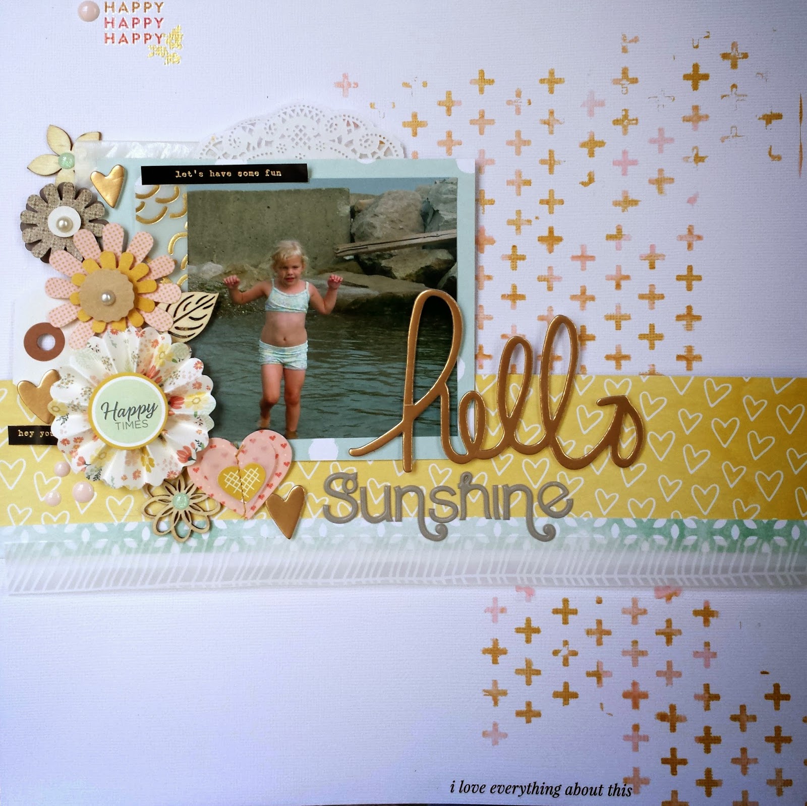
On Monday the member challenge was posted at Studio Calico.  The challenge was to make a layout about a significant relationship in your life.  I knew I wanted to do a layout about my relationship with my husband - we celebrated our 25th anniversary in November.  And over he years he has made me crazy, supported me, helped me, put up with my crafting even when he doesn't understand it, and most importantly, never stopped loving me.

But we take most of the pictures in our family and I will be darned if I could find a recent picture of us together.  Then I remembered a picture I took of our feet when we were on a rare weekend trip alone to celebrate our anniversary.  And it was really perfect - even though it was from a weekend celebration, it captured the everyday support for each other that marriage means. 

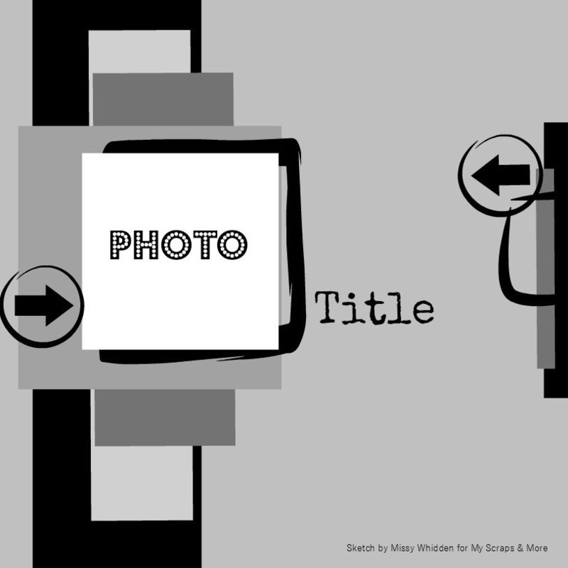
I used the current sketch at My Creative Sketches to inspire my layout design.  I liked the chance to use lots of layers and fun patterned papers - I was trying to capture "that loving feeling" without going over the top romantic.

I started with papers from my February Citrus Twist Kits for my project - then added some green and the black and white stripes. 


The embellishments all came from the Citrus Twist kits and I love that there are so many textures in the choices this month.  The cork stars with the gold glitter are to die for and rub ons are always one of my favorites.  And I am a total sucker for rubber pieces so these Maggie Holmes tags and banners made my day.

The alpha this month was the biggest surprise in the kit.  It is from the new Crate Paper baby line and it wasn't even on my "maybe" shopping list.  But I seriously love it - the puffy alpha and the subtle gray lines are awesome - and the best thing - the letters are in two sizes which creates so many options.  I used the small size here.

I can't believe the weekend is almost over - I'm off to finish laundry.  Hope you found time to scrap this weekend.


Sunday, February 7, 2016

Using Scraps

No secret - I love patterned paper - and I hate to throw even small pieces away.  They are great for making cards, for layering and for my occasional foray into pocket pages. And sometimes its fun to challenge myself to pull a layout together from just scraps - other than the layout base, no cutting into new papers allowed.

The first sketch of the month at Stuck?! was perfect for a "scrap only" layout.  It used several papers and showed three photos.  Since I rarely use three photos on a layout, some of those photos provided opportunities for adding more scraps.


I started with the paper scraps I had left from my January Citrus Twist kits.  Then I went to my scrap baskets to find some other papers to add - using the heart paper as a guide, I chose a piece of red and a piece of navy left from other projects.  From there it was just a matter of using the sketch as a a guide and pushing the scraps around until I layered them in a way that appealed to me.


Because there is so much going on with all the patterned papers, I needed to keep the embellishments pretty simple.And you can never go wrong with hearts and arrows, right?

Do you through your scraps away or hoard them?  How do you store them?  I'm planning a Workplace Wednesday post that focuses on storing scraps but I'd love to hear your ideas.  You know organizing supplies is almost as much fun as using them.

Have a great Superbowl Sunday!


Sunday, January 31, 2016

January at Citrus Twist Kits

I finally seem to be about over the January crud (otherwise known as bronchitis) and am getting back to all things scrappy - YAY!  Last Friday I unpacked my January Citrus Twist kit box and boy was it pretty.  I had the scrapbook main, the add-on, both patterned paper add-ons and the sprinkles kit to play with (and a couple of shop extras).  In between naps, I cranked out three layouts I really loved.

The first one was based on a Citrus Twist sketch and gave me a chance to layer lots of the patterned papers I found in my box.  The papers are bright and fun and perfect for holding off the winter blues.


Here's the sketch I started with.....


And here's the layout I ended up with.  I chose a photo of my son with out cat from his holiday visit for my layout.  He had a tough semester at school and was pretty down on himself when he got home.  But he and Taffy have long had a special bond and she spent lots of time cuddling with him - a definite mood lifter!  And since she is getting old, I wanted to take the opportunity to document their relationship.


I chose the bright yellow paper to serve as the main block in my layout and added other papers on top and behind it to capture the elements in the sketch and create some dimension.  But the photo block seemed to float awkwardly on the base paper (a Citrus Twist exclusive - I loved the grid with pink splats), so I added a branding strip from the bottom of one of the papers.  It really seemed to anchor the photo block and from their the layout came together quickly. 

The Heidi Swapp wood veneer word came that pretty aqua color and was perfect for my layuot.  A few die cuts, some puffy stickers and some ink splats and the layout was done.

I will be sharing at least 3 other layouts using these kits this week - I hope you'll come back and check them out.  In the meantime, have a great Sunday.

Saturday, December 5, 2015

So This Is Christmas

The holidays started in earnest with Thanksgiving at our house so I haven't had much time to scrap.  But the decorations are up, the shopping is well underway and some gifts are even wrapped.  So last night I took a little bit of time to scrap.  And -- of course -- just to maintain that Christmas spirit -- I chose a photo of our tree last year. 

But I hit a little bump in the road - when I scrap everyday, layouts generally come pretty easily.  But when it's been a few days, I often have a hard time getting started.  So I started looking for a sketch and found this one at Stuck?!


I really liked all the horizontal layers, but I was using one vertical photo.  So I had some work to do.  I cut a number of pieces of patterned paper for layers and just played with them til I came up with my design.

supplies are from November Citrus Twist kits and my stash
I used some tags from the Fancy Pants Christmas collection to add additional layers.  I especially loved the striped one and the way it tied my other papers together.  So I cut the bottom off the tag so I could repeat the pattern on the other side of my layout.  And those red letters from SevenPaper might be one of my favorite alphas ever - but you only get one of each letter which just isn't very practical.  Luckily I had stocked up since it took two packages to spell Christmas. 

I hope your holidays are going well.  Thanks for taking a minute to stop by.


Tuesday, December 1, 2015

December Daily 2015

This is the third year that I am trying to put together a December Daily album.  The 2014 album is in the basement - all the pages are done and it just needs photos (maybe a project for 2016).  The 2015 album is on my desk and just needs to have a few pages done (definitely a project for 2016).  But I think this is the year I will finish an album during (or close to) the holiday season.

I think one reason I struggle with the project is because I don't really do much pocket scrapbooking.  I have a hard time acheiving balanced pages.  So this year I decided to do a two page spread for each day - a 6x8 layout and one pocket page.  I am hoping this layout will make the process more comfortable for me. 

I also took the time to make foundation pages ahead of time (starting with Thanksgiving and ending on January 1).  The idea never made sense to me since I didn't know what we would be doing each day.  But I thought I would take a lesson from the experts and give it a try this year.  Maybe that is the secret to finishing the project.

So that just left choosing an album.  I originally wanted to use the pink and gold album from the SevenPaper Clara collection - but I couldn't find page protectors.  So I bought the Studio Calico South of Market handbook from a few years ago - I thought the grey herringbone design would provide a great canvas for a fun cover.   In the end I had both albums and couldn't choose.  My family was split. 


I finally went with the pink album because I thought it would be harder to use on another project.  The gold deer is from Heidi Swapp and the acrylic title and stars are from Colorcast Designs .  (You have to check out their website - seriously drool-worthy). 

So now I just have to make an effort to take and print photos regularly - if I do that, this album should finish itself, right?

If you have any tricks for finishing a December Daily album, I'd love to hear them.  I'll be keeping you posted on my progress this month.

Thanks for stopping by.

Saturday, August 29, 2015

3 To Inspire

Every Saturday Citrus Twist Twist Kits posts a "3 To Inspire" challenge.  The DT member leading the challenge gives you three prompts that you use together to create a single layout. Last Saturday the prompts were:

1. Create with at least 5 squares. 

2. Use medium (mist, ink, gesso).

3. Layered stickers.
 
So here is what I came up with
 
 
Use 5 squares - I used 4 squares of patterned paper, a square photo and a large square of plain vellum.
 
Use a medium - This was a bit out of my comfort zone.  I used gesso with a mask on that square of plain vellum to create texture behind my photo.  I absolutely loved how this turned out and will repeat the process on other projects.  I also used the gesso and mask to add interest on both sides of the page with the gold crosses.  I also added blue, green and gold ink spatters.
 
Layered stickers - I layered stickers from the Crate Paper Journey collection to create the bottom element in my grid design.  
 
This is one of my favorite layouts in a long time.  I can't wait to see today's challenge.
 
Thanks for stopping by.

Friday, July 24, 2015

Mixing Textures

I think a lot about mixing colors and patterns on my layouts.  But I don't think about texture very often at all.  But the truth is that texture is just as important.  And my July box from Citrus Twist Kits provided the inspiration to use texture as a focus in choosing elements for my newest layout.

I started with a great piece of woodgrain paper.  The main kit included a fun piece of fabric that I would never have thought to use on a layout.  But it served as the perfect base for my photo block.  It added depth and interest that paper just wouldn't have brought to the table.

Design inspired by sketch at Citrus Twist kits
The embellishment kit included denim stickers which sounded a little strange but I love.  And they added another textural element.  Shiny gold chipboard contrasted with the fabrics and woodgrain for added interest.  And it just so happens that I had added some cork stickers to my box that worked perfectly with my project. Enamel dots, wood buttons, flair and acrylic shapes all added more texture and interest.  And of course I don't seem to be able to finish a layout without ink splatters.  But this time I used navy colorshine instead of gold, white or black.

Hope you have a great weekend.  We are headed to my hometown.

Thanks for stopping by.

Tuesday, June 9, 2015

Mixing Metallics

Metallics are a huge trend in scrapbooking right now.  And I'm all in - I love the shine and/or glitter they add to my projects.  But I've always used one metallic on a project - silver, rose gold, gold, bronze or copper.  I don't mix metallic when I am picking jewelry so why would I mix them on a scrapbook project?

But the challenge this week at Studio Calico was to pull together a simple project with new (to you) colors.  So I challenged myself to mix metallics.  (And as a bonus, my simple layout design was based on the Sunday sketch.)

Saturday my daughter printed some pictures from her freshman year of high school from her phone and gave them to me to scrapbook for her album.  Those photos are a gift since candids with friends are hard to come by when they are in high school.  And one of those photos were of a friend - Christian - she talked about all year long.  I am super excited to be able to incude that relationship in her album.

I had a tag from the Pink Paislee Atlas collection (LOVE!) sitting on my desk that started my design.  Then I pulled some scraps of my favorite papers from the Carolina Moon kit that happened to coordinate perfectly with the tag.  In the spirit of keeping it simple, I didn't trim a single piece of paper or mat my picture.  I just laayered the paper strips and tags one either side of hte picture.


The tag had silver accents and I attached a Heidi Swapp charm to the twine running through the tag to add  different element.  And I added some other little emebellishments, including copper hearts  (from the Galileo project life kit) and arrows (from Pretty Little Studio).  Silver stars and dots from the Bottle Toss project life add on last night added more shine.  And that big white acrylic word created a great title without weighing down the whole layout.  I really like the white on white.

I have to admit to linking the mix of copper and silver here.  Maybe I should try mixing metallics when I wear jewelry too?

Thanks for stopping by.


Monday, May 4, 2015

Trying New Things - Silkscreen

Did you have a chance to play this week in celebration of National Scrapbook Day?  I love all the challenges that get posted around the world - they tend to push me out of my comfort zone so that I try new things (or at least experiment with products and techniques I rarely use.  Silkscreens are a great example.

I have a few silkscreens - mostly from Studio Calico kits - but I rarely use them.  I love the thought of them and I love the look you get, but I'm not very confident with them.  And I rarely want to take time to let a project dry.

But this weekend, I got those babies out - twice.  I use done with acrylic paints here and it was super easy.  I figured out approximately where I was going to put my photo and then laid the silkscreen down next to it.  I put little dabs of color theory blush crush and 24K paint on the silkscreen and then smeared it around so the colors blended and I had a random mix of pink and gold.  The only problem I had was that my silkscreen was small and I had to reapply it several times to cover enough of the background for the look I wanted.


The second time I got out my silkscreens, I used them with watercolors. I used a small piece of watercolor paper and adhered my silk screen.  I then applied different yellow, orange and pink colors across the silkscreen to create a title block for a simple grid layout.


Oh - and those clouds - a stencil with gesso.  And I painted that veneer butterfly.  I was using those supplies.  Now the trick is to keep the momentum going.

So did you try anything new this weekend?  Link me up.  I'd love to see.

Thanks for stopping by.

Saturday, April 25, 2015

Vellum!

I have lots of scrap related obsessions, but lately vellum has been on the top of the list.  I love that it has been included in collections in lots of colors, prints and textures lately.  And I have quite a stash.

Most often I use it for layering in a photo block.  But when I saw the current sketch on the My Scraps and More Sketch Blog, I decided to try using vellum as the inspiration for my layout.  The sketch uses lots of strips of paper and I thought it would be fun to layer strips of vellum.


The layered vellum strips created a light girly look that i really like.  I mostly used strips from my scraps. And I added in a few strips of white and gray patterned paper to make the strips feel more substantial.   More vellum and a glassine bag to create a photo block finished off the layers across the page.


I dug out some old Basic Grey chipboard alphas for the title and added some embellishments.  And I just couldn't resist that floral stamp from the Studio Calico Lisse Street kit.  I lvoe that it looks like a doodle.

Thanks for stopping by.

Tuesday, April 21, 2015

Not Where I Was Headed

I'm having a lot of fun with the sketches from the My Scraps and More Sketch-a-thon this month.  And most of the time my layouts end up looking something like the sketch I started with - even if I turned it or changed the angle.  But once in a while, the sketch and my finished layout part company by the time I'm done. 

Saturday I started with this sketch.  It called for 3 photos.  I only had one, but I had a plan.  I was going to use one of those Maggie Holmes acetate letters and a piece of patterned paper for the the other two photos.   I think that's when I started to go my own way.


Then I looked at all the layers drawn under the two photos on the sketch.  Those became two strips of paper under my "substitute items."


The same kind of layers were drawn down by the other photo - suddenly those became four strips of patterned paper.  And that fun diagonal frame in the sketch - it became another square of patterned paper that connected the two components.  And now  that pretty sketch had turned into a grid style layout - still pretty, but very different from the sketch.

It just took a couple of things to finish off the layout.  I added small alphas right on top of the acetate alpha to create my title, added some ink splats (of course) using tinsel, seafoam and blush colorshine, a couple of bits from the new Pink Paislee collections, and some veneer butterflies from my stash. 

This is what I love about sketches.  They provide a great starting point and leave a lot of room to bring your own style to your finished project.

What would you make with this sketch.  If you give it a try, link me up.  I'd love to see.

Thanks for stopping by.

Sunday, April 12, 2015

30 Minute Layouts

I am great at collecting classes - but it seems like I never take the time to actually work through the lessons.  But last Saturday I had lots of time (my husband was sick and my daughter was doing the teenager thing and staying in her room), so I opened the class from Lilith Eckels at Big Picture Classes.  It was titled "30 Minute Layouts" and I am the slowest scrapper known to man most days so it seemed like a perfect fit.  Plus Lilith rocks - I always love her projects.  So I figured it was good for some eye candy if nothing else.

Have I mentioned that I am painfully slow when I scrapbook.  I obsess over the placement of every enamel dot, die cut and piece of veneer.  I can move one label around for hours trying to find the perfect place.  So imagine my surprise when I had worked through 2 lessons and had two completed layouts in about 3 hours.  This was record setting pace for me.

The first lesson was really about choosing supplies and organizing.  I watched the video and read through the narrative - and then whipped together a layout about work.

The second lesson is about pulling layouts together with leftovers from other projects.  I started with a stack of scraps by my trimmer and embellishments scattered across my desk.


I added the base paper, the veneer hearts, and the label.  Everthing else was sitting on my desk .  If I didn't use it, I would have to put it away.  I call this a win-win.  I played, ended up with a layout and have less to put away.    (Note:  Design inspired by sketchy saturday at PI)

Then I made a second layout with the scraps from the scraps - all I added was the base paper and the alphas.


So maybe I should take more of those classes I collect?  And for sure I am going to consider possibilities before I clean up. 

Thanks for stopping by.

Thursday, April 9, 2015

Problem Solving Through A Layout

We all scrapbook for different reasons - and if you are like me, maybe for a lot of reasons.  I scrapbook because I think those albums are important to pass on to my children down the road .  But even more importantly I have learned that I am happier if I find time to do something creative every day.  And sometimes, I scrapbook about a problem or concern that is on my mind.  I find it is a great way to organize my thoughts.

Lately I have been thinking a lot about work, retirement, and finding a balance in my life.  I haven't reached any momentous conclusions, but I know that I have work to do in this area.  So when Studio Calico's member challenge this week was to use a photo to indirectly document something, I chose to do a layout about work and how I feel about work. 


The journaling is very personal to me and not something I want to share with anyone.  So it is on that white tag sticking out behind the photo.  I stuck a library pocket to the back of the photo block so that the tag can go in and out easily.  I don't want to share the journaling right now - but I don't want my thoughts to be buried forever either.

Putting the layout together didn't resolve anything for me, but it did help me to organize my thoughts about the issues I want to address.  That's a step forward.  So next time you're worrying, try focusing on something creative as a way to think through your issues.  If nothing else, you will have some time to relax and play.

Thanks for stopping by.

Note:  The layout design was inspired by the April 4th sketch at My Scraps and More.

Tuesday, April 7, 2015

Adding Texture and Dimension

I love pretty paper, but lets face it - it is flat.  So I am always trying to add dimension and texture to my layouts.  Those heavy textured papers are always favorites for just that reason.  But they seem to be harder and harder to find.  And since my LSS closed, I am having to guess at the texture of a sheet of paper based on online descriptions and knowledge about specific manufacturers.

As a result, I am looking more at my stash to find ways to use layers and embellishments to add dimension and texture to layouts.  When I worked with this sketch from MSAM, I really tried to focus on texture and dimension as a way to make the design my own.


I started with a patterned paper background.  The large polka dots were fairly bold for a background, but seemd to go with the feel of my page and added a lot of dimension before I did anything else. 

Textures - Crate Paper - Craft Market
Then I started building the layers.  I pulled the peach and the floral papers from the March Studio Calico kits.  Then I dug through my scraps and found a piece of navy corrugated paper (maybe Fancy Pants?) and added that.  I also used a glassine bag that was leftover kit packaging under my photo - those pabs are a great way to add dimension and texture without spending an extra dime!


I added die cuts from Pinkfresh Studios (Up In the Clouds) and Elle's Studio (Cierra) and a glittery piece of wood veneer that was in my stash.  I dug out those gold foil alphas from the Studio Calico Lemon Lush line for the title.   Some ink splatters (using teal, peach and primrose colorshine) finished it off.

The finished layout had lots of dimension without burying the picture. 

Thanks for stopping by.

Monday, April 6, 2015

It's All About the Title

I title just about every layout I make.  But most of the time that means pulling out a pack of thickers and sticking them on. It works but its just not always a lot of fun (even if I have lots of thickers to choose from.)  So I started thinking about how else I could make a title.

I remembered those stories I read in Highlights magazine when I was little - the ones where pictures substituted for some of the words.    And I decided to use that as the inspiration for the title on my next layout.


This layout is made with goodies from my March Studio Calico box.  Everything came in the kits except the dog die cut - it was in a dear Lizzy die cut pack that was a subscriber's special and the wood heart (from my stash).  I love the mix of fonts, painted wood veneer and a die cut to create a title.  It is totally unexpected and not like any other layouts in my album.  And it was still super quick and easy.

I'd love to see your take on different ways to make a title - link me up.

Thanks for stopping by.. 

Monday, December 1, 2014

Tag!

For the first time in more than 20 years, I wasn't hosting Thanksgiving.  So I had some extra time.  So I decided to make some special holiday tags.  (It was the perfect project because I could work easily in small bits of time and finish each tag pretty quickly.)  Plus I made a dent in my never-ending holiday stash. 

I started with 10 plain white shipping tags.  I laid them out on an old piece of cardboard like this.


 I pulled out my favorite multi-media product ever - the gold martha stewart liquid gilding and a foam brush.  (I've learned that foam brushes work really well with this product and, because they are so inexpensive, you can just throw them away when you are done.)


 I painted the tags with the liquid gilding and had 10 shiny gold tags that would serve as the base for my project.  The liquid gilding dries super fast, so I was ready for the fun part in no time.  I pulled out a box of miscellaneous christmas embellishments and started to put together different combinations of paper scraps and embellishments. 

The best part of this project was the ability to create a really different feel for each tag.  Here are some of my favorites.


 I love the vintage feel of this one.  And the soft texture from the scrap of handmade paper that is behind the Santa.  Initially the red twine was not a bold enough finish but when I doubled up, it was perfect.


 These colors are way less traditional, and the effect is much cleaner than the first tag.  I doubled up the twine again here for a stronger impact from the trim.


Tags are also a great way to experiment with different techniques.  I experimented with silkscreen and acrylic paint over the liquic gilding on this tag.  The result wasn't as clean as I wanted, but it still created a fun look.  Tags are a great place to experiment with techniques!


This is my favorite - I had been looking for a chance to use that plaid washi from Freckled Fawn.  And the deer from the Gossamer Blue Get Happy wood veneer is awesome (I used a couple coats of black color shine to color it).  I finished it off with wide red satin ribbon which helped to balance the visual weight from the deer.

And here is a picture of all 10 tags. 


Some of them will end up on gifts and others will end up as part of holiday projects (like my December Daily-ish album).  They were so much fun to make, that I will probably make more - and maybe with the silver liquid gilding.  I've never tried it.

If you have a chance experiment with some tags - they are fun, quick and inexpensive - and a great way to use up bits and pieces in your stash.

Thanks for stopping by.


Saturday, November 29, 2014

Obsessing Over Die Cuts

I love adding layers and little details to my layouts.  So I am thrilled with all of the die cut and ephemera packs that have been coming out with the new collections.  They provide quick and easy layers, can provide places to journal and add details that pull your eye through a layout.  I think thee are die cuts on almost every layout I do these days.

I sort my die cuts by color and store them in Elle Avery envelopes that way.  So most often I mix and match die cuts from different manufacturer's and collections.  But this layout was a layout I made using the November Studio Calico kits.   One of the add-ons included the ephemera pack from the newest Maggie Holmes collection - Open Book.

 
When working with a kit, I usually start with the patterned papers.  I pick 3-5 that I really like together and lay them on the desk.  For this layout I had 3 papers picked - the navy text, the pink dot, and the mossy green chevron.  I had a scrap of the purple Basic Grey paper sitting there from a prior project.

My initial idea was to layer the three papers I'd chosen on the picture.  But I couldn't get it to "work."  Eventually I pulled the layers apart to create a horizontal block across the layout .  I really liked that, but the picture didn't look right (I'd already cropped it with my original concept in mind and I had way to much space on one side of my layout)  

I started by building up the photo block, adding a piece of the purple Basic Grey scrap and another paper from the kit - the white with cork polka dots.  I folded a glassine bag that was used to pack kit embellishments in half under the photo  - this is a great way to add texture and dimension and to reuse packing material.  This gave the photo more weight but I still needed to balance it on the other side of my layout.  

Those die cuts really came to the rescue - I took a smaller piece of the purple scrap on my desk and placed it opposite the picture.  I layered three die cuts to create an element on my layout that balanced the photo.  I added a gold polka dot tag from Pebbles to the cluster and placed a kraft thicker heart from Amy Tangerine on top of the tag.  I used enamel dots to hold the tag string so it looks like the tag is hanging on the layout.


To finish I added another diecut cluster at the top of the page, mixing in antoher one of those kraft thickers and a label from my kit. I love that floral banner


 A shipping tag die cut went under the photo, a phrase label from the kit went on top of the photo and I added one more die cut to create a third element in the large horizontal piece across my layout.  I pulled some old thickers from my stash for the title and created some hand-written journaling strips to finish off the the design.  (I may be the last person in the world to figure this out, but those journaling strips don't have to be white - I used pale blue cardstock and love the softer look.) And of course, every layout needs some ink splatters (I just need to learn to let them dry before I touch them.I used navy color shine from Heidi Swapp here.


Thanks for stopping by today.


Sunday, November 23, 2014

12 Days of Christmas at Papercut Labs

Papercut Labs is hosting a fun holiday event - it is the 12 Days of Christmas Crop and Blog Hop.  They have 12 fun challenges that can be combined for entries for some great prizes.  And I can't resist the chance to win some goodies for my stash, so of course I'm playing along.

My first entry is a layout inspired by the amazing Natalie Elphinstone.  My Studio Calico kit in November included this amazing tree paper.  But I was totally stumped by it.  I couldn't figure out what to do with it.  Then she posted a gorgeous layout at Studio Calico and on instagram using it as her base and I was off.  She mixed patterns and strong colors with the paper for a gorgeous effect.

I had a picture of my 22 year old son standing by a buckeye tree that he picked at a free tree event when he was only 5 or 6.  It was only a twig then, and I love this picture because it captures both that old memory and my life today.  It seemed like the perfect picture of this tree paper.  I mixed it with shades of green, blue, purple and peach (a really different color palette for me).    I added some die cuts (including some amazing vellum leaves from my Studio Calico kit) and a doily.  The doily was too bright when a first tried it, so I turned it over and used the back side which was the perfect pale blue.  Here's what I ended up with.


I used Studio Calico color theory lavender soda ink to stamp on the peach paper and amethyst color shine for the ink splatters.  I also added a few enamel dots and a piece of wood veneer for the finished layout.  And I used some pale blue cardstock from the card kit for my journaling strips.

Don't forget to leave a comment for an entry into the holiday giveaway. 

Thanks for stopping by.

Saturday, November 15, 2014

Scraps!

No doubt about it - pretty patterned paper is one of my weaknesses.  I probably have more patterned paper, carefully sorted by color and pattern, than I can use in my lifetime.  And there is no question - I continue to fall in love with no collections and add more paper to my stash.

But I hoard my paper.  I hate throwing even small scraps away.  And those scraps go into hanging files, sorted by color and pattern.  I use them as layering pieces sometimes.  And if they are big enough pieces, I use them for cards.  Or I go there when I think a project needs just a splash of a certain color.

But last week one of the challenges during the pinspiration crop at My Scraps and More was to create a layout inspired by a picture of a rubik's cube.  And I challenged my self to use only scraps (other than the layout base).  And of course embellishments were fair game.

So I pulled scraps of 9 different papers - I chose different colors and patterns.  And then I cut 3 inch squares and arranged them in a simple grid pattern.  Once I liked the arrangement, the adhesive came out and I created the base for this layout.


I layered on 3 3x3 photos with a white border from Persnickety Prints and went to town with the embellishments.  The Heidi Swapp color magic die cuts worked really well because I could use my inks to get just the color I wanted.  I also added stickers, paper scraps, enamel dots and buttons.  And of course, a layout is almost never done til there are ink splatters.

 So use those scraps and link me up to your projects.  I could use some new ideas.

Giveaway alert:  Don't forget the blog rebirth giveaway.  There are only a couple more days to enter.

Have a great Saturday.  Thanks for stopping by.

Thursday, July 4, 2013

Still Working on "This Is Me" with Roundabout

Studio Calico Kit Subscription

Use this  link to sign up for a new Studio Calico kit subscription and we will both get 1000 rewards points - that's good for $10 off an add-on!
http://www.studiocalico.com/welcome?ref=f7503d08

 Bloglovin' 

Google Reader is shutting down  - use the button on the sidebar to follow me on BlogLovin! 
I know the "This is Me" class was in May.  But I didn't get much done that month and I'm trying to do at least a couple pages every month.  I did two pages using Roundabout (and some Planetarium scraps) for my "Needs Work" section.  These are some of the hardest pages for me - they are focusing on things I know I need to work on.


The first one is "Marriage Is A Journey."  My husband and I have been married almost 23 years.  And we are at a transition point.  We started as friends, fell in love, and got married.  Now the second of our three children is moving out and we have more time to be a couple again.  But like many couples, our kids activities took up most of our time over the last 15 to 20 years.  So we have to learn to be a couple again.  (We'll get there, but definitely something I'm working on.)


My favorite part of this layout (from a creative point of view) is the layered project life card and Heidi Swapp transparent tab.  Remember that I am using a Snap album but with a landscape orientation.  The PL card/tab stick out the side of the page protector and album.  And I love that the words work together to say "you + me together."


The second layout I did is about my stash building habits.  When I am stressed, I like to shop.  It used to be for clothes and shoes, but in the last year it has been for scrap supplies.  Let's just say my scrap room is very well stocked after the last year (and after a giant purge.)  And I really want/need to learn to destress by using my stash, not adding to it.


Someday I'll finish this project (probably just in time to start an album about the new, hopefully improved me.)  In the meantime, I'll keep plugging along, making a few pages here and there.

Thanks for taking the time to visit.  Have a wonderful Wednesday!