I've really been going strong in my scrap room lately, but this past week I slowed way down. I had a stack of sketches on my desk and lots of pictures, but I just couldn't seem to get started on anything. Then last night I came across the latest Creative Jumpstart.
Creative Jumpstarts are challenges published (I think bi-weekly) by Marcy Penner and Stephanie Bryan - two of my favorite scrappers. The challenges vary but this one was a recipe challenge - striped paper, chipboard and washi.
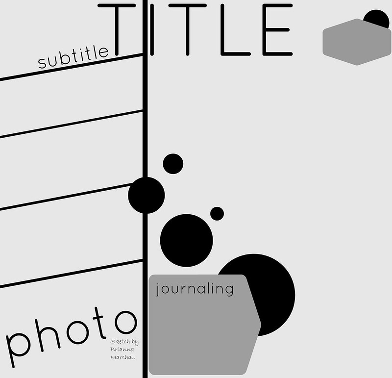
This was just the push I needed. I had a picture of my cube-mate at work where she is looking between the glass panels that separate our workspaces that I had wanted to scrap and a fun striped paper from the Studio Calico Lisse Street kits that reminded me of her (I don't know why - it just .did). And I had a sketch from My Scraps and More I really liked but had been struggling with
I thought it was perfect for my photo because the stripes reminded me of the way the cubes are lined up and the way we look for the glass panels. But I finally figured out that the angle of the stripes was throwing me off. I am a pretty lazy scrapper and its a lot of measuring and work to get those angles straight for a whole page.
So I turned the sketch 90 degrees, straightened out the stripes (sort of) and ended up with this.
Most of the papers I used were from the 4x6 paper pad - the smaller scale worked well for the size of the strips.
I layered some of my paper strips for added interest. And I used foam tape to adhere some of the strips and the photo - this created some dimension which I really liked.
Next the washi - one of my favorites right now is a whide tape with navy hearts. It was perfect, but I wanted a less perfect strip. So I adhered one side of the tape to the paper and then tore down the middle for an uneven strip at the bottom of my page. I finished it off with some chipboard thickers.
If you try the creative jumpstart, the sketch or both, I'd love to see. Link me up!
Thanks for stopping by.


 "
"


Really clever. I like the strips and the dimension. The plus signs are the perfect embellishments. Cool. Michelle t
ReplyDeleteLove this! I really struggle with what to do with the + signs but you make it look effortless they just go so well how you have them! Lovely layout! x
ReplyDelete