Soccer is a huge part of my sons' lives. If you follow my blog, you know that I put together an unbelievable number of soccer layouts. I know you get tired of looking at them, and you can be sure that I get tired of putting them together. I feel like they all start to look alike.
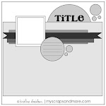
 So in Nicholas's senior album, I am really trying to do some different things with those soccer layouts. It might be different color combinations, different techniques, different embellishments or a different focus. This layout about the scrimmages (especially about the one against the team from the public high school in our community) uses an obvious difference. I printed the pictures in black and white. (The layout was inspired by the monthly sketch challenge at My Scraps and More.)
But one of my favorite parts of the layout is the title block.
My husband cut the large wood circle from veneer we bought at a wood working store. The small wood circles came from the same shopping trip. And I love these new Amy Tangerine corrugated letters. The font design inspred the letter placement that creates a sense of movement.
Have a great Wednesday!


 "
"


I love everything about this! The black and white photos against the bright colors are great and I love the wood veneer and the title block, too. Fantastic layout!
ReplyDelete