Pages

Sunday, June 30, 2013

Lily Bee Challenge

Lily Bee is sponsoring a challenge and the prize is a Gossamer Blue kit.  The challenge is looking for a summer themed layout using at least 50% Lily Bee Products.  I like Lily Bee a lot but have a hard time finding much in my local stores.  So I started by pulling all the Lily Bee papers and embellishments I had in my stash.  I had a pretty good selection of papers, but almost no embellishments.  So I picked a base paper and then cut other papers to create a custom look.

Since time at Lake Erie has meant summer to me since I was growing up, I knew I wanted to use that as my theme.  Here's what I ended up with.

The pieces I cut from Lily Bee paper seemd to bright against the orange and white background paper, so I added vellum circles.  Most of the stickers are Lily Bee, but I added Studio Calico stars and Freckled Fawn enamel dots.  And that heart in my title is from Fancy Pants. I don't know if its a winner, but this layout makes me smile when I remember time at the beach.

Have a super Sunday!  Hope you have a chance to scrap.

Saturday, June 29, 2013

Lifting Stephanie Howell

I loved the gold and white Anna Griffin paper in the Studio Calico Outer Banks add-on. But it was totally different from papers I'm usually choose and I couldn't figure out how to use it.  The I realized that the pattern reminded me of doilies.


And doilies remind me of Stephanie Howell.  So I went to her gallery and found a layout that inspired me.  And I was off and running.


 I used gold lame and primrose color shine to color some of my doilies I was layering.


And I didn't have chipboard flowers I wanted to use so I mixed the Anna Griffin die cuts from June's kits with other embellishments in my stash.


But I loved the journaling directly on a doily and used that idea exactly like she did. The layout I ended up with was a more literal interpretation than I usually make when I scraplift, but I liked the end product.  And I'm thinking that I will be off and running with that paper now that I've cut it.  And this is why I love the Studio Calico kits.  I'm inspired to try papers, patterns, and embellishments I wouldn't otherwise.

I'm hoping to scrap this weekend.  Hope you have a great Saturday.

Friday, June 28, 2013

I'm Published!

I'm so excited!  For the first time ever, one of my layouts is published.  You can find it in the online magazine Life Paper Scrapbook on page 71.  Here's my layout.


I pulled this together using the June kits from Studio Calico.  Those kits included great twine and this was the first time I played with letting it just wander across the page.  I used little pieces of wood veneer, little stars, and brads (where I cut off the prongs) hold it in place.  It creates a really great look.
 

I loved these Heidi Swapp alphas and am still using them.  They create sch a unique look.  And the Elles Studio background paper was perfect!


Then it was just about adding little bits and pieces. This leaf was in my stash and was from freckled fawn.


Saturday, June 22, 2013

A Bright Color Challenge Means Soccer

I've been following the blog at Life Paper Scrapbook lately.  In addition to lots of good information, they have two challenges a month - a color challenge and a sketch challenge.  Yesterday I shared my take on the June sketch challenge.  And when linked that layout to the Life Paper Scrapbook blog, I saw that the June color challenge was posted. 

The June color challenge is full of bright summery colors - which makes me think of - what else - a soccer layout.  I know - you're looking at the picture of flowers and saying - "really, soccer?" 

I had printed a copy of a layout by Lilith Eckels that I especially liked (I love all her her work, but this one especially caught my eye for some reason) that served as my starting point for my layout.  I loved all the bits and pieces she used.  So I pulled out an assortment of patterned paper - some new, some from my scraps and lots of stickers, die cuts, and other bits and got to work.  When I finished, I didn't like at as much as I like the layout Lilith did, but it was pretty cute.


See you can find all the colors from the color challenge in my layout - even pink.  And I loved the large journaling card from Carta Bella's new line, Well Played.

I loved the way embellishment clusters framed the photo block on Lilith's layout.  I ended up with 3 clusters on my page.

 The cluster at the top of the page used Basic Grey, Studio Calico, My Minds Eye, and Theresa Collins.  It was lots of fun to mix all those different elements.

 I dug out my old Creative Memories circle punch to held ground the embellishment cluster on the side of the page.


I added a number sticker from Jenni Bowlin at the bottom of the page to finish off the embellishment cluster - it was Nicholas's jersey number.  (And after I took the picture I turned that phrase sticker around so that it was right side up - LOL).

Now you see what I mean, right?  This color challenge was perfect for a soccer layout.

Have a super Saturday - hope you have time to scrap.  

Thursday, June 20, 2013

Cake with Life Paper Scrapbook

I loved this month's sketch at Life Paper Scrapbook when I first saw it.  But I tried to put a layout together several times and just couldn't get the pieces to work.  I finally figured out that it was the proportions that were getting me every time.  And I liked the sketch enough to keep trying.  And then tonight I got home from work and knew just what I wanted to do. 

I wanted to play with a monochromatic look and use a picture of a lemon strawberry cake I made for my son.  I wanted to stick mostly with shades of yellow and white ( and maybe a little pink.) 

Tonight the layout came together in about an hour - it doesn't follow the sketch exactly, but it clearly was inspired by the sketch. and it was the perfect chance to use that amazing pink and yellow washi from Outer Banks.  What do you think?


I used just one photo on my layout with lots of laying to emphasize it.  And this slide frame from The Pier with the pink wash was the perfect finishing touch.


 That Dear Lizzy chipboard tag covers up some primary colored candles that just didn't go with my layout. 

Because the layout used such a uniform color palette, I had to use other design elements to add interest.  One of those was repeating elements.  I used slide frames, sequins and stars to tie the layout together.  You can see one star peeking out behind the photo block and more scattered at the top and bottom of the layout.


 Texture was also an important element.  I love the stars from the Planetarium kit and the sequins and ink splatters also had visual interest.  And the Thickers I used to add a title are some of my favorites because they have so much texture.


Try the sketch - it was fun and challenging.  And have a fantastic Friday.

The Life of A Little Sister

Last weekend was the Oklahoma benefit crop and I'm still working on some of those challenges (I know I won't get them all done, but I'm doing as many as I can.)  One of those challenges was a layout that talked about the weather.  It was the perfect opportunity to use this picture of my daughter from a few years ago - she's sitting in the rain watching one of her brother's play soccer and she says its all she did for the first 10 years she was alive.  (She exaggerates a little bit :))


I tried something different for me on this layout - I mounted my patterned base on a piece of cardstock for added dimension.  I always love the look when I see others do it, but I'm not sure it is for me. 

I love this vellum heart on the picture - these stickers were from the Studio Calico Darling Dear collection and I've been hoarding them.  The subtle impact is just great.  (My stash of hearts is almost gone though.)


And while I was working on the layout, I got some happy mail from Chic Tags.  I was lucky enough to win the Sunday challenge a couple of weeks ago and I got to pick $25 dollars of goodies from their store.  The banner tag at the top of this layout was the perfect touch.


And look at all the goodies I have to play with in the future.  (This package totally made my day.)


Hope you have a terrific Thursday.

Wednesday, June 19, 2013

A Quick Soccer Layout

I haven't pulled together a soccer layout in at least a week.  And as much as I complain about all the soccer layouts I do, I must miss them.  When I saw the Sunday layout sketch at Studio Calico, I knew I wanted to try a soccer layout.  Here it is.

I love the contrast between the bright colors in the papers I chose (mostly from Studio Calico Collections or kit exclusives)  and the black and white photo.  And the coolest thing about this layout - see that strip of wood squares - I found it when I made a trip to the woodworking store with my husband.  I think I paid $2 for 3 feet and it is so fun to use non-scrapbooking things on a layout.

Have a wonderful Wednesday!

Tuesday, June 18, 2013

Choose Happiness with Gossamer Blue and Crate Paper

In my last post, I talked about being stuck and spending a whole day trying to put a layout together.  Monday after work, I had a different experience - this layout came together in about 90 minutes.

Gossamer Blue posted an inspiration challenge on Friday that caught my eye when I came across it yesterday.  Here is one of the inspiration pieces.


I've never done a Gossamer Blue challenge before, but choosing happiness (and not letting events or the choices of others choose for me) is something I'm working on.  So this challenge really captured my imagination when I came across it.  I coudn't wait to get home Monday and put something together.

My favorite papers right now are from Crate Papers line, "The Pier"  so I started with those.  I added a little "Maggie Holmes" and a pink chevron paper from "Fourteen."  Most of the embellishments I pulled were also from "The Pier" but I had a great Heidi Swapp chipboard sticker that was the word "happy" I knew I wanted to use and you can never go wrong with a doily.  Here's the end product.


I love the stitched banners in "The Pier" die-cut pack.  They are the perfect way for non-sewers like me to add stitched detail.


And the Pink Paislee Luxe rubons added the perfect finishing shine. 


This turned out to be one of my all time favorites.  Maybe it came together so quickly because I really felt the sentiment behind the layout. I just might hang it in my scrap room as a reminder that it is up to me to choose happiness.

In the meantime, I have a conference to attend today.  I hope you have a terrific Tuesday.


Sunday, June 16, 2013

Unstuck With Roundabout

I had free time on Sunday and was determined to scrap.  But I had no motivation or inspiration for anything creative.  I purged my paper stash for most of the day and even seeing all that pretty paper left me cold.  But I was determined - a free day is rare.

So I pulled out my Roundabout kits (they are all mixed up in an oversized ziplock bag) and looked at them.  Still nothing.  Then I pulled out my pile of photos to scrap.  And my stash swap pictures made me smile - finally a start.

Then I looked at my challenge/inspiration notebook.  There was a layering challenge in the Oklahoma benefit crop, a sketch at the My Scraps and More sketch blog, and a My Scraps and More Got Talent mini challenge - use 3 stamps.  Could I put them all together?  That seemed to be enough inspiration to get me going.

I used the sketch as a starting point for my basic layout design.  (Of course, my layouts never look like the sketches, but they still get me started.)


And each photo block had five layers, meeting the terms of the Oklahoma benefit crop layering challenge.


And I used two word stamps and two arrow stamps on my layout.  (I never use my stamps, so this was a major accomplishment.


And I liked the finished product - maybe not one of my all time favorites, but still, I liked it.  I'd love to know how you get unstuck - please leave a comment and let me know. 

Hope your Monday is simply marvelous!


Finding Me . . .At 50

On Thursday, someone asked me why I was changing so much.  On Friday, My Scraps and More posted a challenge - a layout using a picture of you. Then I was in my local Archivers and I saw the new Authentique line - Be"You"Tiful.  Now I never, ever use pictures of me - even my this is me album will only have a couple when it is done.  But this got me to thinking - was I changing and what would I do in a layout about me.  Here is what I ended up with.


And I don't think I'm changing exactly.  Instead I think I'm finally really seeing me and accepting who I am.  At 50, I think I'm finally through with trying to be who others think I should be.  And my scrapbooking is helping me get there. I am more creative than analytical; I want to wear soft, feminine clothes, not business suits; I don't want to be super organized and scheduled all the time - I am happier going with the flow and following impulse.  And most importantly, I want my children to get to this point long before they are 50 - so I have a new focus on what is important to me about being a mother.

 Its hard - for me and for those I love, but I am finally growing up.  I think this quote might be my new mantra:


So I'm going to try to keep growing up.

Today we're having a quiet father's day - I'm hoping to get a little scrapping in and maybe a nap (I have one of those dreaded summer colds.)  Enjoy your Sunday and celebrating the men in your life.  And thanks for listening to me ramble about my growing pains.

Friday, June 14, 2013

Swap!

I love stash swaps - its so much fun to get a box of goodies in the mail.  And its even more fun to swap your stash for things for a new friend.  So when it was time to sign up for the Studio Calico summer swap, I was so excited.  But I didn't know I'd hit the jackpot like this. 

Welobellie is a scrapper in Hawaii - how fun is that?  I now have a scrapping friend in Hawaii.  And she must be one of the most generous scrappers ever.  I got not one, but two big boxes filled with paper, embellishments, and alphas.  I got home from work at 10 last night and was overwhelmed by all the goodies she sent me.  I might need to reorganize my stash to make room!
I can't believe all the fun embellishments - even some of those hard to get feather wood veneers from Studio Calico

Tons of alphas, labels and other fun stuff.  I wish I could stay home and scrap today.

And a giant stack of patterned paper - including some of my favorites - that Studio Calico feather vellum, the red woodgrain from Yearbook, and papers from Front Row - I loved that color combination.

I am still working on a box (or maybe 2) of goodies for Welobellie, but hope to send them off tomorrow  I hope she likes them as much as I loved mine.

Have a great Friday!

Tuesday, June 11, 2013

Fun and New

Its been busy these last couple days and I haven't felt very creative.  So I don't have a layout to show you.  But I do want to share some new goodies.

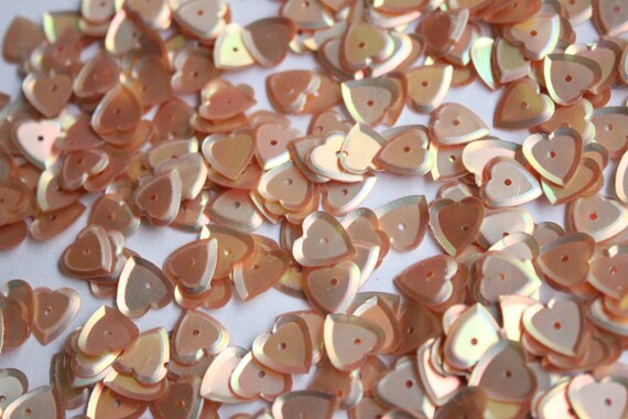
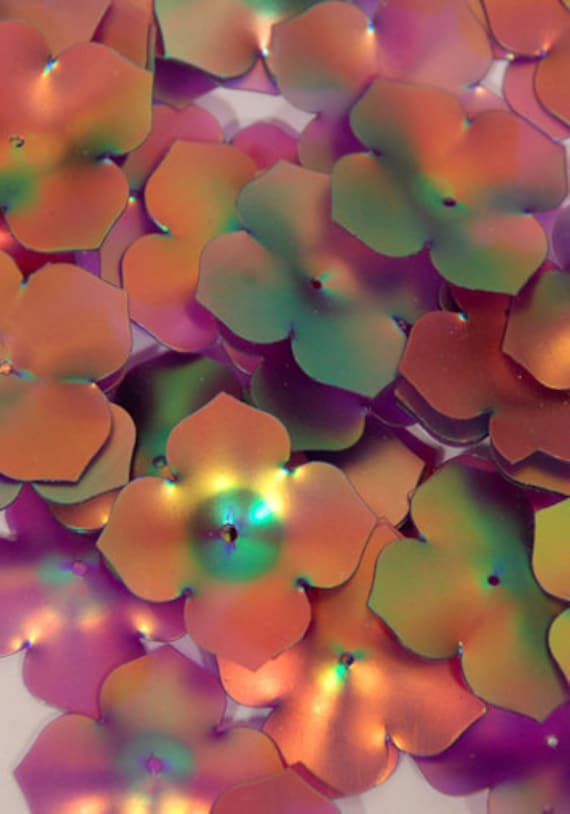
First - some new sequins from an Etsy shop (Idea2sequin) I have an addiction to both sequins and Etsy.


Some amazing new erasable markers that I learned about through Studio Calico and Camp Calico - now I want the pens and highlighters.

I'd love to see your newest finds - leave a link in the comments.  Have a terrific Tuesday.

Sunday, June 9, 2013

Two Kinds of Layouts

There was a thread on the Studio Calico boards this week that really made me think.  Why do you scrapbook - is it really about memorykeeping or is it about having a creative outlet?  (Most of the people writing said it was more about the creative process.)  My husband is always talking about this too - he argues that the purpose behind scrapbooking has become less important to me that making pretty pages.

But both the creative process and memorykeeping are important to me. As I looked at my scrap room, my online galleries, and my albums, I realized that I do two distinct kinds of albums.

Memorykeeping

I started scrapbooking back in my high school years, stopped for a while, started again early in my marriage, stopped again and then found Creative Memories.  I started again and have never stopped.  And these albums are mostly about memorykeeping.  My long-term goal is to finish a set of albums documenting birth to 18ish (college or moving out) for each of my 3 children.  

I always wanted them to look nice, but the pages were very simple in the beginning.  While they've gotten more complex, my focus was and remains on documenting memories.  T
This page is from one of my early Creative Memory albums.  Its very simple cardstock - a few themed stickers, a circle punch and a corner rounder  - and maybe a little bit of patterned paper.

These layuots are usually two page layouts, have lots of pictures and are about an event. They go in albums that are organized chronologically.

A Creative Outlet

In the last year and a half or so, I've started a whole second set of layouts.  I call these my "pretty pages."  Often they are inspired by online challenges or online classes.  I used a wide variety of supplies and often an focusing on the technique, the challenge requirements, and the creative process.  These layouts are more about using the creative parts of my brain then documenting an event.  For instance, I never would have played with gesso and watercolors on a layout before I started to explore scrapbooking as a creative outlet.


These layouts are usually one page layouts, might be in a smaller scale and often push me out of my comfort zone creatively.  I put them in 12x12 3 ring albums, but not in any real order.  Mostly they go in albums in the approximate order that I complete them.

Bringing the Two Pieces Together

This is when it gets interesting.  As I look at work I've done recently, I can see how the two distinct styles of scrapbooking are coming together.  Each side of my scrapbooking habit is making the other stronger.  

I use a broader range of supplies in my "memory keeping" layouts and experiment with different page designs.  And I consider documenting more "everyday" kind of events in these albums.  For example, this layout about the "big game breakfasts" that I did for my son's senior album documents a special memory and not an event.


And it uses a mix of stitched elements, washi tape, transparent elements, patterned paper, wood veneer, sequins and enamel dots.  And those ink splatters even made their way onto the layout.  The embellishments are clustered instead of spread randomly across the page.  And it is a vastly different style than the original memory keeping layout I did several years ago.

And this layout about my oldest son documents his path since high school graduation and how I feel about that journey.  It was definitely done for a challenge and started out to be about the creative process.  But the journaling hidden behind the photo block documents a difficult time in my life and how I felt about that time and being a parent during that time.  


This "creative" layout actually became a non-traditional "memory-keeping" layout.

And sometimes a layout starts out in the creative category and becomes a memory keeping layout - like this one based on a journaling prompt "in five years."  

 
My journaling was about where my son might be in five years (when he graduates from college) and ended up as the last page in his junior album.  It will be fun to see how it compares to reality when those 5 years are up.

Making Each Other Stronger

I've realized that the two sides of my passion for scrapbooking actually work together to make all my projects stronger.  And I don't need to give up the creative projects for the memorykeeping.  I just need to work to achieve a balance between the two kinds of projects.  And who knows, maybe some day the two kinds of projects will actually merge into one style.  

I'd love to hear how you think about scrapbooking - is it about memory keeping or is it about a creative outlet.  Have a super Sunday!

Friday, June 7, 2013

The Impossible Challenge - No Patterned Paper

My Scraps and More started their summer challenge event on Friday - and the first challenge was tough.  Put together a layout with no patterned paper.  Since I love patterned paper and mixing patterns, I was totally stumped - until I got started.

I used gold lame and primrose colorshine on white cardstock to create the base for this layout.


Then I created a photo block by layering cardstock, vellum and handmade paper.  I added lots of vellum and transparent elements from Studio Calico, Basic Grey, Heidi Swapp and Glitz.


I used ribbon, twine, washi and wood veneer for more texture.


And I finished it with a cluster of vellum and transparent pennants, wood veneer, and of course,  sequins at the top of the page.


By the time I was done I didn't even miss the patterned paper.  This was a great creative exercise.  Give it a try - make a layout without patterned paper. 

Have a super Saturday!